Teaser Trailer Title Deconstruction - The Butterfly Effect


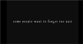
The tagline is placed in the centre of the screen making it the dominant therefore the audience has no other choice but to read it, too there is no sub dominant so our eyes are made to be transfixed onto it and nothing else. It reads "some people want to forget the past" and then morphs into the tagline "some people want to change it". In combination with the other attributes editing, sound and mise en scene (typography) it is proven extremely effective. This appears at 0:06 into the trailer.
We also see the letters move around the screen at 0:08 to form another tagline that reads "some people want to change it" hinting at the narrative of the film. The tagline is synchronized to the non diegetic sound as it appears on screen as the percussion instruments beats the first beat of the non diegetic sound. Too the tagline transits into the next tagline in the sense that it dissolves into the next again synchronised with the non diegetic sound.
The non diegetic produces its climax at the beginning creating a jump factor at the most unpredictable moment with a sustained minor pedal note remaining throughout the rest of the trailer adding suspense, anticipation and a fast pace to it. As the tagline transits into the other we see a blue glow come off of the typography connoting the clinical and psychological aspect to the films plot. Too as the tagline appears we hear a scraping sound most likely produced by an electric guitar played with a metal bar. As the tagline morphs into the other we also hear an electronic buzz sound hinting at the supernatural side of the film.

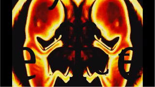
A montage is used towards the end of the trailer to which it builds up to the climax of the narrative within the trailer and the title of the film. Prior to revealing the title as a whole, close up shots are used of the title with highly graphic images. An example being the screen shot on the left that appears at 2:24 showing a mirror image of a coloured ultrasound. The title of the film is mirrored too, although it is hard to see as it blends into the background image.
At 2:23, during the montage, we see the title form into place. Transitions are used to link all the backgrounds together to form the title screen below at 2:27. The use of transitions get across the psychological factor of the film as due to the extreme amount of jump cuts, cross cutting and loss of sound towards the end to add a disorientating finality to the trailer.
The final shot, reveals the title, using the same typography in terms of font and colour as seen within the montage. The background is a faint image of a brain, again hinting on the psychological factor that plays a large part in the narrative.The typography is clear and has been manipulated to suffice the psychological factor, as you can see the double f in "effect" are back to back adding a unique-ness to it.


No comments:
Post a Comment