In this post I have been using Photoshop to practice font manipulation in preparation for our typography that we will use in our trailer, website and poster.
In this first image you can see how I have manipulated the first letter to have jagged edges and make it unique.
In order to manipulate parts of the text, you have to convert it to a shape and then use 'direct selection tool' to manipulate points on the characters.
Here you can see all the points which are available to be dragged out and around to create a different shape and style of the letter.
Here you can see I have manipulated each letter in a slightly different style and increased the height of the 'b' and made the 'd' slightly slanted.
Here I went back to the original font and experimented with the smudge tool to make the top font almost appear as if it was actually written on the paper. This gave me the idea for using a font which looked slightly hand written, so if we needed to make it look like a hand written I would know how to do this.
I then used the smudge tool on the font which looked hand written and made it seem as if the ink had smudged. I really liked this effect and decided to incorporate it with an image to improve the effect further.
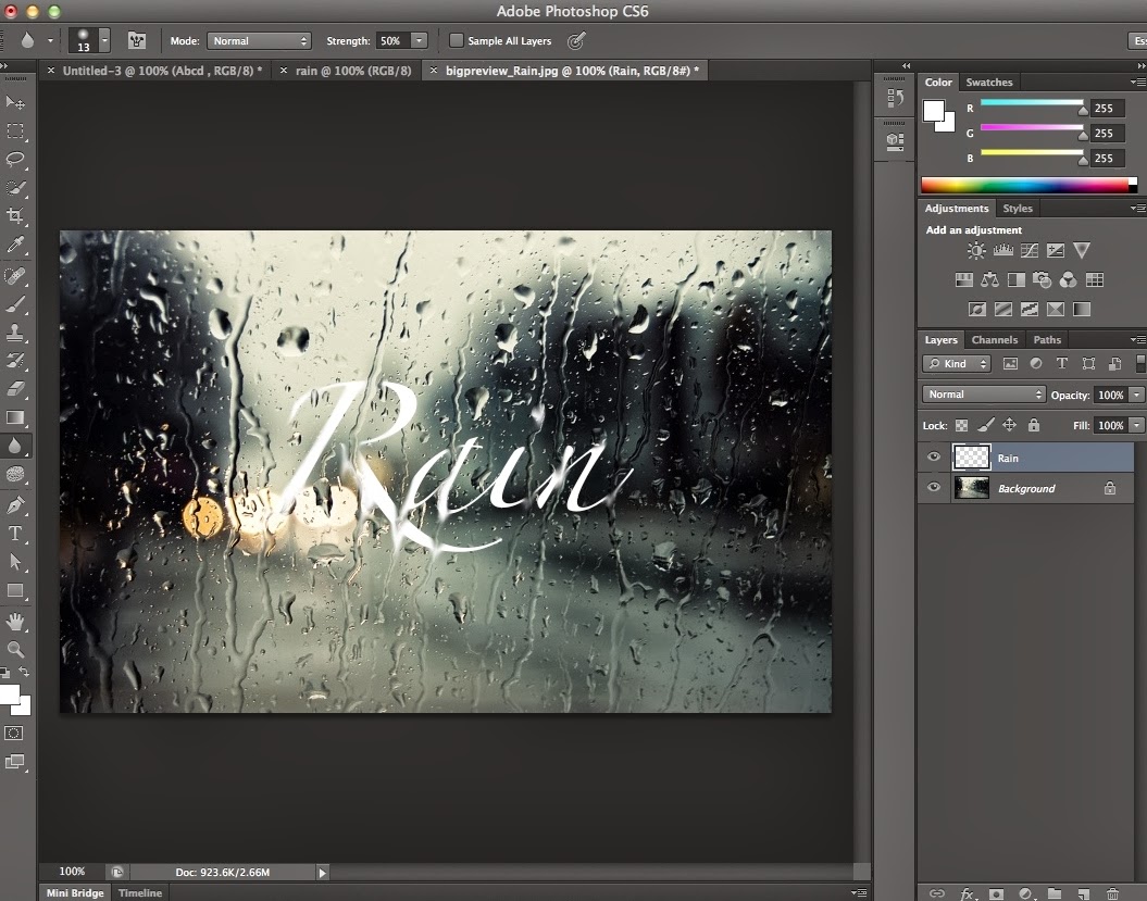
I decided to use an image of rain on a surface and try to make the text which would appear to be on the image look like it was running down the screen.
I used the smudge tool again and followed the rain drops down so that when it met the text it appeared to be running down the glass.
This is the final effect, showing the progression of text manipulation.


No comments:
Post a Comment