Danielle Blasse 7010 - Cloe Pace-Soler 7352 - Rebecca Holloway 7279 - Natasha Welch 7399
Townley Grammar School - 14109
Showing posts with label editing. Show all posts

Monday, 24 February 2014

Final Tweaks: Green Screen

Looking at some of our feedback on our trailer, it was obvious that tha narrative was not completely clear. One of the main issues was that during the facebook scrolling scene, the audience did not have enough time to read the facebook comment on the screen. Therefore, I decided to make amends and edit this scene.

Method

1) I had to create an image of the necessary facebook comment zoomed in on the screen.This proved to be a tricky process as when I first tried to do this on photoshop, the comment was too long on the screen. Therefore, I had to edit the image by duplicating the zoomed in screen shot and layering the images on top of one another so that you could read the whole comment. I had to erase around the edges of the top layer to ensure that it had smooth edges and looked professional.
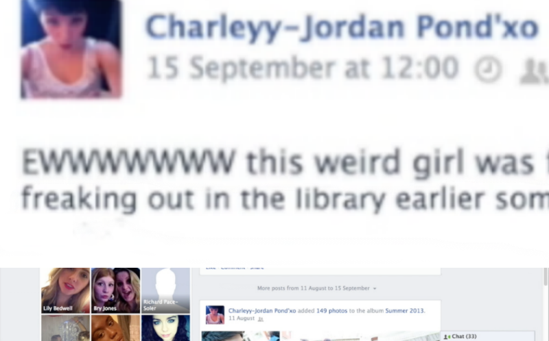
2) Then, I imported the image into Final Cut Pro, and put dragged it in position so that it was the background of the footage of her sitting on the laptop. However, this was still not very effective as the protagonist was sitting directly in front of the comment. So, I decided to make the footage of the protagonist disappear so that the audience could read the comment.

3) Therefore, I split the footage of the protgagonist on the laptop into two parts. Then, I moved the second part along so that it would not be featured at the same time as the close-up of the comment.

4) I had to put on the 'Keying' effect on the second part of the footage filmed in front of the green screen so that the background would come back when the comment disappears.

5)  I made the image of the comment longer so that it was long enough for the audience to read. Eventually, I made it 2.0 seconds long to make it effective.

6) Finally, I put on the 'Static' transion 'Style B' on either side of the image of the facebook comment to make it fit in with the sequence effectively.


Evaluation

Pros

  • This new version makes it easy for the audience to read the comment as the protagonist's head is no longer in the way, making it clear to read. It is also larger and stays on the screen for longer. This makes the narrative much more clear for the audience and we will not have so many problems of people misunderstanding the relationship between the two characters.
  • Using the Static Transition 'Style B' twice, rather than 'Style A' looks much more professional, rather than overusing various different effects, which looks a bit childish. I think it also suits the psychological, distorted effect that we want for the genre.

Cons

  • Having the protagonist disappear for a while may seem a bit unprofessional and random, however there is not many other options for us after receiving feedback that the protagonist being in the way is a problem for the narrative.
  • The facebook comment could be seen as lingering on the screen for too long, which may ruin the pace of the trailer, however it is still important for the audience to understand the narrative.

 

Friday, 10 January 2014

Montage editing


Finally, I completed the editing of the montage.
Within the montage, I used a variation of clips to interweave with the shots of the Victim being stalked, which we filmed specifically for the montage.

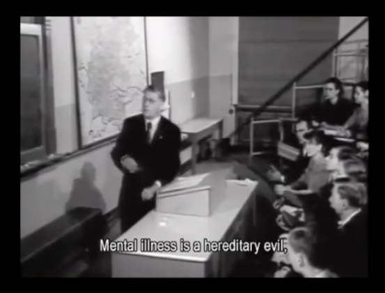
1)Firstly, we used old-fashioned documentary clips, which I found on youtube, downloaded and imported into Final Cut Pro. This proved to be a challenge because all the documentaries were on average 1 hour long, and so not only did they take a long time to download but finding the 1 second clip that we wanted proved difficult.


These old-fashioned clips are effective because they reinforce the psychological genre and the message about mental discrimination. They also have a very creepy, sinister feel to them, which helps us fit in with the conventions of our genre.


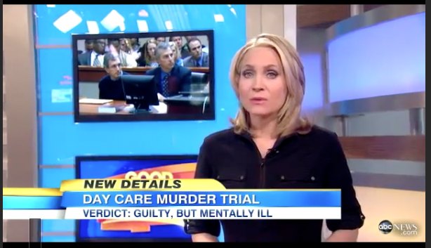
2) Secondly, I included News Clips which discussed mental illness. I downloaded many clips of various mentally ill criminals being either discussed in a studio or sentenced in court as I thought these would look official and also show the audience what the protagonist fears the most. I ended up using this clip of a woman in a new studio as this has an official, clinical feel.


3) Thirdly, I used actual footage of the protagonist having a mental breakdown to what's happening to her. These clips are important as they show the effects and symptoms of the mental illness.


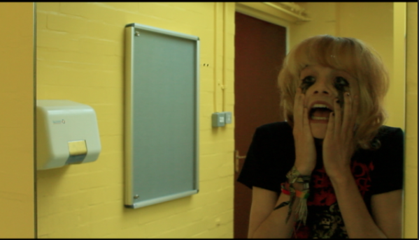
4) Lastly, I decided to use more footage using the green screen so that I could give a surreal edge to the montage. Therefore, I created two clips- one of the protagonist screaming at the camera with an image of pills, distorted in the background. This conveys that her illness is overwhelming to her.


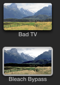
5) I also created a clip of the protagonist spinning round with her imaginary friend in the background, flashing in and out of view. This conveys that the friend is not actually real. I put a spinning background on this clip, and put the effects 'Bad TV' and 'Beach Bypass' to give a distorted, overwhelming feel to the clip.


6) I also made the montage tenser by cutting out some clips and and making others shorter. This makes the overall montage snappier and more dramatic, which leads up to the eventual climax well.


Tuesday, 7 January 2014

Changing the Green Screen Background

Looking back at the completed green screen footage, we decided that it did not look at realistic as we wanted. Therefore, I thought we should play around with the background and see if I could make it better. To begin with I wondered if I could make it look more realistic with the existing background. As the problem was with the lighting, I decided to change the lighting of the foreground image to make it match the background more smoothly.


1) I selected 'Colour Board' and then on the 'Exposure' tab I increased the highlights slightly and then decreased the midtones and the low-tones.

2) Then, I used the effect 'Day into Night' which makes the footage look more gloomy, matching the gloomy dark background more.

3) Then, I used the Keyer effect which allowed me to change the background of the footage. I imported the image of the cell, making sure the picture was of a high quality so it would not be blurry, as this would not look effective.

4) Finally, I played around with the Keyer effect, making it 'shrink' slightly so that there was not an obvious grey line surrounding the protagonist's outline.

This made the footage more realistic than previously, however I thought I would also try a different background to see if this was more successful. I took all the same steps, but used a different picture which had brighter lighting to suit the foreground more smoothly.


BEFORE:


AFTER:


Evaluation

PROS


  • The image conveys how she is trapped with her mental illness. The grim mise en scene and low-key lighting gives a creepy edge to the image, reinforcing the psychological genre.
  • The image does not look completely realistic, which could be seen as a good thing as it reminds the audience that it all in her mind, and that she is not really in a padded cell/prison cell.

CONS


  • The lighting still does not completely match the foreground. This is because in the background the lighting is seen on the right side and this is impossible to recreate in the foreground image.
  • The background is not the same quality as the foreground footage. This is more obvious in Option 2 with the prison cell, which would have to be changed if we were to use it as it currently looks very unprofessional. This could be solved by finding a higher resolution photograph.
  • Overall, I think this idea, although somewhat effective, is not to my liking as it looks only semi-realistic and so the audience cannot be sure whether it is supposed to be realistic but is failing or whether it's in the character's mind, which may be misleading.

Friday, 20 December 2013

Green Screen Editing

1) First of all, I had to choose which clips to use in the scene. I decided first of all to use a clip of the protagonist pacing with the antagonist standing in the background. I thought this would portray the stress on her mind, and also indicate that the antagonist, being her imaginary friend is the cause of it.

2) I used the Keyer tool on the protagonist clip, and then dragged on the image of the antagonist in the background. This made sure that the image of the protagonist was in front of the other clip, to avoid it looking unrealistic. I then had to export this clip before I could put a background image on.


3) I chose the background of the shot as a picture of a padded cell, as I thought this would look effective against her pacing as it would show her to be in a room which makes it look more 3D and effective than against a flat 2D background.

4) I put the 'Keyer' effect on the green screen image, which enables me to change the background.

5) I used the 'crop' tool on the padded cell image, to remove the black borders around it as this made it look unprofessional. I cropped the image 16.5 pixels on the bottom and 16.5 pixels on the top, which made it perfect for the image.

6) Then, I had to make sure the green screen image was smoothly in front of the image. I played around with the 'Keyer' tool and made sure that 'Fill Holes' was on 0, Edge Distance was on 5.0 and Spill level was on 45.%.

7) It still seemed after this that there was a grey hue around the head of the protagonist. Therefore, I used the Shrink/Expand on -2.0 to get  rid of this issue.

8) I did the same thing on many other clips, playing around with the setting to make some elements transparent in order to see what style I liked best.


This is an example of using a different style of 'keyer' called 'Luma Keyer' which makes the image in front much more transparent and luminous. I thought this style could maybe be useful to convey the distorted, hazy nature of her mind.

Evaluation 

Pros

  • The pacing clip in front of the padded cell image is effective as it conveys how she feels trapped within her own mind and can't escape from her illness.
  • Having the antagonist in the background standing still makes her seem ominous and therefore aids the psychological genre.

Cons

  • If we were to film again, I would like to try and film with more of a Full Shot as it would maybe look more realistic, however this isn't much of a problem.
  • The pacing clip is a little too slow for the montage as all the clips need to be fast to fit in with the fast, dramatic pace of the scene. Therefore, we need to speed up the clip in some way to fix this. 


Thursday, 19 December 2013

Montage Editing

 1) First, I had to download all the clips from youtube and then choose which parts of the footage to use in our montage. I then exported every two youtube clips together with the desired short clips and exported them.

2) Then, I transferred the material to school and imported them into final cut. I also had to import the filming that we did of the victim being kidnapped, as well as the green screen footage that I recently edited.

3) I had to sort through the footage and decide what to use and what not to use.

4) I went through all the youtube clips and made sure each clip was suitable for the montage by cropping certain clips so that there was not too much of a large black border around this, as this would seem unprofessional.

5) Then, I dragged all the footage into the project and made them the right length. As it is a montage it is necessary for all the shots to be short and snappy. I cropped all the footage so that it was 1 second long, so that it would all be the same length and not look messy.

6) I took inspiration from the Sinister trailer, as well as other trailers by using a black transition screen in between the 1 second clips, to add drama. I made sure all transitions were 0:15 seconds long, for effect.

7) I repeated the same for all the footage we imported, and then dragged in the youtube clips. I used a specific order of: kidnapping scene > transition > mental illness clip > kidnapping scene, so that it would make more logical sense.

8) I made clips nearer the end of the montage become increasingly shorter as this would make it more and more dramatic as it goes on, leading to the climax scene which is the loft scene.

Evaluation

Pros
  • Effective at building tension before the climax, which is important in a trailer.
  • Conventional of genre- inspiration taken from Sinister
  • Uses clips from old fashioned documentary, effective and adds to surreal effect

Cons
  • Some of the lighting is dark, however we can fix this in later stages. 
  • Some of the clips are too fast to be seen properly at the end- will have to reorder some of the clips. 

Friday, 13 December 2013

Final Cut Pro Effects

1) First of all I imported the relevant files onto Final Cut Pro.

2) Then, I started playing around with the available effects to make the scene more effective overall.

3) I chose the effect 'Trails' with the Duration on 0.08, the Echoes on 2.0 and the Trail on Light only on the POV clips. This was used to show the blurred vision of the Victim which indicates that she has been drugged or injured badly, also emphasising the POV element of the shot.

4) I then chose the 'Cool Tones' effect with the Amount on 70.0, the saturation on 50, the Value on 25.0 and the Shadows on 0.75. I thought this effect made the whole scene look more cold and chilling. Previously, the shots were too warm and lit up to have very scary feel.

5) Finally I used the 'Bad TV' effect. I used this on a shot of the Victim asleep. I used a 0.4 second clip half way through and then a 0.9 clip later on. On the first clip I used Bad TV with Gaussian Noise with the Amount on 10.27 and on the second clip I used Gaussian Noise with the Amount on 30.27.
This was done to indicate the deterioration during the scene.


Evaluation

Overall, the effects make the scene look more effective at putting across the relevant points, such as how the Victim has been drugged. It gives a more successful climax to the trailer as it looks more chilling and bleak, highlighting what is happening in the scene.


Thursday, 12 December 2013

Adjustments to our website

In recent weeks, I have been working hard on editing the background image for our website, and have encountered many problems along the way. This week I got started on trying to fix them as best I could.

Because the background image for our poster features important points on both the left and right hand side, it makes it very hard to arrange everything while keeping it in place. Combining this with different screen sizes makes it almost impossible to position everything correctly, mainly the actual YouTube window for our trailer to be shown in. After researching for a little while, I found the magnet tool on the settings window of the YouTube window. This stuck it to that part of the background, I then checked on both a mac, windows computer at school, and my laptop that it stayed in position, solving our arrangement issues. I then applied this effect to other parts of the web page, such as the reviews and social networking links to ensure everything stayed in place.

After looking at websites made by previous media students, we noticed that they had made the most of their background and had used it to add some more exciting elements to the web page, such as a time lapse in the background. Our back ground image isn't really suited to this, however, we did think about trying to do something with our protagonist's imaginary friend. Since she is wearing a black jacket, it means that if we blacked out her face, it would look like a dark shadow approaching in the background. We decided a flickering effect would work quite well on our website.

Firstly, I used Photoshop to create a new version of our final photograph, where the imaginary friend was just a shadow in the background. I then had two potential methods of creating the effects with the two images, I could either set up a slide show in the background using both the images, however after trying this out, I realised that I couldn't get the two pictures to change quickly enough for it to look good, so I then created a gif in Photoshop using to the two images.

I preferred how this looked much more, and it meant only one file had to be uploaded to the website. Therefore I used this and it can now be seen on our published website.

There were also a few minor changes I made to the website, such as giving the reviews sources, and moving the end of the tag line to fit with the first half, as it became misleading, and was following the conventions of a poster rather than a website.

Friday, 6 December 2013

Editing the loft scene

The loft scene is the last part of the trailer which provides the climax. It must be very short, but the scariest and most shocking part of the trailer in order to provide the effect we need.
It consists of a slow montage sequence and then a fast paced climax which shows the actor realising that she has been kidnapped.


 1) To begin with I chose the relevant clips for the scene. I selected many clips which features the shot out of focus and then gradually coming into focus in order to show her waking up.

2) I included many slow panning shots as this gives a
sleepy effect which mimics her awaking.

3) I put all this clips in the relevant order, and then changed the timing of them by either slowing them down or speeding them up.

4)  I made the clips of the lightbulb, which shows the light being too bright at the beginning, with a slow pan to make it seem as though she is just waking up.

5) I included a eye-line match shot featuring her head looking downwards and then a close-up POV shot of her seeing her hands bloodied by her sides.


Evaluation


  • The visual effects are effective and create added tension.
  • The POV shots put across a sense of perception, conventional of genre.
  • The variation in camera angles and shots makes it interesting to watch.
  • The lighting changes make the lighting suit the genre by making it darker and creepier. 


Thursday, 5 December 2013

Editing Colours in our trailer

From one of my previous posts, you can see that I experimented with changing the saturation, contrast, brightness and exposure levels of some of the shots. I wanted to look at other films we have deconstructed in the past from this blog, and look purely at what effect the altered colours cause.

From this screen shot, we can tell from the mise en scene that it is set in the past. It is extremely easy to tell, because of the mise en scene, and a more obvious different, the vintage style colours which have been used. The shot is mostly made up of yellowy tones, and there is no harsh contrast in the shot. The brightness and exposure levels are also quite low. When thinking about these qualities, and the time this is meant to be portraying, you will notice how they match up quite well to old photographs, and these similarities help us to realise when something is set in the past. If we were setting anything in the past, we could use these techniques. 

This shot varies highly from the previous one. The colours are much more vivid due to the saturation being increased, and there is also quite a high exposure. These qualities, combined with the mise en scene tell us that it is modern, and set in the present day. The still also has quite a warm look to it, probably caused by an increase in colour temperature and saturation, making it easy on the high and quite a common convention of film at the moment. We could take this idea and use it in our trailer, but instead go for quite a 'cool' look by decreasing the colour temperature and saturation. 

This shot is probably closest to our genre, and I think the colours are quite interesting. The saturation isn't very high, and there isn't a great contrast either, however the brightness is still high enough so that the viewer can see all the features of the character's face. The lower saturation immediately gives quite a dark feel to the shot, by no means is this a happy experience, and the feelings of sadness, depression and pain could be portrayed through these colours. I think this is definitely a technique to consider when editing the final montage shots for our trailer, and to make a distinction between real life and our protagonist's imaginary friend. 

Finally, I wanted to look at this shot because we could use similar techniques for parts of our trailer. We immediately get a sense of dark foreboding atmosphere from this shot, and most of it is portrayed through the colours - this could be used as a build up in our trailer. The low saturation makes the scene quite dreary, however the contrast is very high in this shot, making the black and white stand out, and helps draw the audience's attention to the dominant parts of the scene. The colour temperature is also very low, and we can see this and the lack of saturation by looking at the washed out red door on the right hand side of the frame. The high contrast also makes some parts of the frame, especially the background appear in very dark shadows, creating a sense of danger and mystery in the shot. 

Friday, 29 November 2013

Green Screen: Background

1) In order to edit the background onto the green screen image, I first had to record the facebook page. I did this using quicktime player and selecting File > New Screen Recording. This allowed me to film everything that was on my screen at the time.

2) I had to try many times to get the recording right, as it needed to be 8 seconds long to fit in with what we had already recorded as the background.

3) I edited the background footage on Final Cut Pro, by putting in the facebook footage, then dragging a black screen in. This would then show the background turning to black when the character shuts the laptop.

4) I used a 'static' transition in between the facebook footage and the black screen, to indicate towards the technological aspect.

5) I then exported this footage so that I could use it as the background image.

6) I created a New Project and dragged in the footage filmed in front of the green screen.

7) Then, I selected the effect 'Keyer' and dragged it on the footage. I could then change aspects of the effect so that it was more clear cut and looked more realistic.

8) Finally, I dragged on the exported facebook footage to be the background of the footage.

Evaluation 

Pros

  • The timing of the footage is just right as the static effect happens just the character shuts the laptop, which is effective.
  • The static transition is effective as it indicates that the image in the background is featuring what is on her screen, and also it gives a distorted edge.
  • The unrealistic, surreal look of the character in front of the images could be used effectively as it indicates that the scene is only in the character's mind, rather than real.
  • The scrolling movement is pretty smooth, rather than very jittery which make it look very unprofessional.
  • The mise en scene of the facebook wall is made to perfectly fit in with the character we were trying to portray, and includes images as well as text to make it realistic and visually appealing.

Cons

  • The background when it turns black looks a bit unrealistic as it contrasts with the bright lighting used on the character, however this would be very hard to avoid.
  • The scrolling may be a bit fast to read everything on the screen, however it was necessary to make it fit in with the time of the protagonist shutting the laptop, and we also didn't want the scene to be too long as it would drag on unnecessarily.

Thursday, 28 November 2013

Editing the library scene

During one of our recent editing sessions, I made the following changes.

For the alleyway scene, we have to potential clips to use, and the one which we are most likely to use was a little wobbly, so I first applied stabilisation. However, this made the footage appear very blurry, so I reverted it back to how it was.
The next thing was a very simple step, I simply added a transition after the last library scene shot so that it fades to black, ready for the titles sequence.
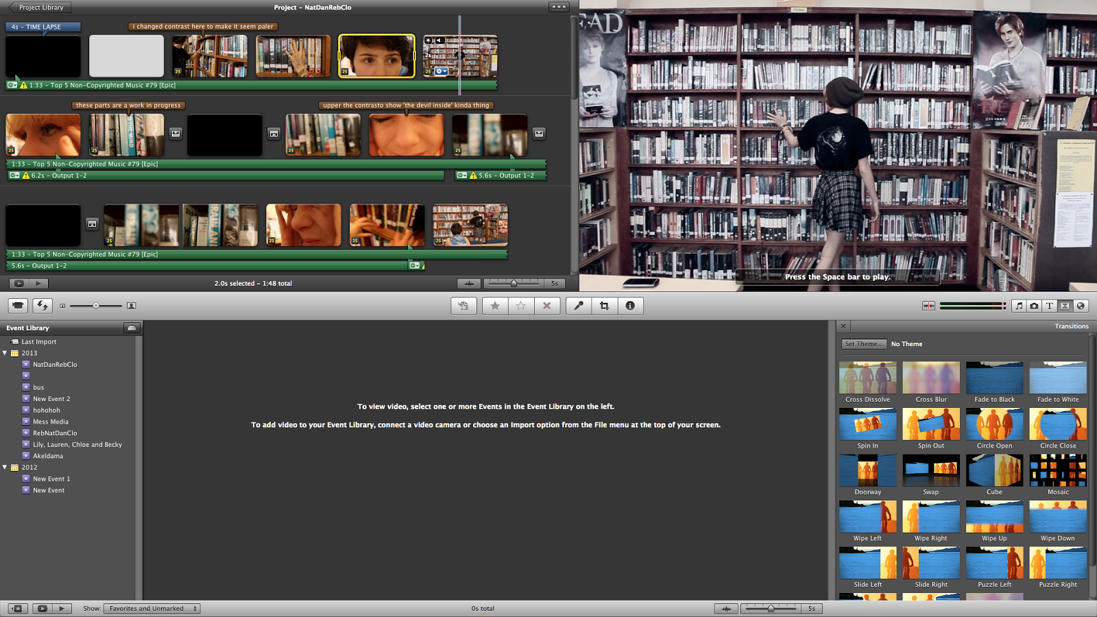
While watching the library footage, I thought that it was actually quite boring, so I decided to try and change the colours to demonstrate the character's perception of the events unfolding, adding some dynamics to their personalities on screen.
For all shots watching our protagonists, and before she starts having a fit, I changed the white balance to a blue tone and reduced the saturation slightly, to make it appear like an average dreary day, where nothing seemed out of the ordinary.
Once our protagonists starts showing odd behaviour, I wanted to make this difference very clear to the audience, increase the exposure, saturation and contrast dramatically, to show the very unpleasant experience the protagonist is showing, and offering the audience an idea of what it is like.
I had two different settings depending on whether the camera was facing the protagonist's face, or a POV shot was being used. For the POV shots I again increased the exposure levels, contrast and saturation, but decided to increase the saturation even further. For all of these shots the white balance was normal.

Using this image and the one above you can compare the subtle but still noticeable differences between the colours, also the hints of red indicate the protagonist's slight panic in realising she has been watched.
After changing the colours, I noticed that our timeline didn't quite follow through, we watched Cloe's character watch the protagonist after she had actually moved along the bookcase, so I decided to use cross cutting editing to change this.
I split the clip and placed the close up shot either side of the establishing shot of the protagonist walking along beside the bookcase.
I felt like the editing session was very productive and hopefully will be able to incorporate the different colour schemes elsewhere in the trailer to portray the different perceptions of situations and make the trailer a little more original and interesting to watch.

Potential Website Image Editing

We wanted to edit together a couple of images we took on one of our photo shoots to see if it could be used for our website background. This post goes through the editing process of the photos and my evaluation of whether it could be used or not.

Firstly, we took one image with Natasha in the background of the image. We then cut around her, I am using Photoshop to complete this task.
Here I copied and pasted the cut out onto another photo, taken in the same place but showing the other character Natasha plays.
I then positioned the cut out in the correct place and slowly blurred the outline to make it blend in with the already blurred background of the new image. This makes it seem as if we both people in the same image.
I then started work on the actual colours of the image, to try and fit more to the conventions of our genre and also give a more professional edge to our photograph. I started by editing the contrast and brightness, increasing the contrast and decreasing the brightness slightly.
I then went into the filter gallery and adjusted the framing of where I wanted a vignette effect to be, so that the attention is drawn to the protagonists, instead of the location.
Next, I played around with the saturation, I wanted to create quite a vivid image in the centre, so boosted the saturation a little while making it have a few blue tones, fitting the conventions of our genre.

Here you can see me selecting the cool colour setting, so that it is a little more dark and a feeling of sadness comes through the image to the audience.


After this step, I again went and tweaked the brightness and contrast so that it suited the changes to the saturation I had made.


Here is the final image I created. I think it is great and could work well on our website, however we have to consider the different sized screens that will be used by our audience, and due to the placement of the characters this may mean they are covered up by our trailer and reviews of the website, perhaps just the top layer of the photo could be used, revealing just one character, or another entirely, but with the same kind of editing applied to it.