4. How did you use media technologies in the construction and research. planning and evaluation stages?
Filming
Throughout out filming process, we had two major parts which required media technologies, we had to record a screen on a computer, and use a green screen. For the green screen, we had to use our storyboard to work out how to film in front of the green screen correctly. It took us several attempts until we got the shots we wanted from the green screen, but the end result we came up with during the editing phase was worth it.
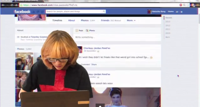
During part of our teaser trailer, in the background, the audience can see a Facebook profile scrolling in the background. We filmed our actor in front of the green screen, and to record the profile, we used software called Cam Studio. When using Cam Studio, you can change the quality, the area of the screen you want to capture, and of course what is on the screen. For this, we used one of our current Facebook profiles and customised it, so it looked as if it was our victim's own Facebook profile. This included changing the name, profile picture, and adding many fake posts to the profile, so that it fitted in well with the mise en scene of our teaser trailer. Here you can see our practice of using the software, before final editing had taken place.
Editing
For our teaser trailer, we predominately used iMovie for all of our editing, this is because we had a lot of experience in using iMovie and didn't have to waste time learning how to use the software. In iMovie we arranged all our clips into the correct place, added our sound and was able to trim down clips so our teaser trailer was no longer than 1 minute long.
In iMovie, as well as editing the length of the clips, and adjusting the overall narrative, we were able to edit the colours of some of the clips. We felt this was necessary to change the feel of the teaser trailer, and make it conform with the conventions of our genre. In this blog post, you can see how I edited the colours of the library scene, so that it became clear to our audience that our protagonist sees and lives life differently to the other characters in the trailer, and the red tinge also connotes danger, which follows our protagonist throughout the trailer.
However, we wanted to really impress with our editing, and this meant we had to do some editing outside of iMovie and import it in. For this, we used Final Cut Pro, as it has many more capabilities than iMovie and suited our needs for the montage sequence, green screen and titles.

Montage Editing
For the editing of the montage sequence, we wanted to use many visual effects for the various clips here we had included, and Final Cut Pro was perfect for this. We were able to import all the clips we wanted, ranging from the ones we had filmed to the news footage, linking to the mental illness idea. Within Final Cut Pro, we were able to add effects, transitions and sound we had recorded to the montage, using more effects on top of the sound to distort it in the areas necessary. We found it much simpler to edit the montage sequence in Final Cut Pro, and it meant we had less restrictions placed on us which we would have had if we'd just used iMovie. Once the montage sequence was complete, we exported it and imported it into iMovie, positioning it in the correct place. You can read more about creating the montage
Green Screen Editing
Our green screen editing also took place in Final Cut Pro, because we found it to look very unprofessional in iMovie. We did a couple of trials before deciding on using Final Cut Pro, as we attempted it in iMovie and also Premiere Pro, however, we had more access to Final Cut Pro, and it was user friendly, hence why we made our decision to use it.
Sound
For the sound of our teaser trailer, we had to record our own sound effects and compose a soundtrack for the trailer. We had various inspirations for the sound used in our trailer, and researched the sounds used in various trailers, as can be seen here.
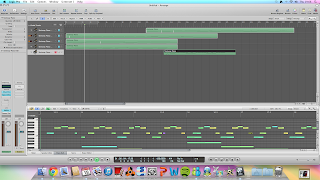 We first looked at various sounds we could incorporate into our teaser trailer, as we had different parts which needed catering for, such as the green screen section, montage, and ending. The media technology we used mainly was Logic Pro, as we had experience in this and found it easy to layer the sounds we wanted to experiment with.
Once we had recorded, and layered and edited our sound, we imported it into iMovie, to position it onto the clips which make up our trailer. This meant we had to decided what parts of the original sound to keep, and which parts to mute, so that only the soundtrack could be heard. We managed to complete all of this in iMovie, however, for the montage section we went back to Final Cut Pro, as it allowed extra precision in the short, face paced clips. iMovie wouldn't have allowed us to be this precise, and since we were exporting the sound and audio from the montage out of Final Cut Pro, it made sense to do it all at the same time.
One problem we did encounter at first when editing our sound was matching it up correctly with the titles and news footage clips throughout our trailer. We were able to simply drag and drop the sounds into the correct places, however once we imported files from various software into iMovie, such as the montage from Final Cut Pro, and soundtrack from Logic Pro, the overall soundtrack of our trailer became out of sync in places, and we had to merge the overlapping parts so they flowed into one another. Also this was a lengthy process as we had to keep replaying parts of the trailer to ensure it was correct, we did manage to do it in the end and are very happy with the outcome.
Titles
Throughout the development of our teaser trailer, we changed our titles many times. After deciding what they were going to say, we had to decide how we were going to present them on the page.
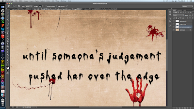
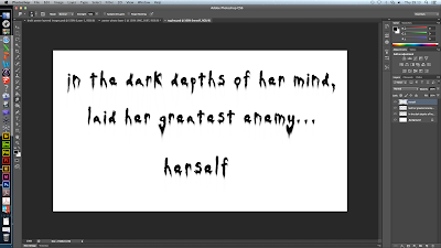 At first we decided to work on our titles within photoshop and went for a look which included the title appearing on an old piece of paper, made to look as if it was hand written with blood dripping over it. We achieved this look by beginning with a white background and one by one importing new layers, one for each letter of every word allowing manipulation of the typography, and then a layer for each drop of blood and the background, so we could add fluidity between the 'ink' and the blood.
Here you can see the final product of our first attempt at creating the titles. However, we realised some problems with this method. Firstly, because we had created them in photoshop, it would be very hard to export them with the background and blood stains and successfully add effects within Final Cut Pro with it still looking professional. We also thought that the old piece of paper didn't conform to the conventions of our genre well enough, and perhaps gave the impression it was more of a slasher than a psychological thriller. Due to this, we started work on our next attempt of the titles.
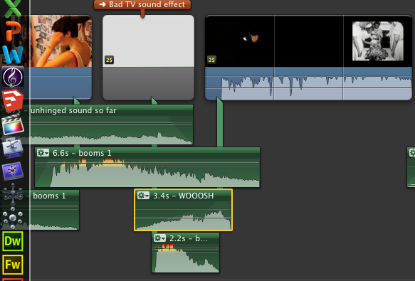
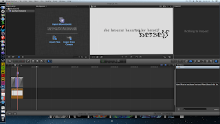
For our second attempt, our first major change was to begin work within Final Cut Pro. We then decided to use a very simple background for the titles so that the emphasis would be more on what the titles said, rather than the background, and also it would bring our audience's attention to the effects we applied within Final Cut Pro. We decided that since our cultural link is mental illness and privacy, the effect 'Bad TV' within Final Cut Pro may give our titles the effect we needed to conform more to the conventions of our genre. We liked how this version of our titles much more, and so decided to import them into iMovie and include them in our final teaser trailer.
Poster design
For our poster, we used Photoshop heavily throughout the whole development, as it suited all are needs and would help us achieve a professional outcome. First of all, we used our initial plans as a base and expanded this out, completing several drafts of our poster.
We had several photo shoots throughout the time we were filming, and managed to get a few different photos we could work with and use as a base. In this draft, you can see how we used a photo taken in the library location, featuring our very first typography. We felt that this was a good idea, but upon editing it using Photoshop, we didn't think it looked very professional. So instead, we used the layers in Photoshop to have both a photo of our protagonist and her imaginary friend, in the same shot, which would later be the same thing we did for our website image.
Throughout the development of our poster, we had to focus on typography, because this is a major feature of the poster. For this, we again used Photoshop, and went through many different versions of typography that we had manipulated. First of all, we chose a font we felt fit well with our narrative, and then used some of the many filters and effects you can apply to the layers in Photoshop to manipulate it, so it was truly our own. Photoshop gave us the freedom to alter our typography once we had already placed it, as we found this was necessary quite late in the process because our poster wasn't looking professional enough. The biggest change you will notice that happened to our poster is the placement of the title, at the beginning it was just in one line, but the end product features it spread over three, looking like the letters are balanced upon each other and a shelf in our background image. We were able to incorporate this layout onto our website too.
Another part of typography that was important to develop for our poster, was the development of the tag line, where we again used Photoshop in the same way, because it allowed us to manipulate the text using the same 'Wind' filter as the main title was. This meant that the typography fitted together well and helped us to make it look professional.
Website design
For the development of our website, we were able to use several different media technologies alongside each other. We host our website on Wix, which allows us to edit the template of our website, the placement of all the elements on our website, and link to our social networks and teaser trailer.
Our website came a very long way from our initial ideas, and in order to complete it the way we did, we had to start with a plan of what we wanted. Following this plan, we were able to choose a background image to work with, which we hoped would be the background of our website.
In order to do so, we again had to use Photoshop to edit the image we wanted to use, in this post, you can see the editing I did, to create a viable image for use on our website. Photoshop allowed me to stitch two images together, while still looking professional, and edit the colours. I thought this was vital, because before editing, the photo looks very dull and not interesting, so by increasing the contrast and saturation, we were able to radically change how this image looked.
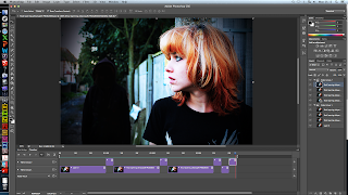
A feature we wanted to include on our website was a moving background, and we decided to do this by having the protagonist's imaginary friend appear and disappear from the background. We thought that on a website this would catch our audience's attention. In order to complete this, you can see how in this post, I created a gif using the time line tool in Photoshop, and saved it as the website's background on Wix.
Typography
Typography of course is another big part of the website, and was vital that we used the same as the poster and our teaser trailer, to create a professional package. We had many different versions of our typography, and it all stemmed from a plan we made at the beginning of the process. Here you can see how we went from a drawing to a basic design of possible typography, using the online service Pixlr Editor. This was good for playing with ideas, as it was easier to use than Photoshop and allowed us to practice with different typography manipulation before deciding on our final idea.
There was a while during the development of our typography where we played with the idea of using a inky looking typography, because we thought this would fit in well with our narrative and hint at the idea of kidnap. You can see here how we experimented with this idea.
However, we wanted to make it look really professional, and this trial didn't meet our expectations, so we moved on and created this, which is much more uniform and fits better with the conventions found in typography of products also in the psychological thriller genre.
Using the typography that had been manipulated for the poster, I was able to make slight adjustments, again using Photoshop, so that the images were transparent, and therefore would be successfully placed on our website without and grey backgrounds ruining our web page. You can see in my final post about the website, how I used the final typography and imported it into Wix, positioning it following a similar design as the poster, while ensuring the content was all in place on our web page. We used YouTube to have our teaser trailer playing in the middle of our web page.






No comments:
Post a Comment