Danielle Blasse 7010 - Cloe Pace-Soler 7352 - Rebecca Holloway 7279 - Natasha Welch 7399
Townley Grammar School - 14109
Showing posts with label Danielle Blasse. Show all posts

Monday, 31 March 2014

Evaluation Question 3 - Danielle

Evaluation Question 3

What have you learned from your audience feedback? 

Survey
  • After conducting a survey on the basis of our initial ideas about our 60 second teaser trailer the feedback we received helped us to establish large parts of the narrative and consolidate ideas that we had primarily agreed on. One of the main aspects that we chose to concentrate on within our survey questions was the representation of the protagonist and antagonist. 
  • We asked questions regarding mise-en-scene and costumes. It was a great opportunity to allow our audience to get a say during our planning stages of our overall package as it allowed us to air our decisions and obtain critical feedback that aided our decisions, as you can see from the image on the right

    YouTube
  • From our audience feedback we had to take on board a moderate amount of small changes. Reoccurring comments focused on areas of the sound and camera angles that suggested that the protagonist and antagonist had a friendship. After taking on board the feedback we made  final tweaks to the sound  by building the tension in the sound earlier before the montage scene to avoid a feeling of detachment in the sound.
  • Our audience noticed that the "booms" leading up to the montage were not effective enough, however after some consideration we realised that the build up in sound towards the montage was actually not effective enough at all.

  • To overcome this issue, we decided to not use the same "boom" track in the build up to the montage that is already being used in the montage. That way, the new timbre of the "boom" in the montage will have a bigger and more effective impact on our audience as it's not a sound that they have already heard in our trailer. It makes it less predictable. We decided to cut the piano track earlier than we had previously, therefore it didn't play during the montage scene.

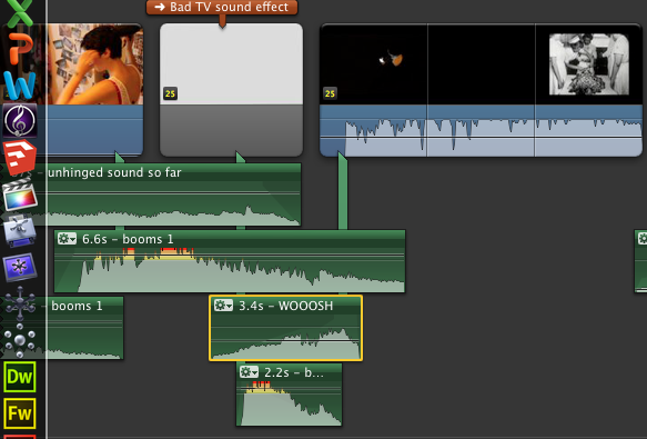
  • Additionally, we also also cut the "woosh" audio clip from one of our audio tracks that were previously used in the trailer and applied it to the end of the title to create a bridge passage between the sound of the scenes before and the montage scene. Once we had applied all of these changes to the sound, we copy and pasted the "booms 1" track below the "woosh" creating another layer but we cut to the climax of the "boom 1" audio clip and this added to the tension and created an entrance that was needed for the montage scene.
  • Furthermore, the "boom 1" track was cut as close to the climax of the track as possible, this way the booms got faster as we neared the montage building up suspense and anticipation in the trailer. Using track "booms 1" instead of the "booms" track which were used in the montage scene allowed us to pace ourselves a lot more in the build up rather than building up the tension in the wrong place altogether. Overall, this solved the problem and the booms used in the montage scene, proved to be more effective.


  • The feedback also allowed us to look at our trailer in a much more critical light and for us it definitely gave us the opportunity to be able to make informed decisions based on the response from our audience. It was made aware to us that the narrative may have been unclear at points in the trailer due to using camera angles and editing, therefore we chose to cut out on the amount of eye line matches we used between the protagonist and the antagonist. 


  • Our audience feedback benefited us majorly as it allowed for our audience to suggest what would be more effective and this solved the issue we had about certain parts of footage that we were indecisive to remove or keep. Our audience feedback also highlighted areas of our trailer that we had not picked up on such as the sound layers not following on from each other and certain camera angles making the narrative unclear to hard to follow. 

Evaluation Question 2 - Danielle

Evaluation Question 2

How effective is the combination of your main product and ancillary texts?

  • The combination of our teaser trailer and ancillary texts is effective as a cohesive package. During the planning and production stages of our trailer, website and poster we decided to avoid the conventional black, white and red colour scheme. Instead, we opted to adjust saturation of the images for our poster and website to illustrate the psychological notion of our trailer. This idea was established through trailer deconstructions such as Dark Water. 
  • Prior to producing our typography for our coursework we carried out multiple typography trials in aid to select the most effective typography to work with our trailer, poster and website. However, an issue that we did face was the manipulation of the text without it looking too unprofessional. We also carried out extensive font research of we had a bare basis to work with when manipulating our typography. We chose to use a font called Dark Ages as it was simplistic enough to manipulate. With the use of Photoshop we were able to achieve the typography we wanted by tiling, flipping and editing specific letters for it to fit the title “Unhinged” effectively, therefore we flipped letters around and manipulated their spacing on our poster and website conveying the detached nature that the narrative entails.
  • In terms of our typography for our tag line, we need to make sure that it is different from the typography that we used for our title. 

  • We decided to use the font called "OldStyle" as we thought it was basic enough to manipulate and it also fit in well with the rest of our chosen typography. I started off by opening up a new file in Photoshop and making sure that my canvas was transparent therefore allowing it to be transferred onto our poster without any fuss. When typing our tagline into Photoshop, we decided to separate "herself" from the majority of the tagline so it would give us the option to move it around our poster.
  • In order to manipulate our typography we applied a "wind" effect to our tagline. To do this we went to filter - stylize- wind and then selected wind from the menu going from the right. This made the typography look extremely worn out. This fits in well with our poster and our title as the mise en scene looks worn out as does our typography for our title. 

  • This is the finished typography. In terms of manipulation it doesn't show how it has been manipulated explicitly. Overall, this is not as effective as it looked in Photoshop, however it fits in extremely well with our poster. 
  •  With the use of Photoshop alone we were not able to achieve the typography that we had hoped for – we ran into problems such as not knowing which kind of typography fit our genre. We ended up only using the smudge tool to manipulate the typography by smudging and smearing the colour of the typography from the corners of the letters. From producing the typography shown on the right,  we were not convinced that it showed off our ability to manipulate typography or if it was in fitting with our genre enough. To overcome this we chose 3 different fonts from Dafont.com and manipulated them yet in accordance to our 3 ideas seen here none of them proved to be adequate enough to suit our package as a whole. After using various tutorials online that showed us step by step on how to achieve a typography that we wanted we applied the same procedures to our chosen font and were left with. 
  •  A cohesive media package requires the same typography to be utilised throughout all products, which we have done. We used the font Dark Ages as our foundation, as seen on the right, which we downloaded, from the well-known font site, Dafont. From this we were able to manipulate our chosen font however we pleased to fit our package. Due to our inexperience using Photoshop to manipulate text, we started by only using the smudge tool, which quickly proved to be inadequate if we wanted to stretch ourselves. Therefore we explored the endless possibilities of what we could do with our typography. After thoroughly researching our ideas, we decided to keep our manipulation to the text extremely simplistic as our ideas were beginning to seem too elaborate, making the text unclear to read and unfitting with our package. 

  • Overall, as a cohesive package our main product and ancillary texts compliment each other. In the sense that the trailer, poster and website carry the high saturation levels, same typography and incorporate the same title and tagline. 

Evaluation Question 1 - Danielle

Evaluation Question 1

In what ways does your media product use, develop or challenge forms and conventions of real media products?

  • Our media product conforms to many aspects of the psychological genre. Prior to producing our 60 second teaser trailer we carried out our research thoroughly by deconstructing films which explore a similar narrative such as The Soloist and The Butterfly Effect Through this we were able to establish the conventions of the psychological thriller genre such as low-level lighting, use of canted framing shots, use of tight framing and dull grey and black colours. We were also able to recognise the distinct approaches of how to illustrate a mental illness. The Soloist illustrates the journey of the protagonist in a documentary way, whereas The Butterfly Effect delves into the enigma. After completing trailer deconstructions and rooting sources of inspiration to aid the development of our narrative we decided to produce a media product, which focuses solely on the discrimination of a teenage girl Schizophrenia.

Teaser Trailer
  • Typically, a psychological thriller trailer follows an anachronic modular narrative, which involves the use of flashbacks, and flash-forwards, which is one of the listed conventions. In this respect our 60-second teaser trailer conforms to this convention; our loft scene is an explicit example of a flash-forward as there’s acceleration in the narrative established through the use of our montage scene, which builds the downwards spiral of the protagonist.
  •  In combination with our use of non diegetic  eerie, discomforting and discordant sounds we develop our trailer to conform to the conventions of a psychological trailer as our use of non-diegetic sound also achieves a sense of perspective for the audience. An explicit example of this would be the ear ringing sound that we used in relation with oblique shots as our protagonist experiences a schizophrenic episode, which is shown on the right.
  • Furthermore we conform to the conventions of the psychological genre as it builds tension and provokes a scare factor among the audience. In combination with the sound, the use rapid cross cutting and fast paced jump cuts evoke the enigma and builds tension for the penultimate montage scene. However, we also challenge the conventions of a psychological thriller through our choice in cast. A convention of a psychological thriller is that the protagonist is a male, yet we challenge and subvert this convention by having both the protagonist and antagonist as females. Another way that we challenge and subvert the psychological thriller genre is by using little to no gore, and focusing solely on the actions that the protagonist performs due to her schizophrenic mind.
  • Sound was a large part of our trailer as the production took a while and had to fit with the ambience of the trailer.
  • I started by aligning the new non diegetic sound up with the production company clip, in order to have the sound begin as the production company is shown on screen, this was it eases the audience into the narrative of the trailer with no sudden changes in the sound too early on in the trailer. However, I did encounter an issue when inputting the non diegetic sound of the piano melody into the trailer.

  • Although I had made sure that the sound matched up to the exact timings of the trailer as I produced it, I did not trim the track of the "ear ringing noise" therefore it went on further than needed. To resolve this issue, I had to delete that individual track from the Logic Pro project, bounce the file and import it into our footage. From then, I had to import the "ear ringing noise" file into iMovie separately and adjust it by changing its fading options in accordance to the piano melody.
  • At this stage of inputting the sound into our trailer,  I decided that the other non diegetic sounds that we had recorded prior to making the piano melody such as the whispers would extremely well with our piano melody. I dragged the whispers into place and then had to make sure that they did not dominate the sound entirely. We also thought it would be effective to add the sound of an old TV as it would help build suspense and add to the relevance  of the bad TV effect on our  green screen footage. 
  • Overall, adding the sound to our trailer has definitely heightened the effect of it. The sound for our trailer becomes the climax in terms of sound. We made sure we were able to build tension threough using sound effects such as 'swishing' noises and sinister sounding crashes. We applied each track carefully making sure that nothing overlapped the other causing extreme discomfort in the sound all together.
  • We also had to make sure that the volumes of each track were fairly similar and worked well together, so we had to manually apply a fade out or fade in to certain tracks so the audio sounded together and not random and detached.


Poster
  • Furthermore, our poster challenges conventions by steering away from the conventional red, white and black colours that are traditionally seen within a horror film packages in film posters such as the Final Destination.
  • Prior to designing our own poster, we deconstructed psychological thriller posters as a means to gain inspiration. We started by deconstructing posters such as Jacob's Ladders' film poster. We noted that:
  • From the name, ‘fatal attraction’ we can understand that the director, Adrian Lyne has a reputation for directing horror films.•At first glance our eyes meet the blurred image of a face that remains centred but slightly to the right as if being pulled by something else, connoting possible disequilibrium in the movie.
    •The choice of a black background depicts that it isn’t necessarily a happy, light hearted comedy but quite the opposite as black connotes death. The black also mirrors the hidden depth of the story line that is revealed as the story itself is unravelled.
    • Similarly, the three colours used are black, white and red the traditional colours for a horror/ thriller movie. 
  •  During the process of deconstructing many film trailers we decided to challenge the conventions of psychological thriller film posters and utilize psychedelic colours within our poster. We used this as our initial idea after gaining inspiration after deconstructing the Butterfly Effect  film poster; which utilizes psychedelic colours within its main image.

  • The main image as you can see on the right is the silhouette of the protagonist casted against the clinical blue colour of butterfly wings presenting the psychological genre of the film as well as the concept of the film too.
  •  With this in mind, we decided to adjust the contrast, saturation and sharpness of the image through using Photoshop; we were able to pay closer attention to detail to the shadow casted behind our protagonists’ imaginary friend as we were able to stretch the shadow as much as we wanted to, allowing our poster image to come across with more of a professional and creative edge. 
  •  We also increased the saturation of the poster image to achieve the vibrancy that we now have present on our poster, in this respect we majorly subvert psychological thriller film posters as we do not use any of the conventional colours red, white or black. 


Website
  • After thorough research of other psychological thriller film websites we decided to edit the photos that we had taken during our photo-shoot to an extent that it challenged conventions. After deconstructing the Butterfly Effect we took on board the use of using fluorescent colours within our package. 
  • During the post production point after the photo-shoot we decided to adjust the saturation levels and utilize the Focal tool that allowed us to bring the image of the protagonist nearest to the camera into focus more whereas, it allowed us to blur out her imaginary friend. 
  • Developing this further we also used Photoshop to make a GIF. file of the image of the protagonist allowing us to achieve the disappearing effect of the image to reiterate the instability of the protagonist. Similarly, to our poster image we also edited the main image in terms of its saturation levels which also made the image appear at much more of a professional standard. It also added a vibrancy to the colours of the website, allowing the colours on the protagonist’s jumper, hair and features stand out a lot more than they did prior to the editing of the image.

Evaluation Question 4 - Danielle

Evaluation Question 4

 How did you use media technologies in the construction and research, planning and evaluation stages?
 
Photoshop:

Typography & Tagline
  • Along with the poster production, we also had to produce our own typography.  We used Dafont to search for a good font to form the foundation of ours typography that we wished to manipulate. After narrowing down to three fonts, we chose to go for a font called Dark Ages as it was simplistic enough for us to manipulate without making it look unprofessional. 
  • For this we also used Photoshop to  manipulate our typography  in fitting with our title and other media products. We started out by using the smudging tool on Photoshop to manipulate the ends of our title as our typography manipulating skills were extremely undeveloped. Once we had chosen a tutorial to carry out  we applied the skills that we learned to the creation of our typography. After realising that using the smudge tool was not sufficient we decided to use tools such as tiling and shading as well as using the stylising option on Photoshop many times in order to achieve the fragmented look of our final typography. However, lacking the skills for Photoshop at first was not our only issue.
  • After creating our final typography we had to transfer it onto a transparent background so we could use it on all of our media products, our website, poster and teaser trailer. Yet even when importing a copy of our typography onto our website, the transparent background turned grey, therefore making our typography look rather unprofessional and definitely ill fitted with the rest of our package.
  • Additionally, we were able to reverse the letter of our title too allowing us to get across the psychological element of our trailer. To do this we used Photoshop's "transform" tool to manipulate singular letters.
  • In terms of our tag line, we decided to use the font called "OldStyle" as we thought it was basic enough to manipulate and it also fit in well with the rest of our chosen typography. I started off by opening up a new file in Photoshop and making sure that my canvas was transparent therefore allowing it to be transferred onto our poster without any fuss. When typing our tagline into Photoshop, we decided to separate "herself" from the majority of the tagline so it would give us the option to move it around our poster.
    In order to manipulate our typography we applied a "wind" effect to our tagline. To do this we went to filter - stylize- wind and then selected wind from the menu going from the right. This made the typography look extremely worn out. This fits in well with our poster and our title as the mise en scene looks worn out as does our typography for our title. 
  • This is the finished typography. In terms of manipulation it doesn't show how it has been manipulated explicitly. Overall, this is not as effective as it looked in Photoshop, however it fits in extremely well with our poster. 
     
Poster
  • We also used Photoshop to produce typography for our trailer as well as contributing towards the production our poster. We started out by selecting the images that we wanted for our poster image; luckily we decided to carry out photo-shoots during every filming day in case we missed the opportunity. When filming our loft scene we noticed that we should carry out an extensive photo-shoot as the lighting, in combination with the mise en scene was provided great shadows against the wall.
  • Once we had selected our image, we started to edit it by adjusting the saturation and contrast levels the image to suit the rest of our package, as the use of psychedelic colours is a running theme through out our website, poster and teaser trailer.
  • We needed to make sure that our poster conformed to the narrative and genre therefore we took two images one with the imaginary friend (antagonist) and the protagonist - we then started off by using the lasso tool to cut away any remains of the image that were not needed, and then used the rubber tool to remove the hard to get to areas. We then cut the image of the protagonist tied to a chair and applied it to the image of the antagonist standing directly behind her to create the sinister poster image that is evident on our final poster.
  • However, we did run into a problem after finalising our final poster image. Psychological horror film poster are conventionally portrait, although our image was portrait we realised that it didn't fit the exact measurements of an A4 sheet of paper which meant that the poster would be distorted if it were to be printed out. However, we were able to overcome this issue by using the image size editor and scaling to size out tagline and title.

Pixlr Editor
Website
  • We used editing software such as Photoshop, Pixlr Editor and Wix to help us edit and produce a website for our trailer. One problem that we encountered was uploading our typography, titles and tagline onto the website without them distorting somehow.
  • For our website image, we used Photoshop's lasso tool to cut out one image of the protagonist and then used the rubber tool to get rid of any of the remaining image. Once we had achieved the image with the two images of the protagonist and her imaginary friend, we used Pixlr Express.
  • Pixlr Express allowed us to edit our image quickly and extremely efficiently. It also provided us with other options that Photoshop failed to give us, such as the focal tool.
  • We used the focal tool to bring focus solely to the protagonist rather than her imaginary friend allowing our audience to notice her first as she is our primary subject.
  • The focal tool also made the imaginary friend the secondary subject in on our website. This meant that the imaginary friend was the second object that our audience was drawn to.
  • Finally, we adjusted the hue, saturation and contrast of our image to again make sure that the colour scheme was in fitting with the psychedelic colour scheme that we chose to abide by.
  • Using Photoshop we made sure that each image was set to a transparent background yet once imported onto the Wix website, a grey colour covered it distorting the text and making it hard to read. It also made it look extremely unprofessional, however, we were able to overcome this by simply re-applying a transparent background onto the typography and re-inserting it onto the website.
Logic Pro
  • We also used sound editing software such as logic pro to our advantage to manipulate our sound that we had recorded by looping and layering our sounds to create a much thicker texture in sound and build up the suspense and anticipation that we wanted.
  • An explicit example of  looping and layering sounds is used within our green screen scenes, when the antagonists name is repeated for a while.
  • We recorded the sound as three individual tracks making sure that we used a quiet area with a good acoustic so it make the editing process a lot easier.
  • Once we had recorded I left the  audio clips at the length that they are at would prove to be too short to just insert into our trailer. To overcome this issue, I right clicked on a selected track and chose "loop" from the drop down menu and this looped each track. However, it became extremely predictable to listen to.
  • In order to overcome this problem, I had to select a specific amount of regions that I wanted, in this case I wanted three and then I spread them out along the other tracks at random to add to the tension and build suspense.
  • After this I trimmed the edges down and made sure that the track was even as possible towards the end. To do this, I faded it out towards the end and then bounced the file and converted it into an mp3 file. Therefore, I could sync it with iTunes and then drag it directly onto our footage.


iMovie
  • Throughout the process of producing our trailer we used iMovie and Final Cut Pro as our editing software. The main feature within our 60 second teaser trailer was the use of our green screen, which enabled us to stretch our editing skills.
  •  We carried out thorough research into how to edit our green screen footage as this was our first time using a green screen. We utilised all the editing software that was available to us from iMovie through to Adobe Premiere Pro  which allowed us to edit and manipulate our green screen footage in more accurate and specific way than iMovie offered.
  • To broaden our editing skills we developed our skills using  Photoshop  to help with our photo manipulation for our poster as well as our video editing skills for our website as it has includes an ongoing gif of the protagonist.
  • Additionally, we had to incorporate the recording symbol within our footage to convey the protagonist’s mental illness spiralling out of control.
  • A problem that we encountered when searching for a webcam overlay was that none of them had a transparent background. To overcome this dilemma we saved the image and opened it in Photoshop with a transparent background and used the eraser tool to erase the black background that was part of the original webcam overlay. This proved to be time consuming but it was a good alternative to using a webcam overlay that did not have a transparent background at all.
  • However, once we did this, we found a downloadable version of a webcam overlay that could be downloaded and applied to footage straight away. We simply imported the overlay into iMovie, making sure that advanced tools were switched on and then dragged it on top of our footage and selected "picture in picture" from the menu and finally adjusted the size of it around the frame of our footage.
  • We had to make sure that the webcam overlay remained the same size throughout all the footage that we applied it to as it was clear when the size of it dropped.

Thursday, 6 February 2014

Final tweaks on sound

Final tweaks on sound

After receiving feedback from our audience about our trailer, a lot of them noticed that minor parts of the sound could be changed slightly producing a more fitting sound.

Our audience noticed that the "booms" leading up to the montage were not effective enough, however after some consideration we realised that the build up in sound towards the montage was actually not effective enough at all.

To overcome this issue, we decided to not use the same "boom" track in the build up to the montage that is already being used in the montage. That way, the new timbre of the "boom" in the montage will have a bigger and more effective impact on our audience as it's not a sound that they have already heard in our trailer. It makes it less predictable. We decided to cut the piano track earlier than we had previously, therefore it didn't play during the montage scene.

Additionally, we also also cut the "woosh" audio clip from one of our audio tracks that were previously used in the trailer and applied it to the end of the title to create a bridge passage between the sound of the scenes before and the montage scene. Once we had applied all of these changes to the sound, we copy and pasted the "booms 1" track below the "woosh" creating another layer but we cut to the climax of the "boom 1" audio clip and this added to the tension and created an entrance that was needed for the montage scene. Furthermore, the "boom 1" track was cut as close to the climax of the track as possible, this way the booms got faster as we neared the montage building up suspense and anticipation in the trailer. Using track "booms 1" instead of the "booms" track which were used in the montage scene allowed us to pace ourselves a lot more in the build up rather than building up the tension in the wrong place altogether. Overall, this solved the problem and the booms used in the montage scene, proved to be more effective.


Friday, 10 January 2014

Inputting the sound into our trailer

Inputting the sound into our trailer

Now that we have been able to produce non diegetic sound to go alongside our trailer, all we have left to do is insert it into our trailer with the other non diegetic sound that we have already inserted. 


I started by aligning the new non diegetic sound up with the production company clip, in order to have the sound begin as the production company is shown on screen, this was it eases the audience into the narrative of the trailer with no sudden changes in the sound too early on in the trailer. However, I did encounter an issue when inputting the non diegetic sound of the piano melody into the trailer.


 Although I had made sure that the sound matched up to the exact timings of the trailer as I produced it, I did not trim the track of the "ear ringing noise" therefore it went on further than needed. To resolve this issue, I had to delete that individual track from the Logic Pro project, bounce the file and import it into our footage. From then, I had to import the "ear ringing noise" file into iMovie separately and adjust it by changing its fading options in accordance to the piano melody. 

I noticed that the ear ringing noise, once aligned to our footage, that it automatically lowered the volume of the non diegetic sound piano melody. To resolve this, I had to select the ear ringing noise track and unselect the ducking option, which enabled the dominant track to be automatically lowered in volume so new tracks could be heard. By doing this, it allowed the piano melody to dominate the trailer instead, which was what we were hoping for. 


At this stage of inputting the sound into our trailer,  I decided that the other non diegetic sounds that we had recorded prior to making the piano melody such as the whispers would extremely well with our piano melody. I dragged the whispers into place and then had to make sure that they did not dominate the sound entirely. We also thought it would be effective to add the sound of an old TV as it would help build suspense and add to the relevance  of the bad TV effect on our  green screen footage. 


Overall, adding the sound to our trailer has definitely heightened the effect of it. The sound for our trailer becomes the climax in terms of sound. We made sure we were able to build tension threough using sound effects such as 'swishing' noises and sinister sounding crashes. We applied each track carefully making sure that nothing overlapped the other causing extreme discomfort in the sound all together. We also had to make sure that the volumes of each track were fairly similar anbd worked well together, so we had to manually apply a fade out or fade in to certain tracks so the audio sounded together and not random and detached.
The montage scene is an example of how we manipulated audio of a video clip, in the sense that we layered and echoed certain dialogue such as "Schizophrenia" so the audeince to make a direct link to what our narrative entails. 
Lastly, we chose to use silence after the montage scene so the suspense and tension that we built through our montage is now being held by the audience so that way we can have them on the edge of their chairs. We decided to end our trailer with the scream from the antagonist in the loft and non diegetic sound as the title of our trailer flickers on the screen.


Unhinged sound

Unhinged sound

For our trailer, we now have to input all of our non diegetic sound onto our footage. Each scene of our footage uses different amounts of sound to build suspense up to the end of our trailer. To make the process of inputting the sound easier, we decided to produce and manipulate our choice in sounds using Logic Pro and then exporting then as mp3 files ready to attach to our footage. 

In order to do this, we had to figure out what kind of non diegetic sound would suit our trailer the best. This formed to be extremely difficult for us as our trailer explores many themes within it such as discrimination and privacy. We also wanted to make sure that the sound built up to the montage scene, by layering the audio of documentaries based around Schizophrenia onto each other. Therefore, we would have to keep the non diegetic sound up to the montage scene fairly simple in terms of the melody and dynamics. We decided that a simple piano melody that builds up to a climax would suit our trailer extremely well. 

To achieve the sound we were hoping for, I had to manipulate the music by watching our footage at the same time, to see what would fit the best where. This also opened up the opportunity to try various new sounds without it effecting our trailer whatsoever as the sound, in the screen shot on the left, is still being edited.
 To edit the sound, I used Logic Pro as it enabled me to manipulate each track independently of any others that I already had inserted into the project. For example, once I had recorded the simple piano melody for our library scene, I needed to layer over the sound of a high ringing noise to create a minute disequilibrium in the sound. However, once I inserted the high ringing noise, it was extremely loud in comparison to the piano melody which was our dominant sound. In order to adjust this, I had to open the mixer, select the track that I had placed the high ringing noise on and pull down the fader to just adjust its sound. 

Producing and editing the sound for the trailer alongside our footage helped incredibly! When looking through  our footage in relation to the sound, it was clear that another layer needed to be added, in order for the second title to be as effective as it can. Therefore, I decided to add a low rumbling bass sound to the sound, making sure that the places that the bass beat is played works, and fits in effectively to our trailer.
To make sure that the bass track that I had produced fell in all the right places, I double clicked on the tracks and was able to see exactly where all the sounds aligned together, as shown in the screen shot to the left. Once I aligned the sounds into the correct places in terms of the footage, the sound covers a large majority of our trailer. In order to complete the sound production of our trailer, all that it left to do is input the montage scene and sound.  This is what the sound composes of so far:


Thursday, 19 December 2013

Sound production for Time lapse and Library scene

Sound

It is vital that we start to work on our sound now that our filming is completed and our editing is well underway. We need to be able to provide sound throughout our trailer in a professional manner.

Time lapse and library scene
Our trailer opens with a time lapse and library scene of which both focus predominantly on the protagonist. We started to collate a few ideas around non diegetic sound for this scene and decided that it would be best to produce an instrumental piece of sound. To do this we used Logic Pro. Once I decided on the most effective motif, I played around with the left hand accompaniment to make sure that the foundation of the motif layer was sufficient. I continued to manipulate the motif in ways that I could to produce different sound with it that allowed to build the tension as it developed. Once I was satisfied with the layers surrounding the motif it was time to put them together. We are also using a white noise sound effect, which has already been edited into our footage to convey the protagonists discomfort and build the tension as things spiral out of control.
 Although, an issue I ran into was the difference in note values. In order to overcome this I was able to double click on the audio track and either slide or squeeze the length of notes to correct the mistakes. This proved to be extremely helpful as it saved me from recording again.

Evaluation of time lapse and library scene sound:
Looking back over our research we realised that using an instrumental track for the opening would be the best idea. This is because we would be able to manipulate it easily and build up more of a suspense. Overall, we think that the sound for the time lapse and library scene is effective as it doesn't give too much away but still hints at disequilibrium in the narrative of the trailer as it develops.

Montage and green screen sound
As well as our time lapse and library scene being key parts of our trailer. So is our montage and green screen scenes. When using the green screen, we have already established that we are going to be using whispers layered on top of each other that repeat the name "Charley" as the protagonists imaginary friend whispers into her ear. We also felt that this was very effective as it is specific to our characters and we have been able to manipulate it further to create the discomfort that we were aiming for.

 Additionally, we have also decided to use generic trailer transition sounds such as loud crashes and bangs as the protagonist loses her grip on reality. A key scene that we could apply these sounds to would be the scene where the protagonist stalks the antagonist - Charley, via Facebook and webcam. As well as using the generic trailer sounds, we will be able to layer the discordant sounds on top of the eerie melody of the piano without it sounding off key as these sounds tend to not be homed by any such key. We also have a lot of choice when it comes to manipulating the sound to sound eerie and discomforting due to our prior research that is shown below:

Now that we non diegetic sound for the beginning of our trailer, we need to make sure that we edit it into our footage. Following on from that we also need to be able to narrow down what sounds that we wish to use as we are only limited to 1 minutes worth of sound. Once we have decided on the sounds that we are going to use, instead of layering the sounds that we wish to use in iMovie, we will need to manipulate them and create one track solely for entire sound that we will use for our trailer. This will hopefully avoid the problem of confusing sounds and having too many tracks when editing. Therefore, if we wish to add any further tracks, e.g. the white noise sound effect, we will be able to build tension sufficiently without it sounding unprofessional. 

Friday, 13 December 2013

Wix: Typography

Wix: Typography 

When creating our website we needed to consider many things. Our chosen typography was a vital feature for our website. 

From the picture, you can see that we have not inserted our own typography yet. We are able to insert the manipulated title of our trailer onto the website. To do this, we saved it on a transparent background and uploaded it as an image to our Wix page and hoped to replace it rather than using the font that was there. However, once we uploaded the image of our title typography it still showed up with a grey background, despite having a transparent background when it was saved. Overall, this was not successful at all. 

Apart from our typography for our title we also needed to use our chosen typography for the majority of our trailer. However, this caused many issues as Wix does not allow you to use your own font. After researching into it we found out that we could only use our own font via HTML or JPG code which would extremely time consuming. 

Overall, we found that using our own typography will cause many problems and will prove to be too time consuming especially as we have a limited time to produce our website to an excellent standard. In order to overcome the problem of our title we may have to make our title again in Photoshop and apply it onto our website. 

Tag line typography manipulation

Tag line typography manipulation

In terms of our typography for our tag line, we need to make sure that it is different from the typography that we used for our title. 


We decided to use the font called "OldStyle" as we thought it was basic enough to manipulate and it also fit in well with the rest of our chosen typography. I started off by opening up a new file in Photoshop and making sure that my canvas was transparent therefore allowing it to be transferred onto our poster without any fuss. When typing our tagline into Photoshop, we decided to separate "herself" from the majority of the tagline so it would give us the option to move it around our poster.
In order to manipulate our typography we applied a "wind" effect to our tagline. To do this we went to filter - stylize- wind and then selected wind from the menu going from the right. This made the typography look extremely worn out. This fits in well with our poster and our title as the mise en scene looks worn out as does our typography for our title. 


This is the finished typography. In terms of manipulation it doesn't show how it has been manipulated explicitly. Overall, this is not as effective as it looked in Photoshop, however it fits in extremely well with our poster. 

Storyboard: Montage Scene

Montage Scene

We are now at the stage of editing our montage scene together. We have decided to place it at the end of our trailer so we want it to be as effective as possible. Since our first initial storyboard, we have made a few changes. 


To begin the montage scene we are using our green screen footage of the protagonist stalking Charley via Facebook. We have then decided to use footage of news and documentary clips that focus on patients that suffer with Schizophrenia.  Our documentary footage also includes a shot of the human brain, therefore we are able to reiterate the fact that our trailer falls into the psychological genre. 

We have decided to use a range of shots too, therefore we add to the creativity of our trailer. We have included a shot of the protagonist as she stares at her reflection in the mirror to reveal her imaginary friend running mascara own her face. From this point onwards, we thought it would be good to include some of our green screen footage that uses our protagonist and her imaginary friend. 

Following this, we will then have another shot of some news and documentary footage that focuses on the psychological aspect of our trailer and shows the depths that some affects can have on schizophrenic patients. We are then having an extreme close up of our protagonists medication and a close up as she pours her pills into her hand. 


The last four shots of our montage scene will include a build up to the last scene of our trailer which is the loft scene. For the montage we are using the last of our green screen footage of our protagonist pacing up and down rapidly as her imaginary friend watches her. We will then use an extreme close up of the footsteps of our protagonist as she walks along following the antagonist ( Charley). 

We are then going to use the last of our documentary footage to reiterate the psychological aspect of the trailer before ending our montage scene with a shot of Charley being captured by our protagonist as she places a sandbag over her head. Once the montage scene is completed, it will establish the foundation of the loft scene, which is the last scene of our trailer.