Danielle Blasse 7010 - Cloe Pace-Soler 7352 - Rebecca Holloway 7279 - Natasha Welch 7399
Townley Grammar School - 14109
Showing posts with label question 4. Show all posts

Monday, 31 March 2014

Evaluation Question 4 - Danielle

Evaluation Question 4

 How did you use media technologies in the construction and research, planning and evaluation stages?
 
Photoshop:

Typography & Tagline
  • Along with the poster production, we also had to produce our own typography.  We used Dafont to search for a good font to form the foundation of ours typography that we wished to manipulate. After narrowing down to three fonts, we chose to go for a font called Dark Ages as it was simplistic enough for us to manipulate without making it look unprofessional. 
  • For this we also used Photoshop to  manipulate our typography  in fitting with our title and other media products. We started out by using the smudging tool on Photoshop to manipulate the ends of our title as our typography manipulating skills were extremely undeveloped. Once we had chosen a tutorial to carry out  we applied the skills that we learned to the creation of our typography. After realising that using the smudge tool was not sufficient we decided to use tools such as tiling and shading as well as using the stylising option on Photoshop many times in order to achieve the fragmented look of our final typography. However, lacking the skills for Photoshop at first was not our only issue.
  • After creating our final typography we had to transfer it onto a transparent background so we could use it on all of our media products, our website, poster and teaser trailer. Yet even when importing a copy of our typography onto our website, the transparent background turned grey, therefore making our typography look rather unprofessional and definitely ill fitted with the rest of our package.
  • Additionally, we were able to reverse the letter of our title too allowing us to get across the psychological element of our trailer. To do this we used Photoshop's "transform" tool to manipulate singular letters.
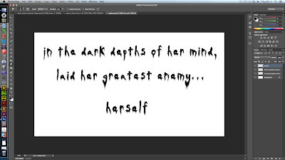
  • In terms of our tag line, we decided to use the font called "OldStyle" as we thought it was basic enough to manipulate and it also fit in well with the rest of our chosen typography. I started off by opening up a new file in Photoshop and making sure that my canvas was transparent therefore allowing it to be transferred onto our poster without any fuss. When typing our tagline into Photoshop, we decided to separate "herself" from the majority of the tagline so it would give us the option to move it around our poster.
    In order to manipulate our typography we applied a "wind" effect to our tagline. To do this we went to filter - stylize- wind and then selected wind from the menu going from the right. This made the typography look extremely worn out. This fits in well with our poster and our title as the mise en scene looks worn out as does our typography for our title. 
  • This is the finished typography. In terms of manipulation it doesn't show how it has been manipulated explicitly. Overall, this is not as effective as it looked in Photoshop, however it fits in extremely well with our poster. 
     
Poster
  • We also used Photoshop to produce typography for our trailer as well as contributing towards the production our poster. We started out by selecting the images that we wanted for our poster image; luckily we decided to carry out photo-shoots during every filming day in case we missed the opportunity. When filming our loft scene we noticed that we should carry out an extensive photo-shoot as the lighting, in combination with the mise en scene was provided great shadows against the wall.
  • Once we had selected our image, we started to edit it by adjusting the saturation and contrast levels the image to suit the rest of our package, as the use of psychedelic colours is a running theme through out our website, poster and teaser trailer.
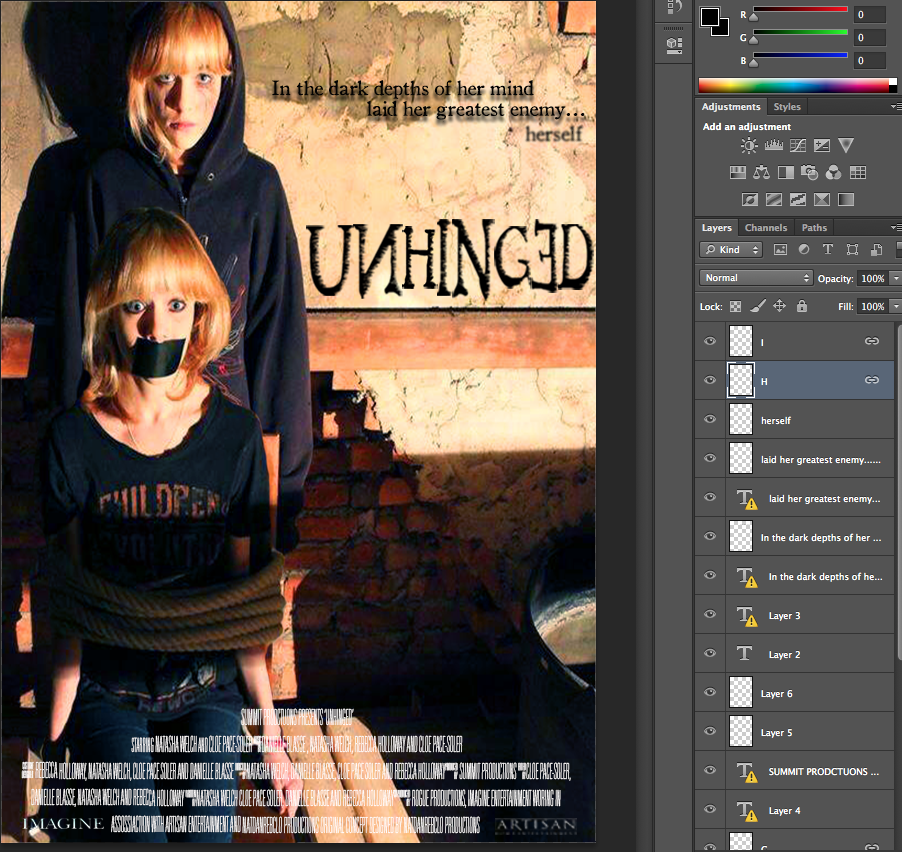
  • We needed to make sure that our poster conformed to the narrative and genre therefore we took two images one with the imaginary friend (antagonist) and the protagonist - we then started off by using the lasso tool to cut away any remains of the image that were not needed, and then used the rubber tool to remove the hard to get to areas. We then cut the image of the protagonist tied to a chair and applied it to the image of the antagonist standing directly behind her to create the sinister poster image that is evident on our final poster.
  • However, we did run into a problem after finalising our final poster image. Psychological horror film poster are conventionally portrait, although our image was portrait we realised that it didn't fit the exact measurements of an A4 sheet of paper which meant that the poster would be distorted if it were to be printed out. However, we were able to overcome this issue by using the image size editor and scaling to size out tagline and title.

Pixlr Editor
Website
  • We used editing software such as Photoshop, Pixlr Editor and Wix to help us edit and produce a website for our trailer. One problem that we encountered was uploading our typography, titles and tagline onto the website without them distorting somehow.
  • For our website image, we used Photoshop's lasso tool to cut out one image of the protagonist and then used the rubber tool to get rid of any of the remaining image. Once we had achieved the image with the two images of the protagonist and her imaginary friend, we used Pixlr Express.
  • Pixlr Express allowed us to edit our image quickly and extremely efficiently. It also provided us with other options that Photoshop failed to give us, such as the focal tool.
  • We used the focal tool to bring focus solely to the protagonist rather than her imaginary friend allowing our audience to notice her first as she is our primary subject.
  • The focal tool also made the imaginary friend the secondary subject in on our website. This meant that the imaginary friend was the second object that our audience was drawn to.
  • Finally, we adjusted the hue, saturation and contrast of our image to again make sure that the colour scheme was in fitting with the psychedelic colour scheme that we chose to abide by.
  • Using Photoshop we made sure that each image was set to a transparent background yet once imported onto the Wix website, a grey colour covered it distorting the text and making it hard to read. It also made it look extremely unprofessional, however, we were able to overcome this by simply re-applying a transparent background onto the typography and re-inserting it onto the website.
Logic Pro
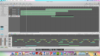
  • We also used sound editing software such as logic pro to our advantage to manipulate our sound that we had recorded by looping and layering our sounds to create a much thicker texture in sound and build up the suspense and anticipation that we wanted.
  • An explicit example of  looping and layering sounds is used within our green screen scenes, when the antagonists name is repeated for a while.
  • We recorded the sound as three individual tracks making sure that we used a quiet area with a good acoustic so it make the editing process a lot easier.
  • Once we had recorded I left the  audio clips at the length that they are at would prove to be too short to just insert into our trailer. To overcome this issue, I right clicked on a selected track and chose "loop" from the drop down menu and this looped each track. However, it became extremely predictable to listen to.
  • In order to overcome this problem, I had to select a specific amount of regions that I wanted, in this case I wanted three and then I spread them out along the other tracks at random to add to the tension and build suspense.
  • After this I trimmed the edges down and made sure that the track was even as possible towards the end. To do this, I faded it out towards the end and then bounced the file and converted it into an mp3 file. Therefore, I could sync it with iTunes and then drag it directly onto our footage.


iMovie
  • Throughout the process of producing our trailer we used iMovie and Final Cut Pro as our editing software. The main feature within our 60 second teaser trailer was the use of our green screen, which enabled us to stretch our editing skills.
  •  We carried out thorough research into how to edit our green screen footage as this was our first time using a green screen. We utilised all the editing software that was available to us from iMovie through to Adobe Premiere Pro  which allowed us to edit and manipulate our green screen footage in more accurate and specific way than iMovie offered.
  • To broaden our editing skills we developed our skills using  Photoshop  to help with our photo manipulation for our poster as well as our video editing skills for our website as it has includes an ongoing gif of the protagonist.
  • Additionally, we had to incorporate the recording symbol within our footage to convey the protagonist’s mental illness spiralling out of control.
  • A problem that we encountered when searching for a webcam overlay was that none of them had a transparent background. To overcome this dilemma we saved the image and opened it in Photoshop with a transparent background and used the eraser tool to erase the black background that was part of the original webcam overlay. This proved to be time consuming but it was a good alternative to using a webcam overlay that did not have a transparent background at all.
  • However, once we did this, we found a downloadable version of a webcam overlay that could be downloaded and applied to footage straight away. We simply imported the overlay into iMovie, making sure that advanced tools were switched on and then dragged it on top of our footage and selected "picture in picture" from the menu and finally adjusted the size of it around the frame of our footage.
  • We had to make sure that the webcam overlay remained the same size throughout all the footage that we applied it to as it was clear when the size of it dropped.

Thursday, 27 March 2014

Evaluation Question 4 - Rebecca


4. How did you use media technologies in the construction and research. planning and evaluation stages?

Filming
Throughout out filming process, we had two major parts which required media technologies, we had to record a screen on a computer, and use a green screen. For the green screen, we had to use our storyboard to work out how to film in front of the green screen correctly. It took us several attempts until we got the shots we wanted from the green screen, but the end result we came up with during the editing phase was worth it.

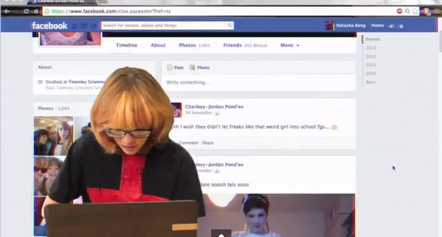
During part of our teaser trailer, in the background, the audience can see a Facebook profile scrolling in the background. We filmed our actor in front of the green screen, and to record the profile, we used software called Cam Studio. When using Cam Studio, you can change the quality, the area of the screen you want to capture, and of course what is on the screen. For this, we used one of our current Facebook profiles and customised it, so it looked as if it was our victim's own Facebook profile. This included changing the name, profile picture, and adding many fake posts to the profile, so that it fitted in well with the mise en scene of our teaser trailer. Here you can see our practice of using the software, before final editing had taken place.

Editing
For our teaser trailer, we predominately used iMovie for all of our editing, this is because we had a lot of experience in using iMovie and didn't have to waste time learning how to use the software. In iMovie we arranged all our clips into the correct place, added our sound and was able to trim down clips so our teaser trailer was no longer than 1 minute long.


In iMovie, as well as editing the length of the clips, and adjusting the overall narrative, we were able to edit the colours of some of the clips. We felt this was necessary to change the feel of the teaser trailer, and make it conform with the conventions of our genre. In this blog post, you can see how I edited the colours of the library scene, so that it became clear to our audience that our protagonist sees and lives life differently to the other characters in the trailer, and the red tinge also connotes danger, which follows our protagonist throughout the trailer.

However, we wanted to really impress with our editing, and this meant we had to do some editing outside of iMovie and import it in. For this, we used Final Cut Pro, as it has many more capabilities than iMovie and suited our needs for the montage sequence, green screen and titles.


Montage Editing
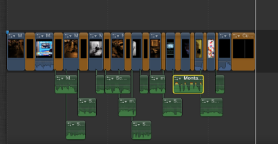
For the editing of the montage sequence, we wanted to use many visual effects for the various clips here we had included, and Final Cut Pro was perfect for this. We were able to import all the clips we wanted, ranging from the ones we had filmed to the news footage, linking to the mental illness idea. Within Final Cut Pro, we were able to add effects, transitions and sound we had recorded to the montage, using more effects on top of the sound to distort it in the areas necessary. We found it much simpler to edit the montage sequence in Final Cut Pro, and it meant we had less restrictions placed on us which we would have had if we'd just used iMovie. Once the montage sequence was complete, we exported it and imported it into iMovie, positioning it in the correct place. You can read more about creating the montage

Green Screen Editing
Our green screen editing also took place in Final Cut Pro, because we found it to look very unprofessional in iMovie. We did a couple of trials before deciding on using Final Cut Pro, as we attempted it in iMovie and also Premiere Pro, however, we had more access to Final Cut Pro, and it was user friendly, hence why we made our decision to use it.


Sound
For the sound of our teaser trailer, we had to record our own sound effects and compose a soundtrack for the trailer. We had various inspirations for the sound used in our trailer, and researched the sounds used in various trailers, as can be seen here.

We first looked at various sounds we could incorporate into our teaser trailer, as we had different parts which needed catering for, such as the green screen section, montage, and ending. The media technology we used mainly was Logic Pro, as we had experience in this and found it easy to layer the sounds we wanted to experiment with.


Once we had recorded, and layered and edited our sound, we imported it into iMovie, to position it onto the clips which make up our trailer. This meant we had to decided what parts of the original sound to keep, and which parts to mute, so that only the soundtrack could be heard. We managed to complete all of this in iMovie, however, for the montage section we went back to Final Cut Pro, as it allowed extra precision in the short, face paced clips. iMovie wouldn't have allowed us to be this precise, and since we were exporting the sound and audio from the montage out of Final Cut Pro, it made sense to do it all at the same time.

One problem we did encounter at first when editing our sound was matching it up correctly with the titles and news footage clips throughout our trailer. We were able to simply drag and drop the sounds into the correct places, however once we imported files from various software into iMovie, such as the montage from Final Cut Pro, and soundtrack from Logic Pro, the overall soundtrack of our trailer became out of sync in places, and we had to merge the overlapping parts so they flowed into one another. Also this was a lengthy process as we had to keep replaying parts of the trailer to ensure it was correct, we did manage to do it in the end and are very happy with the outcome.

Titles
Throughout the development of our teaser trailer, we changed our titles many times. After deciding what they were going to say, we had to decide how we were going to present them on the page.

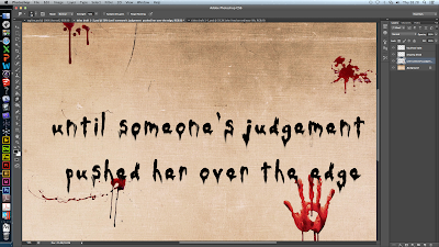
At first we decided to work on our titles within photoshop and went for a look which included the title appearing on an old piece of paper, made to look as if it was hand written with blood dripping over it. We achieved this look by beginning with a white background and one by one importing new layers, one for each letter of every word allowing manipulation of the typography, and then a layer for each drop of blood and the background, so we could add fluidity between the 'ink' and the blood.

Here you can see the final product of our first attempt at creating the titles. However, we realised some problems with this method. Firstly, because we had created them in photoshop, it would be very hard to export them with the background and blood stains and successfully add effects within Final Cut Pro with it still looking professional. We also thought that the old piece of paper didn't conform to the conventions of our genre well enough, and perhaps gave the impression it was more of a slasher than a psychological thriller. Due to this, we started work on our next attempt of the titles.

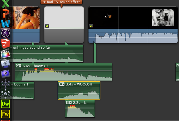
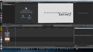
For our second attempt, our first major change was to begin work within Final Cut Pro. We then decided to use a very simple background for the titles so that the emphasis would be more on what the titles said, rather than the background, and also it would bring our audience's attention to the effects we applied within Final Cut Pro. We decided that since our cultural link is mental illness and privacy, the effect 'Bad TV' within Final Cut Pro may give our titles the effect we needed to conform more to the conventions of our genre. We liked how this version of our titles much more, and so decided to import them into iMovie and include them in our final teaser trailer.

Poster design
For our poster, we used Photoshop heavily throughout the whole development, as it suited all are needs and would help us achieve a professional outcome. First of all, we used our initial plans as a base and expanded this out, completing several drafts of our poster.


We had several photo shoots throughout the time we were filming, and managed to get a few different photos we could work with and use as a base. In this draft, you can see how we used a photo taken in the library location, featuring our very first typography. We felt that this was a good idea, but upon editing it using Photoshop, we didn't think it looked very professional. So instead, we used the layers in Photoshop to have both a photo of our protagonist and her imaginary friend, in the same shot, which would later be the same thing we did for our website image.


Throughout the development of our poster, we had to focus on typography, because this is a major feature of the poster. For this, we again used Photoshop, and went through many different versions of typography that we had manipulated. First of all, we chose a font we felt fit well with our narrative, and then used some of the many filters and effects you can apply to the layers in Photoshop to manipulate it, so it was truly our own. Photoshop gave us the freedom to alter our typography once we had already placed it, as we found this was necessary quite late in the process because our poster wasn't looking professional enough. The biggest change you will notice that happened to our poster is the placement of the title, at the beginning it was just in one line, but the end product features it spread over three, looking like the letters are balanced upon each other and a shelf in our background image. We were able to incorporate this layout onto our website too.

Another part of typography that was important to develop for our poster, was the development of the tag line, where we again used Photoshop in the same way, because it allowed us to manipulate the text using the same 'Wind' filter as the main title was. This meant that the typography fitted together well and helped us to make it look professional.

Website design
For the development of our website, we were able to use several different media technologies alongside each other. We host our website on Wix, which allows us to edit the template of our website, the placement of all the elements on our website, and link to our social networks and teaser trailer.

Our website came a very long way from our initial ideas, and in order to complete it the way we did, we had to start with a plan of what we wanted. Following this plan, we were able to choose a background image to work with, which we hoped would be the background of our website.

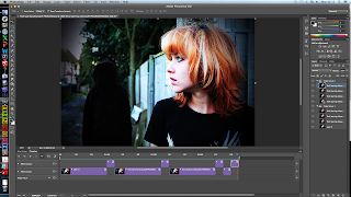
In order to do so, we again had to use Photoshop to edit the image we wanted to use, in this post, you can see the editing I did, to create a viable image for use on our website. Photoshop allowed me to stitch two images together, while still looking professional, and edit the colours. I thought this was vital, because before editing, the photo looks very dull and not interesting, so by increasing the contrast and saturation, we were able to radically change how this image looked.

A feature we wanted to include on our website was a moving background, and we decided to do this by having the protagonist's imaginary friend appear and disappear from the background. We thought that on a website this would catch our audience's attention. In order to complete this, you can see how in this post, I created a gif using the time line tool in Photoshop, and saved it as the website's background on Wix.

Typography
Typography of course is another big part of the website, and was vital that we used the same as the poster and our teaser trailer, to create a professional package. We had many different versions of our typography, and it all stemmed from a plan we made at the beginning of the process. Here you can see how we went from a drawing to a basic design of possible typography, using the online service Pixlr Editor. This was good for playing with ideas, as it was easier to use than Photoshop and allowed us to practice with different typography manipulation before deciding on our final idea.

There was a while during the development of our typography where we played with the idea of using a inky looking typography, because we thought this would fit in well with our narrative and hint at the idea of kidnap. You can see here how we experimented with this idea.


However, we wanted to make it look really professional, and this trial didn't meet our expectations, so we moved on and created this, which is much more uniform and fits better with the conventions found in typography of products also in the psychological thriller genre.

Using the typography that had been manipulated for the poster, I was able to make slight adjustments, again using Photoshop, so that the images were transparent, and therefore would be successfully placed on our website without and grey backgrounds ruining our web page. You can see in my final post about the website, how I used the final typography and imported it into Wix, positioning it following a similar design as the poster, while ensuring the content was all in place on our web page. We used YouTube to have our teaser trailer playing in the middle of our web page.

Monday, 24 March 2014

Evaluation Question 4 - Cloé

4.) How did you use media technologies in the construction and research, planning and evaluation stages?
  • As a group we used many media technologies in the construction, research, planning and evaluation stages of our media products. The points mentioned below are areas I personally did. 

Editing

Titles
    Wording of the Titles

  • Creating the wordings of the titles was a difficult task that the whole group had an input in. I came up with variations that we could use and as a group we attempted to alter these variations to suit the genre and narrative. Our titles needed to be obvious due to the fact our trailers's narrative was a bit complicated. The wordings of the titles was key to ensure the audience's comprehension of our trailer and so I spent a lot of time redrafting these phrases.
  • Once we had the final wordings of the titles we could start making our titles.

Initial attempts

  • When first experimenting with different styles of titles we drifted down a more slasher horror route which didn't match our genre.
  • We started out by having an 'old paper' look for our background, the font we used looked like calligraphy and after using the 'smudge' tool looked like it was leaking down the page. We then added in blood splatters such as a hand and blurred the ink and blood together. Although these titles did seem rather effective, they did not match our genre at all and would have stood out when watching the trailer.
  • We also edited these on photoshop and so they would have been still images, this would have meant that none of the words would  have been duplicated and they wouldn't have been very distorted. 

Development and creating our final titles

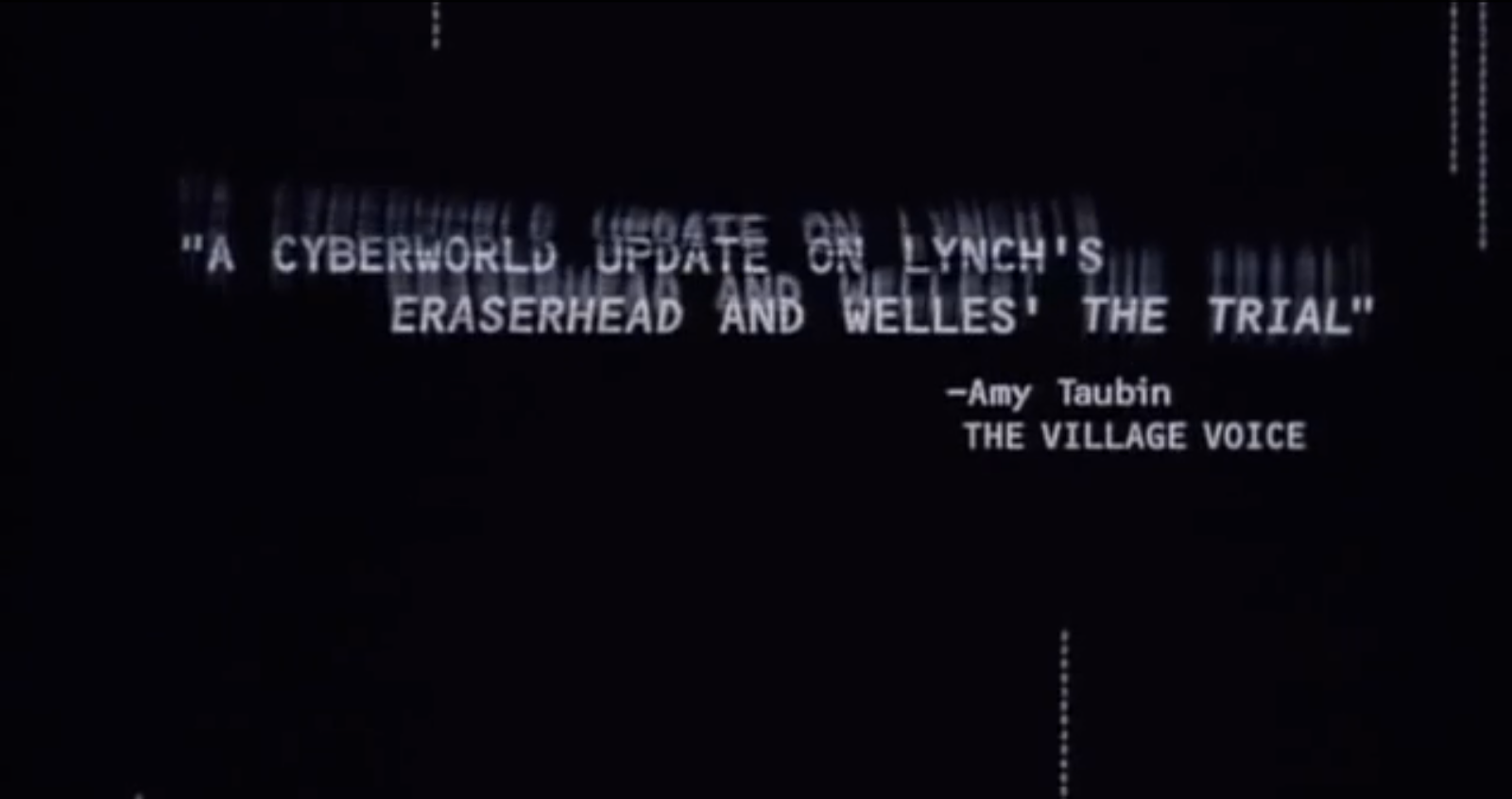
  • When deconstructing films and trailers the titles for both Number 23 and Pi stood out to us and we felt like recreating a similar effect for our own trailer.
  • For example throughout Number 23's trailer there were images and signs constantly flickering up onto the screen. We felt this had a psychological effect which would reinforce our trailer and so we attempted the similar effect on our titles.
  • Pi's trailer had the words in the title double and smudge together, we felt this was also very effective and would reinforce our genre. The doubling of words clearly connote that something is mentally disturbed or something isn't right, and as our genre is a psychological thriller we felt this was suitable. 

  • To create them I first opened final cut pro and chose a plain white background as we felt this would best match our colour scheme and general package. Then, using the same typography as the tagline 'Dark Ages' I wrote in the phrases I had created. 
  • After this I decided that having our titles gradually get more and more distorted would reinforce our narrative as it would represent how our protagonist's mental illness gradually gets worse through the trailer.
  • On the first three slides I applied effects called 'projector' and 'bad TV' and gradually increased the amount on each slide. In the final slide before the montage and climax I increased these effects to full and then repeated the word 'herself' which was layered over the title and was competely distorted.
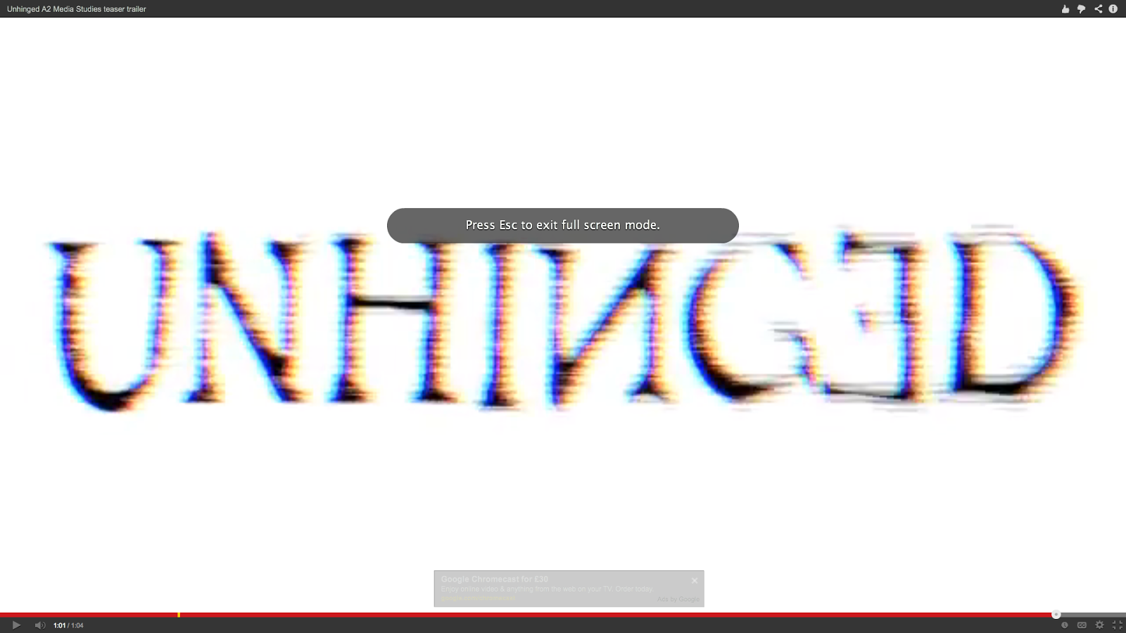
  • I also created the final title at the end of the trailer which said 'UNHINGED' and 'COMING SOON.' This required much more precision as I felt it would look effective if the title's colours were inversed for a milisecond before going back to the original title. I repeated this a few times and had to alter how long each slide would flash up for. I also applied 'projector' and 'bad TV' on both the background and the actual title so that the whole image looked completely distorted. So that this would have a lasting effect I layered the non diegetic sound 'metal impact' which was used throughout the trailer. This meant that the ending linked in with the rest of the trailer and the title was forceful when it appeared at the end.

Bedroom scene

  • I also edited the scene in which our protagonist is stalking our antagonist with a partner. For this scene we felt that close up shots of our antagonist slipping on some tights would be effective as it would be quite an intimate shot, making the scene creepier.
  • We also had a shot in which our antagonist was removing her nightgown, but cut it before the nightgown fell off so that the audience could understand what was going on.
  • This was then cross cut with shots of our protagonist on her laptop watching our antagonist get dressed.  
  • We had a contrast between shots taken from the laptop and shots that we took on teh camera due to the differing colour levels and levels of quality between the cameras. The hand held camera was also higher in saturation and so we felt that it added substance to this scene.
  • We were able to achieve effective angles with the hand held camera such as an ariel shot of our antagonist drying her hair, this made the scene more dynamic and creepy. This scenes were cross cut with the full shot of the room filmed on the webcam.  
  • I also had a part with the mise en scene of the bedroom, we completely changed the room to suit our character by removing all the books on the shelves and replacing them with makeup. We also asked all members to bring pink items and scattered shoes and bras around the room. Once we had done this we printed our images of Justin Bieber and One Direction and stuck them up on the walls. This meant that we could fully develop our character and were able to completely show what our antagonist was like to the audience. 

    Final Tweaks
  • Finally I made additional tweaks throughout the whole trailer, for example using the trimming tool to cut down milliseconds off individual clips therefore making the whole trailer just over a minute.  

Audio

Audio of newsclips
  • The audio in the montage scene was key in raising the tension for our final jump and had it been done badly our final scene in the loft would have seemed random and ineffective.
  • We firstly felt that including the audio of newsclips in our montage scene and layering them so they became overpowering would be effective as it would allow the audience to experience what is going on inside our protagonist's head.
  • In order to do this I had to research for these news clips, and after downloading them I had to select the part of the footage I wanted and detach the audio. This meant that I was free to place the audio wherever I wished. I duplicated a few of these clips and added in more. The types of news clips I chose were ones linked to mental health, for example one clip clearly stated 'schizophrenia.' This meant that our audio explicitly linked in to our narrative, so the audience would be able to understand our trailer is about mental illness.
  • Once having layered all the sounds over one another I was finished with the structure of the audio. However I felt that it was missing something and some clips sounded too 'normal.' Therefore I experimented with various sound effects Final Cut Pro provide such as 'Monster' or 'Alien.' This meant that I was able to distort the voice and the overall montage scene would be creepier and would defintiely raise the tension. I then went about finding effects that created an echo so that these clips would really sound overpowering and would explain that our protagonist is tormented by her thoughts.

Cinematic 'booms'

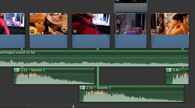
  • However even though the news clips I had inserted made the montage scene scarier, the scene was missing cinematic 'booms' that would speed up by the end of the scene.
  • The process of finding and inputting suitable booms was problematic for us as we were for a while we couldn't find a short, powerful boom. Eventually we found a suitable one on youtube and downloaded this. I then had to drag these 'booms' into the right place in the montage scene.
  • This process was problematic as I had to do this by ear and so made a few errors which was time consuming. 
  • I had to make sure each boom would arrive slightly faster than the previous one in order to increase the tension for the ending. After trial and error I had finally finished a piece that successfully raised the tension and that didn't sound strange.

Filming

Green screen
  • One scene I filmed was the green screen where the protagonist first sees her imaginary friend.
  • We firstly needed to buy the green screen, after doing this we set up the filming area by hanging the cloth on a black flat. I then shortened the tripod to adjust the height of the camera as our protagonist was seated on the floor. 
  • We had to ensure the green screen was correctly lit and there weren't many shadows as this would have posed a problem for us later on in editing. I had to check that the green screen was okay through the camera and ensure that our protagonist's head was correctly framed.
  • Because editing green screen can be problematic if the footage is incorrect, I drew a line where our actor acting as the protagonist wasn't allowed to pass. This was halfway down the screen, the other side was reserved for the imaginary friend.
  • I had to keep refilming this scene as occasionally our actor would push the boundries and if we merged these images together the two characters would have been overlapping.
  • The framing of the camera was key, as was ensuring that the camera was steady and at the same angle each time. This was because if the two sets of footage were different, it would have been obvious when we merged them together, as we learnt from our trial.
Bathroom scene
  • I also filmed the scene within the bathroom where the protagonist drags her makeup down her face. This location was problematic due to the mirror, as in many shots the camera could be seen. I had to experiment with different angles to get the most effective shot without being seen in the mirror. This required the use of the tripod to get the camera at the right height and I had to use the zoom and focus function.
Bedroom scene
  • I filmed parts of the bedroom scene, this being an over the shoulder shot of the protagonist watching the antagonist in her bedroom and a tilt of the protagonist on her laptop. These scenes were also difficult to film as often the camera was caught in the reflection of the laptop screen, and so I had to experiment with different angles in order to avoid this. 
  • Additionally I also used the focus function to focus in and out of the footage on the laptop screen, which made the footage more dynamic and interesting overall as it wasn't just a boring shot. 
Time lapse
  • I also filmed the time lapse. This required setting up the camera on the tripod and ensuring that the protagonist was correctly framed and you could see her. 
  • Although this was simple, we had to refilm this many times as the camera often died or various other problem occurred such as the sun disappearing over a cloud or a dog bumping the tripod. 
  • We finally got our time lapse after refilming it 4 times, and were pleased with the result. 

Poster

Initial Design
  • I also had a big part in making and developing our poster. To begin with we experimented with different effects available on photoshop. I took pictures of our protagonist and positioned her so that in some it looked like her imaginary friend was looming over her. 
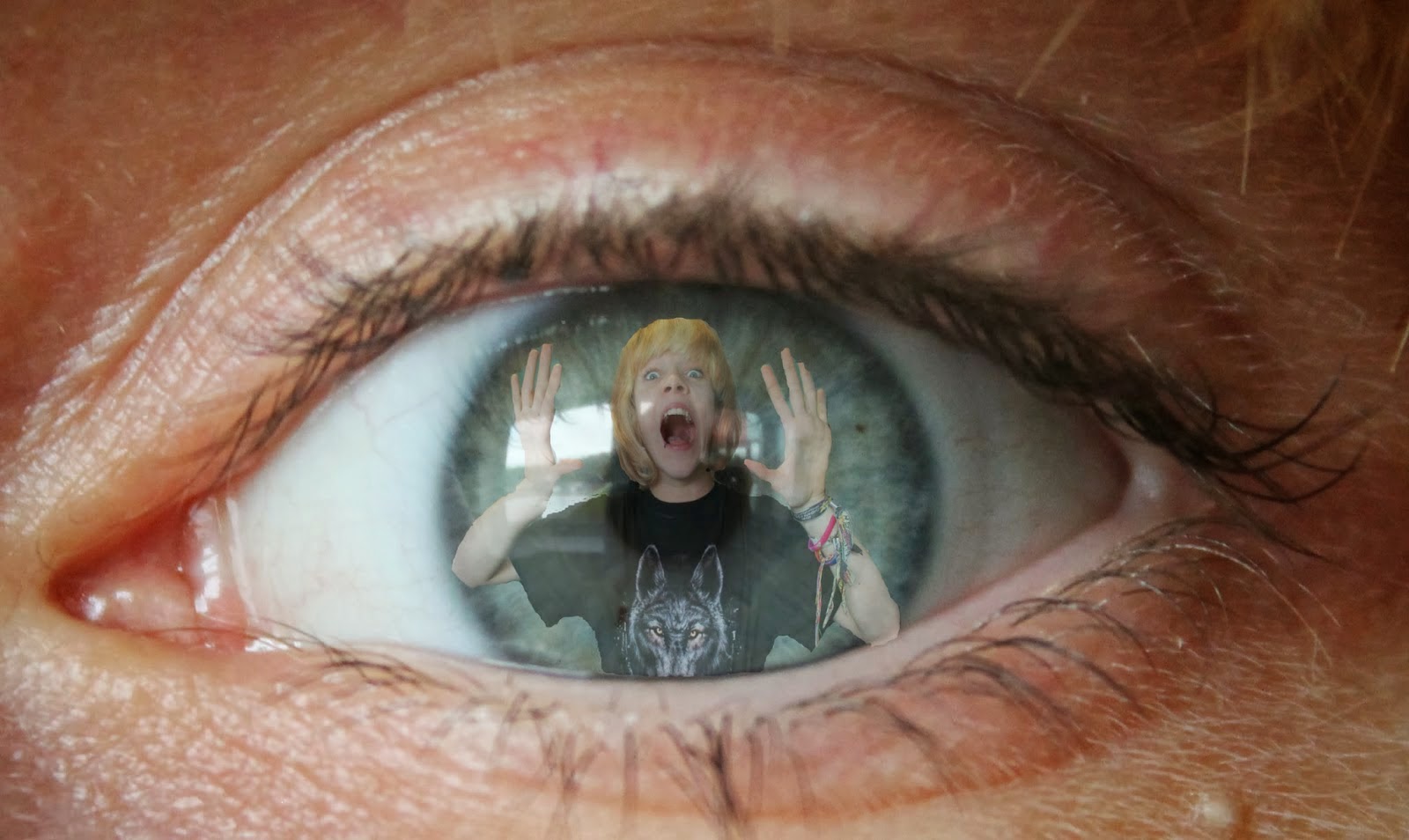
  • The example shown on the left is a close up picture of our protagonist's eye, I then also took a picture of our protagonist screaming with her hands up, this meant that edited together it would look as if she was trapped inside herself.
  • After experimenting with effects we decided as a group that we would like the inclusion of our imaginary friend in the poster. We first learnt about this when editing the images I had taken together. 
Our poster creation and development
  • When it came to making our actual poster we had a few pictures to choose from. We decided to use the images taken in the loft as the lighting and overall message of the image suited our genre perfectly. 
  • The images were merged together and I then took control of the typography on the poster. When creating the tagline I duplicated the sentence and staggered the two lines, I then used 'field blur' on photoshop to blur the bottom line so that it created a shadow. Although this was effective, it made the text much harder to read from afar and this had to be undone. 
  • I then created the cinematic information at the bottom, this gave the poster a more professional look and so the poster was more believable. 


    Sunday, 23 March 2014

    Evaluation Question 4- Natasha

    4) How did you use media technologies in the construction and research, planning and evaluation stages.


    Photoshop


    Image

    First attempt
    After confirming our decision to use the protagonist in our poster, to meet the conventions of a poster. I attempted trials at photoshop, to develop my skills and see what techniques I could apply to images. We initially tried to make an image of the protagonist holding a book over her face, with the title of the film written on the book. We made an effort to make the book a psychology book as it showed images of the brain, which suited the genre. On top of this, we thought that the inclusion of a book would connote the thoughtful personality of the protagonist, and by not including her face we could suggest that the protagonist is mentally stable.


    Development
    Later on, I again attempted creating an image on photoshop. I layered an image of the protagonist over another image of the protagonist's eye, to connote how she is trapped within her own illness. Although the idea was effective, I was unskilled at this point and so the overall product was not very professional and came across as quite comical. However, we did decide that the method of layering was effective and decided to use it in our final product. The colouring of the photograph also did not suit the genre.

    Final Product
    I used Photoshop to create the final poster image. After completing the photo shoot in the kidnap/loft location, I decided to combine the two images of the protagonist and the imaginary character. I opened up the image of the imaginary character standing up and then layered on top of the image the image of the protagonist tied to the chair by rope with tape over her mouth, making sure than the layering was smooth. This was effective as it gives the audience a good insight into the plot, while using effective mise en scene -location and props- and still leaving space for the title and tagline. 


    Typography 

    First attempt

    Once we had decided on our typography, I laid it onto the poster. It was important to make the title visible and also make best use of the space. I decided to put it next to the protagonist's head on the poster, as the lighting was high key in this area, meaning the black font was explicitly visible- which is important on a poster. However, looking back I did not like how the words were squashed up on the image, as this did not have much of an impact and made the poster overall look weak.


    Final Product

    On photoshop, I also edited the typography of the title so that it suited the poster much better. I did this by splitting the title up into three lines, which allowed me to make each letter much larger, using up the space available much more. This had a much larger impact and was also much more noticeable on first viewing. I also used the ‘Rotate’ tool so that I could make certain letters crooked which came across as though the letters had fallen onto one another, suiting the psychological genre much better.


    Camerawork 


    First Attempt
    I also made use of a more advanced camera during the production stages of our trailer in comparison to our previous pieces. To begin with, I was unskilled with the camera, and used simple, static shots on the tripod. This was successful when filming basic full shots of the characters, however did not leave us with much to work with in the post-production stage. As our genre is psychological, it was important for us to be creative in our camera work to depict the state of the protagonist's mind. 


    Development

    After practising with the camera extensively, I learnt a couple of effective techniques. This allowed me to be more creative in the shots that I took during certain scenes. For example, in the shot where the victim -who is getting dressed- is being stalked via webcam. I filmed a close-up shot of her pulling on her tights which pulls focus from the background to the foreground, something which was impossible beforehand and is an effective shot. However, this still didn't allow us to explore the mental illness of our protagonist. 


    Further Development
    Therefore, I researched different camera techniques even more. In the final scene, where the victim wakes up to find she has been kidnapped, I tried to be creative in the filming process by using an aerial shot from above the victim which pans down her body to reveal she has been tied up, also pulling in and out of focus to give a more surreal effect. I commonly put the camera out of focus to depict a POV shot, which shows the instability of the protagonist's mind. I also learnt how to change the exposure and colour levels of the shot, which allowed me to make the scene more low-key, which suited the ambiance we wanted. 

    iMovie 


    First attempt
    I also made use of the software iMovie to compile all of the different scenes together. This meant that I could import the footage into the software, split clips and order them in the right order. I also was able to import soundtracks and sound effects. This was useful in the creation of a sequence, however did not allow me to be very creative in the post-production process. 

    Final Product

    Therefore, I explored the software a bit more, to see what capabilities it had in store. During the post-production stage I made use of different transitions on the software to help create an effective eye-line match by inserting a black slide for 0.2 seconds to mimic a blinking effect during a POV shot, which was filmed unfocused to replicate the protagonist’s hazy state of mind. We also changed the exposure and saturation of some scenes, to help create the ambiance that we wanted.


    Final Cut Pro

    First attempt 
    When I first started to use Final Cut Pro, it was overwhelming due to the wider variation of effects and techniques that were available in comparison to iMovie. I played around with the fast and slow motion effects, which were effective for the genre as they allowed me to alter the pace of the footage and make the clips seem distorted. I created many short video clips to practise with the software. However, the creativity in the first attempts was somewhat lacking. 


    Final Product
    I used Final Cut Pro alongside iMovie in our final product throughout the post-production stage to make use of the different available visual effects. In the final scene, which features the victim waking up to find that she has been kidnapped, I particularly used these effects. On all of the shots, I used the ‘Cool Tones’ effect, which made the footage considerably more low-key, suiting the genre much better and coming across as more chilling and scary, which is what we wanted. I also used the ‘Trails’ effect on the POV shot of the bloody hand as this made the shadows and highlights of the shots delayed, coming across as though the the victim is seeing double, which suits the scene well as she is just waking up. Finally, I used the ‘Bad TV’ effect in several areas, for example in one shot I used this effect for 0.4 seconds at the start and then 0.9 seconds at the end, to build tension for the climax. These visual effects helped improve the overall effectiveness of the trailer, seeming more professional. 

    Chroma Keying

    Research 
    To begin with, I was unsure of how to go about the chroma keying scenes, as this was an area that was completely new to me. I did extensive research into what we would need, and what software would be best. I also planned what backgrounds to use, coming up with a variation of options to use including a moving video of a hypnotic spiral or a static image of a prison cell. However, I decided the best option would be to trial the software and different backgrounds. 


    First Attempt
    For our first attempt, to see how to use the background, I used a temporary green screen to film against and also used a phone camera without a tripod. This meant that when I edited the two videos of the same actor together, the result was extremely unprofessional, shaky and also the colour of the green screen we used meant there were holes in the footage. However, from this process I learnt how to simply use the software, so I was happy with the outcome. 


    Development
    I then tried the process again, however using a tripod and the professional camera, to get a high quality result. This time the outcome was better than previously, however I had trouble inputting a background, as the video I wanted to use was a different resolution to the foreground footage. However, I then overcame this by coming across the 'crop' tool which allowed me to crop a video clip to the right size for the framing. 


    Final Product
    I finally worked out how to effectively use chroma keying by filming several scenes in front of a green screen with a tripod. For our final product, I filmed the shot of the protagonist on the laptop in front of the green screen and then later on used the ‘Keying’ effect on Final Cut Pro to change the background to footage I recorded of the victim’s Facebook profile. This meant that we could effectively show the audience what was on the laptop screen in a creative and innovative way. We also used the chroma keying to show the surreal state of the protagonist’s mind by changing the background to an intimate close-up shot of her screaming to a shot of pills, which explicitly shows how she is overwhelmed by her illness, making the narrative clear and allowing the audience to sympathise with her. The overall product was innovative and successful.