Danielle Blasse 7010 - Cloe Pace-Soler 7352 - Rebecca Holloway 7279 - Natasha Welch 7399
Townley Grammar School - 14109
Showing posts with label final tweaks. Show all posts

Monday, 24 February 2014

Final Tweaks based on Feedback

Our Final Tweaks

Titles:
- Feedback for our teaser trailer had a reoccurring theme of people misunderstanding our trailer, therefore we knew we needed to lengthen our title slides that explained the basic outline of our movie. I then dragged those slides so they were all 2 seconds long, although this added to the overall time, ensuring that people understood our trailer was more important.

Ordering of scenes:
- We also decided to reshuffle the ordering of the scenes to make people understand the trailer a bit more. As the facebook part was the 'trigger' for our protagonist we therefore decided to switch the stalking scene so that it was after the facebook scene. This made more sense in the trailer.

Removing footage:
- We also decided to remove footage where the antagonist goes towards the camera in the stalking scene as many people felt that this showed the characters were making contact and this was not what we wanted to portray.

Thursday, 6 February 2014

Final tweaks on sound

Final tweaks on sound

After receiving feedback from our audience about our trailer, a lot of them noticed that minor parts of the sound could be changed slightly producing a more fitting sound.

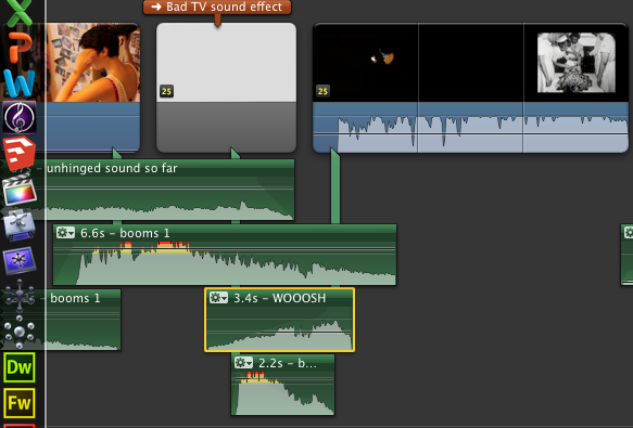
Our audience noticed that the "booms" leading up to the montage were not effective enough, however after some consideration we realised that the build up in sound towards the montage was actually not effective enough at all.

To overcome this issue, we decided to not use the same "boom" track in the build up to the montage that is already being used in the montage. That way, the new timbre of the "boom" in the montage will have a bigger and more effective impact on our audience as it's not a sound that they have already heard in our trailer. It makes it less predictable. We decided to cut the piano track earlier than we had previously, therefore it didn't play during the montage scene.

Additionally, we also also cut the "woosh" audio clip from one of our audio tracks that were previously used in the trailer and applied it to the end of the title to create a bridge passage between the sound of the scenes before and the montage scene. Once we had applied all of these changes to the sound, we copy and pasted the "booms 1" track below the "woosh" creating another layer but we cut to the climax of the "boom 1" audio clip and this added to the tension and created an entrance that was needed for the montage scene. Furthermore, the "boom 1" track was cut as close to the climax of the track as possible, this way the booms got faster as we neared the montage building up suspense and anticipation in the trailer. Using track "booms 1" instead of the "booms" track which were used in the montage scene allowed us to pace ourselves a lot more in the build up rather than building up the tension in the wrong place altogether. Overall, this solved the problem and the booms used in the montage scene, proved to be more effective.


Final website tweaks

As we are coming to the end of developing all parts of the promotional package for our teaser trailer, we decided to make some final adjustments to the website so it fitted well with the new typography on the poster.
First of all, using Photoshop, I took the typography from our poster and changed the colour to white, as we thought this would probably show up most on our website, and would fit with the rest of the typography currently on there.
Here you can see I uploaded the typography onto our website, after removing our other design. I resized the image and positioned it on the left hand side of the webpage. This still fits in with the template, matches the typography placement of the poster, and is the part of the webpage where the typography should show up best.
Here you can see my final placement of the typography. We had a discussion as a group and decided we really liked using the new design on our website, however, we did have some concerns about the typography not being very easy to read, due to the bright tones in the background picture. We decided to create another version and compare the two, to ensure we were making the right decision.
Here you can see I went back to Photoshop and used the typography which was black, exactly as it is on the poster. I then saved this as a transparent file and uploaded it onto our website removing the white one.


Here you can see I positioned the typography in the same place, and was quite happy with the results. However, as a group we discussed again how this would be quite difficult to read too, because of the darker tones in the photograph in the background. Due to this, for now we have picked the white version of the typography, because it matches the rest of the typography on the site.

We also decided that it would be best to change the placement of the tagline, so that it matches a similar format of our poster, you can see the results of this in our final image below.

In addition to these final tweaks, I also had to add to the social networking links we had on the website, including both Twitter and Facebook. I have now added this links onto our webpage and below you can see the final website. 


Friday, 31 January 2014

Final Tweaks on the poster

 Looking at our final poster, we felt that the title was not big enough and this made the whole poster seem a bit lacking. Although there is not much space to make it any bigger we thought we could put parts of the title on different levels as this would also make it look more chaotic.

1) First of all, I made a duplicate copy of our poster so that we could make changes without losing the original poster in case it went wrong.

2) Then, I deleted the title so that I could insert it in again without it being in the way.

3) I opened the image of the title typography and then dragged each letter in individually.
4) I used the 'Free Transform' tool so that I could make it the right size for the space that was available.

5) Finally, I used the 'Rotate' tool to make some of the letters more wonky and twisted than the others as this made it look more delusional.

Evaluation


  • The result of this makes the poster look much more dominant and noticeable.
  • It also makes the genre come across more clearly as it looks more psychological.
  • This also uses the space that we have available more effectively.