Danielle Blasse 7010 - Cloe Pace-Soler 7352 - Rebecca Holloway 7279 - Natasha Welch 7399
Townley Grammar School - 14109
Showing posts with label initial ideas. Show all posts

Thursday, 24 October 2013

Website Image Initial Plan

Here is the initial plan for our website layout.
Currently we have not decided on an image for the background as we will probably have a photo shoot on one of our filming days during half term.

We have however come up with a initial idea for the layout of our website, ensuring it will all fit onto one page.


Here you can see we have incorporated social media links, critic's reviews and links to other pages, as well as the tagline, although the position of that is most likely to change as we aren't 100% happy with it. 

Poster Image Initial Plan

This post is looking at our initial ideas for the image we want to be used on the poster for our teaser trailer.

Here is our initial sketch.

For our film poster we will base it on one of the ideas Danielle used in her Photoshop posts, using the ghosting effect to having two images of the protagonist on top of each other, adding to the psychological feel. We will also incorporate the typography ideas I have come up with for the title of the film and tagline.

Friday, 18 October 2013

Poster image: Ghosting on photoshop (trial)

Poster image: Ghosting on Photoshop


After finding a  tutorial on how to create a ghost effect on Photoshop, we decided that after finding a suitable test image to try it out on - it would be effective as a poster image.

 I started by inserting the test image of our protagonist. I then used the "Pen" tool and outlined the protagonist therefore eliminating the background of the image. Following this, I selected the "mask" option at the bottom right had corner and then refined the mask, making it look less harsh and more realistic.


I then selected "filter" from the tool bar, "filter gallery", "stylize" and selected "glowing edges" which made the image appear black and the detailing of the image colourful. I then went to "filter" again, selected "stylize" and "diffuse" - "anisotropic" which made the colours a lot more predominant.


Then I selected "image" on the tool bar, "adjustments" and then "Channel Mixer" in order to select "Black and White with a Yellow Filter" from the list - this eliminated the coloured outlines on the image making it monochrome. After this, I went to the filter option, selected "stylize" and then chose "solarize" and then added "gaussian blur" to it and adjusting it to 7.8 so it gave off a convincing ghosting effect. 


We then duplicated the layer of the first image of the protagonist and set it alongside it - using the smudging tool to create a winded effect. However this proved to ruin the outcome of the image.
We then selected the filter option and then chose the wind effect to achieve the look that we were hoping for. However we wanted to convey that the two images drew a distinction somehow. 

To do this we chose invert from the adjustment panel on the right hand side and applied it to layer copy 6 and it changed it to a white version. Although, this was not the look we were hoping to achieve. In order to over come this next time we will have to do a trial run on a smaller object.


Poster Editing: Trial

I looked at the pictures that Cloe took and decided to play around with the idea of an image in an eye which Danielle started before with an image of a generic eye and a forest. I decided to take it further simply by using a picture of the actual Protagonist's eye, so it would be more like how the final poster would turn out to be.
I decided to edit an image of the protagonist screaming inside the eye to indicate that there are two versions of her and that she is trapped inside her mental illness and can't escape.

Steps:

1) To start with, I opened both images up in Pixlr, the editing software I used in place of photoshop, for the ime being.

2) I made the second image smaller, so that it would be the right sixe to fit inside the eye.

3) I used the lasso tool around the second image, then used the select tool to move it across into the first image of the eye.

4) I used the Free Distort tool to move the image inside the eye properly, and also distorted the image a little but stretching it to make it look a bit more creepy.

5) I used the erase tool all round the edges of the second image so there was none of the background inside the eye which would have made it look unprofessional.
In the layers box, I reduced the opacity of the second layer so that it was half transparent, making the eye visible behind the layer on top. This also made the shininess of the eye visible which made it look much more realistic.

Evaluation:

The image is okay for a starter but we wouldn't use it as a final image for the poster as it looks quite comical and the image inside the eye doesn't look as distressing as it could. The image doesn't quite convey the emotions that we would like in our poster as it doesn't look very dark, not depicting the horror side to the trailer.

Poster Photography: Trial

-To begin with we thought it would be effective to have tasha facing her imaginary friend as if its a face off between them.
-In the real image we'd probably make sure they were wearing different clothing and they had different hairstyles.
-We thought this could be rather effective as it would clearly show that our trailer is linked to mental illness.
- Here we did a long shot so that her whole body was in the image.

- Another idea of ours was to layer two images of tasha and to have one of her much closer to the camera, looking backwards, and another one further away looking down at herself. 
- This would once again suggest that our trailer is about schizophrenia.  
- I did a high angle so that the 2nd Natasha that is looking over the 1st one would look more threatening, and the close up shot of the 1st one would make the audience relate with her rather than the imaginary friend so that the audience is more sympathetic to her case.

- This image was the one Natasha edited with an image of her screaming. 
- We thought we could have tasha trapped in her own eye to show her having an imaginary friend and to suggest that our trailer is about schizophrenia. 
- I decided to therefore take a close up shot of her eye, this would show emotion in the poster and would make the audience relate with the character.

Thursday, 17 October 2013

Tag Line Inital Typography Manipulation

For the tag line typography, I decided to look for a different font because when we looked at different film posters, a convention found was that the name of the film and the tag line were in different typography.

After a bit of searching I found several  extra fonts which we could consider for our tag line typography.

One font called Lakeshore Drive has the look of being hand written but is a different style, it seems to be much more delicate from our name typography and could add an interesting edge to the poster. It could suggest very subtlety to the viewer that when all seems to be okay, there is actually a darker force at work in our film trailer. Using our initial tag line idea, here is a sample of the font.

Another possible font I found was Daubmark font, which has a similar feel to our main typography but it all in lower case, this could work quite well as it will contrast but there will be a definite link between the two pieces of typography. I personally think this is a more likely font than the previous example. 


I decided to go ahead with this font and have a go at manipulating it in the Pixlr Editor. 
First of all I went over all the letters and coloured them in to make them completely black as there were a few white pixels within the letters, and I drew the ends of letters, such the 'p' because that had been cropped off. 


I then used the select tool to transfer the manipulated letters into a new canvas to start making them slightly blurry at the edges, because this will fit with Danielle's initial poster idea design. 


I then saved the image and switched to Pixlr Express where I changed the focus to the word 'darkest', the plan would be to do this for each 'dominant' word in the final tag line we choose. This will draw the audience's attention to certain words. 


I decided that another technique that could be used is changing the focus horizontally because it would effect all words, and could actually work better on a whole sentence. 


I then used an overlay within the editor to apply to both ends of the words. This works really well because it means the word 'darkest' is literally the darkest thing in the tag line, adding emphasis and drawing the audience to certain parts. The colours at the end could be changed depending on what the colour scheme of our poster, website and trailer will be. I also did one with the colour red as this is often more associated with horror, whereas the blueish one could fit more with the psychological part of our plot.


Colour scheme of the package


Red, Black, White - More traditional

horror. An example of this is Psycho which clearly shows us that it is for more traditional slasher horror as Psycho is an older film. We probably wouldn't be using this colour scheme because it connotes a bit too much horror and doesn't have a lot of psychological connotations to it. It also suggests that there is going to be a lot of blood in our movie which isn't the case for us.

Blue and White - Clinical. An example of this would be the machinist, which is rather clinical and minimalistic, this could be an option for us as it does connote some kind of psychological issue, however it could be that the minimalistic effect isn't enough for our group.

Blue, Red, White - mixture of clinical and horror. An exmaple of this would be paranormal activity. This effect is more modern as it has horror mixed in with the more clinical side of modern horror, this could be suitable for us but as there isn't going to be much blood in our trailer this might be misleading
Neon multicoloured - more modern, delusional, psychological, surreal. This could be quite suitable for us as it clearly demonstrates the breakdown of the mind, though it might suggest an mind more influenced with drugs rather than someone with a mental health issue
Majority white, faded, little colour - bleak life. An example of this is Clean, Shaven. This seems like a rather effective colour scheme as it is similar to the colours of a hospital so it could show that her illness is following her around. Also the bright white makes the man fade into the background which could portray the burden he carries. This could be another possible idea for the colour scheme of our poster. 


Tagline initial ideas

For our film poster it is vital we have an effective tag line, it should compliment the name of our film and also give hints about the plot. When considering possible ideas for the tag line we thought about several themes including paranoia, killing and death. We also thought the idea of an imaginary friend, the idea of a victim and evil should try to be used too. We came up with quite a few ideas, however we have not made a final decision. It is likely several of our ideas will merge together to create our final tagline.

Our Ideas

  • I thought it was over. . . it wasn't.
  • The torment never stops
  • Who am I?
  • Am I me?
  • Are you me?
  • I used to fit in, now I don't
  • I'm on a downward spiral.
  • "I used to fit in" "Now you don't"
  • Never have I been so alone yet so surrounded.
  • I am my only friend.
  • In the dark depths of her mind, laid her greatest enemy... herself
  • What happens when you lose the battle with your own insanity. 
When discussing the ideas as a group, we decided that the first few ideas aren't good enough to be a tagline, they are all too cheesy and too simple. We liked the idea of portraying the protagonist being isolated but never left alone by her imaginary friend. This is where probably the best ideas "Never have I been so alone yet so surrounded" and "In the dark depths of her mind, laid her greatest enemy...herself" come into play. For now, we will choose the second one, but this is not likely to be our final decision. 


Thursday, 10 October 2013

Location for Kidnapping Scene: Shortlist of ideas

After some research we found that the factory in Dartford was not only very hard to find, but had a high chance of no longer existing and therefore we started looking around for a new location for the last scene. We decided to come up with a list of multiple locations with details on location and their appearance according to either pictures I've taken or found on the internet. I felt that I learnt from rushing too quickly into deciding on a location before looking around at other options and making sure the location was available. One of the downsides to the internet, I found, was that many of the websites about 'derelict' places are out of date largely and so a place which apparently is abandoned on the site could have been destroyed or reoccupied in recent years, meaning some more extensive research must take place before hand.

1) Klinger Factory 

This is a video of the Klinger Factory in Sidcup. We would use one of the interior rooms for the scenes.

Practical Usability:

  • Although it is quite close, an exact location is hard to find on the internet and so we would have to go into further research in order to find out where it is. A past group have used the factory and so we could ask them for advice on finding the location.
  • In recent months, there has been a fire at the location and according to reports some of the first floor has been destroyed which means that we may not be able to film there, if the rooms on the lower floors aren't accessible.
  • Fencing has recently been added to the site following the fire. Many people online say it is not easily accessible because of this unless you are experienced in climbing and exploring different urban areas. This could be an extreme issue as we would have props - such as a chair- actors and filming equipment with us when we go to film.
  • There are people who often go to visit the factory as well as tramps and squatters which may get in the way of filming.


Appearance: 

  • The factory would be a good option to use as the interior rooms look rundown and ragged, as well as isolated which adds to the fear factor. 
  • The only issue would be that we would be more likely to use the factory during the day due to it being a difficult one to get into and so it may reduce the effect of the location.


2) Holy Trinity Convent

This is an abandoned trinitarian convent in Bromley. We would use one of the interior rooms of the location.

Practical Usability: 

  • The location is fairly close being in Bromley, however an exact location is still unknown. Again, we could ask the previous group as they visited it after thinking of using it instead of the Klinger Factory.
  • A major issue of the convent is how to get in it as according to reports online, you need to climb through a window in order to get in, which proposes difficulty when with a horde of actors with props and filming equipment.


Appearance: 

  • The appearance is effective as although the rooms are run down and look pretty isolated, they have a lot of religious features and architecture which adds to the edge of the horror genre. 
  • This may seem a little at odds with the psychological genre however.


3) Dungeon

This is an unused room in the school building which does not have any natural light in and may be suitable.

Practical Usability: 

  • This location would be the easiest to use as it is on the school premises and so we would easily be able to transport props and actors, especially when the whole media group and the actors would already be at the school before filming.
  • We may have to film after school however which would require permission. As well as this, the room may be used for other things on occasions and soon could be transformed into an Art storage room which would completely ruin everything.

Appearance: 


  • The room doesn't have any windows and so there is not much natural lighting which adds to the creepy effect. 
  • As well as this, the white, ragged brick walls give a scary edge to the room with the bare wooden floor. I like the ladder as well as it conveys that the location is underground and unreachable. 
  • However, there are a lot of things being stored in the room and this could cause difficulties.


4) House loft

Practical Usability: 


  • This location would be fairly easy to use as we know the location well and would easily be able to make our way there. 
  • Each actor and member of the group would have to make their way to someone's house, which would not be too difficult. It would also be fairly simple to transport props to.


Appearance:

  • The appearance of the loft is pretty creepy as the brickwork is in an upside down V formation which is unusual, and as well as this there are parts in the wall that have been broken away, as well as black marks running down the walls. This makes it look very ragged and creepy.
  • The lighting is very low key which would suit the mood of the last scene and the light is obviously coming from one source and so the plan of having the victim blinded by the light would work pretty well. The light being in an unconventional spot also creates very creepy looking shadows when someone puts their hand across it, which we could work into the trailer.
  • The beams across the loft would work pretty well as we could incorporate them into many effective panning shots and even use them to get higher angles when shooting the victim.


Friday, 27 September 2013

Photoshop - cracked skin


I decided that learning to edit cracks onto someone's face might be useful for our poster, so I looked up a tutorial on youtube which is embedded at the end of this blog.

Steps for creating cracked skin:

Step 1) To being with I had to find an image of someone's face with nothing going on in the background to make it easier to edit. I also had to find an image of either cracked skin or dry cracked earth.

Step 2) I then opened these images up on photoshop and made the woman's face the background of the image.

Step 3) I then had to make the cracked earth less opaque by making it more transparant so it didn't just sit over the top of the photo and so that the browney colour of the earth wasnt visible and only the cracks were.

Step 4) Once I did this I had to 'wrap' the image of the cracked earth around the face to give it a more 3D look and to make it more realistic.

Step 5) Although this did make it look realistic, it still wasn't tight around the face and there was some of the image that was on the background of the image, therefore I then had to liquidify the cracked earth to get rid of all of the image that wasn't on the face.

Step 6) Although this did look quite effective, many of the cracks were over her eyes, nose and lips which didn't look quite right, therefore I then had to liquidify again to move the cracks so they wrapped around the features effectively and looked realistic.

Problems I faced:
I did encounter a few problems along the way such as:
- trying to get the liquidifying tool to work, as it wasn't allowing me to click on the tool although I had followed the instructions correctly.
- making subtle changes with liquidifying tool, I was too rough with pushing the image around and so it made the image all bumpy and made it sit badly on her face.
- trying to make the cracks look more realistic and make them wrap around the features, I found this more difficult to do as all the cracks were going over her eyes and lips which wouldn't look     realistic.


Thursday, 26 September 2013

Photoshop: Reflections in sunglasses

I decided to work on layering an image over another image of a person wearing sunglasses. I thought this skill could be helpful for our poster and website as it connotes that the person in the image is watching something, which we could make a scary image to show that what she sees in life is terrifying.

To begin with, I had to find a generic image of somebody wearing glasses and open it on photoshop. I made sure it was a big and clear image so that it would be easy to see the reflection inside the glasses.


I had to create a new layer to put over the background and name is "left lens" so that all the further instructions would be clear and I would not get confused by the multitude of layers. I had to select the inside of the lens using the markee tool.


I filled the new layer with the colour black, if the my foreground colour chosen in my palette was not black, I had to make sure this was corrected before moving on.


I inserted the image that I wanted to use as the reflection in the person's sunglasses. I chose a picture of a fire as this was easy to use considering it would not matter too much if the image did not join together to create a whole image. I had to rename this image as 'left reflection'.


 I made the left reflection a clipping mask for the left lens which made the image of the fire visible through the background image.


I selected the left lens layer and then added selected filter> distort> spherize and then set it to 75%. This made the image look more realistic as it had a spheric effect, as if a glasses lens.

I repeated all the same steps for the right lens which made the completed image of the reflection in the sunglasses.


Evaluation

  • The effect of the image in the glasses is effective as it allows the audience to see the expression of the character and also what they are thinking.
  • We could use this effect in the glasses or the eyes of the protagonist and potentially show an image of herself looking back at her- this would depict the narrative and give a surreal edge.
  • It looks a bit unprofessional and unrealistic so we would have to develop our skills a bit more. 


Wednesday, 25 September 2013

Photoshop Practice: Manipulating Font

In this post I have been using Photoshop to practice font manipulation in preparation for our typography that we will use in our trailer, website and poster.

In this first image you can see how I have manipulated the first letter to have jagged edges and make it unique.
 In order to manipulate parts of the text, you have to convert it to a shape and then use 'direct selection tool' to manipulate points on the characters.
 Here you can see all the points which are available to be dragged out and around to create a different shape and style of the letter.
 Here you can see I have manipulated each letter in a slightly different style and increased the height of the 'b' and made the 'd' slightly slanted.
Here I went back to the original font and experimented with the smudge tool to make the top font almost appear as if it was actually written on the paper. This gave me the idea for using a font which looked slightly hand written, so if we needed to make it look like a hand written I would know how to do this.
 I then used the smudge tool on the font which looked hand written and made it seem as if the ink had smudged. I really liked this effect and decided to incorporate it with an image to improve the effect further.
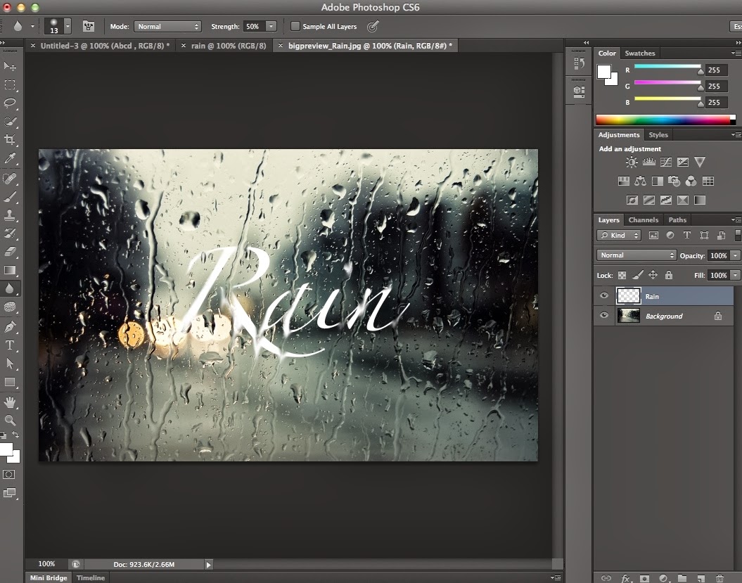
I decided to use an image of rain on a surface and try to make the text which would appear to be on the image look like it was running down the screen.
I used the smudge tool again and followed the rain drops down so that when it met the text it appeared to be running down the glass.
This is the final effect, showing the progression of text manipulation.