Danielle Blasse 7010 - Cloe Pace-Soler 7352 - Rebecca Holloway 7279 - Natasha Welch 7399
Townley Grammar School - 14109
Showing posts with label poster. Show all posts

Friday, 31 January 2014

Final Tweaks on the poster

 Looking at our final poster, we felt that the title was not big enough and this made the whole poster seem a bit lacking. Although there is not much space to make it any bigger we thought we could put parts of the title on different levels as this would also make it look more chaotic.

1) First of all, I made a duplicate copy of our poster so that we could make changes without losing the original poster in case it went wrong.

2) Then, I deleted the title so that I could insert it in again without it being in the way.

3) I opened the image of the title typography and then dragged each letter in individually.
4) I used the 'Free Transform' tool so that I could make it the right size for the space that was available.

5) Finally, I used the 'Rotate' tool to make some of the letters more wonky and twisted than the others as this made it look more delusional.

Evaluation


  • The result of this makes the poster look much more dominant and noticeable.
  • It also makes the genre come across more clearly as it looks more psychological.
  • This also uses the space that we have available more effectively.

Thursday, 19 December 2013

Making the Poster A4


-One thing I noticed when creating the poster was that the image was square, I realised we wouldn't be able to use if it this was the case therefore I researched the size of an A4 sheet and resized the image.
- This meant that the image appeared a bit stretched, however it could just be that it looks different to the previous image and wouldn't be that noticeable if someone who had never seen the poster before looked at it.
- When I did this I then noticed that the title was obviously too big and the typography didn't fit, therefore I had to resize all of this as well and so that it would look okay.
- However now all the typography looks squashed therefore I will need to create the tagline again on the poster so that it is the correct size and so that it doesn't pixilate and then I will need to drag the title 'UNHINGED' back onto the poster.
- Because I had to reinsert the tagline I then decided to play around with the shadows and blurriness of the text.

- In the tagline below I duplicated the layers and made the second one extremely blurry so that it would be a shadow underneath the text.
- I then made herself blurrier than the rest to show that the line between what is real and what isn't is very fuzzy for our protagonist.
- I then also inserted images of the production companies we are using and put them in the gaps visible on either side of the text.

Friday, 13 December 2013

Finalising the poster

Step 1:
First of all I started making the bottom credits for the poster.
To do this I needed to download a suitable font, similar to all the other bottom credits. For this I chose Universal Accreditation.
I then created the two tier words such as 'executive producer' and followed this by all our names.
The font colour was changed to white and the overall font size was made no. 17.

Step 2:
I then added in the typography which Danielle made earlier. I separated the line into two sections so that it would fit into the poster.

I narrowed the text a little bit so that it was more spindly.
Finally I added into the poster the final word 'herself' and I made this slightly bigger than the rest of the text so that it stood out and was noticeable as this was our main concern.


Evaluation: 
Altogether I think this poster is suitable for our trailer, however I feel like I might need to tweak how the typography is positioned on the page as 'herself' should probably be a bit lower down, perhaps even sitting on 'Unhinged.'
Another issue is that because the tagline was done in another project meant that when I transferred it onto the poster it was a bit distorted, therefore it probably has to be redone on the poster.


Thursday, 5 December 2013

Inputting typography into our poster

Inputting typography into our poster

Once deciding on our typography - Dark Ages - we needed to be able to manipulate it sufficiently and input it onto our poster successfully. To begin with we opened up a 2000 x 3000 transparent background on Photoshop and inserted each letter of the word "Unhinged" individually. By doing this we were able to manipulate the typography in greater detail, rather than as a whole. An example of this would be the "N" and the "E" that we decided to flip in the opposite direction, using the "free transform" tool.


I then moved on to manipulate the typography in much greater detail. We decided to go to gallery and choose stylize - wind and chose blast from the menu. This created a windswept look through all the letters on the right of them. This created a worn out and unsteady look therefore grasping the concept of the protagonist in out trailer.


After we were satisfied with our typography. We dragged each layer of letters onto our poster image. One thing that we did have to bare in mind was the sizing of the title which we had to vary many times for it to fit perfectly on our poster image. When we inserted the letters onto our poster we realised that the sizing of the letters looked better when there was a little variation. Therefore, we made sure that the sizes of the letters differed from each other slightly to get across a sense of instability.


To the left is an image of our poster image with the manipulated title inserted onto it. Overall, we are all very happy with this attempt of the typography of the title. It works extremely well with the lighting in the main image too!

Monday, 2 December 2013

Layout Sketch of the Poster

Option 1

This option features the title at the top of the image, in front of the wall, with the tagline split into three parts and separated in a broken up, staggered manner.
Pros
This option makes the eyes travel across the poster as the words are staggered, which means they are more likely to take in the poster.
Has a fragmented feel with fits in with the genre.
Cons
The option makes the poster look a bit empty and sparse, especially as there is no wording at all in the second half of the poster.

Option 2

This option features the same method as above, howevr with the three parts of the tagline more spaced out.
Pros
This option again has the effect of making the eyes travel across the poster, even more so as it is more spaced out.
The wording in the second half of the poster makes it look more full and dense, which makes it more professional.
Has a fragmented feel, which fits in with the genre.
Cons
The tagline being so spaced out makes it look unprofessional slightly as it seems too broken up.

Option 3

This option features the title at the top, but with the tagline in two parts, one slightly further down and across the page than the other one.
Pros
This option makes the tagline stand out a little bit more and looks more professional as it is not so broken up. It makes the poster more dense.
The tagline is still staggered which gives the fragmented feel again.
ConsAgain the botto half of the poster is empty, however as it is mostly in shado this is somewhat unavoidable.

Option 4

This option features the title in the middle of the tagline, a third of the way down the image. The tagline is in two parts.
Pros
This option again makes the eyes travel down the page.
It makes the poster look more interesting to look at as the title is not in the conventional place at the top, which suits the genre.
Cons
The title being in the middle of the tagline may make the reader confused as to what the tagline is.

Option 5

This option features the tagline in two parts in the top half of the poster, and the title in the bottom half, slightly tilted so it follows the line of the shadow.
Pros
This looks slightly more interesting than having the title in the conventional position. It also fits in with the genre by having it slightly tilted as it indicates an aspect of a twisted mind.
Cons
The title is hidden by a shadow in on the left side, which makes it hard to read. Therefore, we would have to somehow edit it or make the title smaller to avoid this which may look unprofessional.

Evaluation

Looking back, I think Options 3 and 4 are the most effective layouts as they make the eye travel, as well as looking professional and interesting. On top of this, there are no issues with lighting or readability in relation to any part of the image. The fonts and sizing of the text would be changed to fit in with the genre so it looks as good as possible.

Friday, 29 November 2013

Poster Photoshoot and Editing


 In our last filming session, we completed a photoshoot in the location of the loft, as we thought this would be a good setting for the poster, being where the climax of the trailer takes place. I came up with the idea of having the protagonist tied up to a chair, with tape over her mouth with the anagonist standing above her, as this is the position that the victim is in during the last part of the trailer and so it would connote that the victim is not the only one at in threat due to her condition.

1) First of all, I opened both images on photoshop. I then used the 'lasso' tool and select around the image of the protagonist, trying to keep it close to her outline.

2) The, using the 'select' tool, I dragged this part of the selected image onto the background image, which was the image of the antagonist.

3) The image initially did not match up with the background smoothly and so I made the background invisible and used the eraser tool to erase around the edges of the protagonist, very precisely so that it would look good.

4)Then, I used the crop tool to make the image portrait. I did this as the convention for most psychological films have a portrait poster and we thought it was very important to keep in line with our genre. I cropped the left side of the wall as this had less space than the right, and we also found the prop of the black bucket effective.

5) Then, I changed the colouring of the image using the colour balance tool, making the colour balance -33, 00, +33, which gave it a subtle blue hue which fit in more easily with our colour scheme.

6) I changed the contrast of the image to slightly more saturated, to give a more intense effect. I explored with the 'hue' tool, to see what it would look like with a more chill blue hue, however I did not think this was very effective.


Evaluation

Pros

  • The final image is pretty impressive as it fits in with all the requirements.
  • It suits the genre well as it shows explicitly the character and her imaginary friend, with gives an insight into the plot of her having a mental illness.
  • The props and positioning of the characters hint that one has power over the over, as well as indicating that she is trapped by her illness, and can't do anything about it.
  • The location of the image is a part that will be used in the trailer, so it comes together as a package well.
  • The lighting is low key and indicates tension within the plot. 
  • There is good spacing to fit in the title and tagline on the wall, which is effective.

Cons

  • The large amount of shadow in the image will make it hard to add text in all areas, however the shadow is also very effective to the visual look.
  • The shape of the poster is not thin and tall enough to be the conventional size of a poster, but this will be very hard to overcome and so we will probably keep it how it is.


Thursday, 14 November 2013

Photoshop Poster

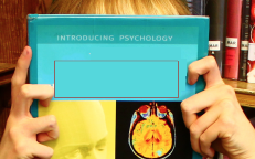
When filming in the library, we took a few shots of the protagonist and a book to convey her quiet and bookish nature. We specifically chose a book which was about psychology and the brain, so that we wouldn't have to edit out any irrelevant pictures and it would be good to indicate to the audience the genre of the film. For some images, we made the protagonist simply hold the book and look away or at the camera, but for some we made her hold the book over her head. We thought this would be effective as it would give the impression that she's 'lost her head' and as the book will feature the title of 'Unhinged' it would convey that it has taken over her brain and mind.

1) First of all I created a rectangle to cover over the title of the book, so that we could therefore replace it with our title and typography. I used the colour picker and chose the exact colour of the book to do this so that it would blend in and not look unprofessional. This proved to be a bit tricky as the actor's hands were in the way of the text, however I could not go over the hands with the rectangle, and so I had to go around this by using more than one.

2) Then, I inserted the typography of our title over the rectangle. I did this by selecting File > Open and then opened the image of it on a transparent background. Then I used the Select tool and moved it onto the current image.

3) The title of the movie came out too big to fit onto the book, which didn't look very professional. Therefore, I used the free transform tool to make it smaller, and also make it look taller and thinner so that it was more suitable for the image.

4) Then, I inserted the names of the group at the end of the book, using the Text tool. I used the colour black and the font that we decided on for the tagline, which was 'Daubmark'.

5) After this, I inserted the tagline, using the 'Daubmark' font again. I made this white as it stood out better from the background, which I darkened using the Brightness/contrast tool to make this even better. Then, I used the text wrapping tool to make it slightly arched, which adds a bit more interest.


Evaluation

Looking back at the complete image, it doesn't seem like something which we'd eventually use as it does not convey the psychological genre as well as it could, and could even be the poster of a romance film, being set in a typical library. As well as this, with the constrictions of the size of the book, the title of the film is not very big and doesn't stand out in the way that I'd like. However, this would not be easy to overcome if we used this idea. The poster does not convey the horror/ominous side of the film.


Sunday, 3 November 2013

Indepth poster ideas

For our poster we have taken into account the various locations we could use and have come up with the following ideas as a base. These can be used to take practice shots in each filming location, as we film, and then see what works best, it gives us at least three possible options.

We still have the ghosting idea, as mentioned in previous posts, but we have also come up with a few more.

In this idea, we would have the protagonist's face in the centre, with lots of other smaller images, perhaps conveying different emotions, and we could try and achieve a kaleidoscope effect to show the protagonist's warped view on her situation and also hint at the idea of her imaginary friend. The director's information would be displayed as an overlay in the bottom box, the tagline would depend on if there was a kaleidoscope effect or not, and would have to be placed where it could be viewed clearly. 


This poster idea has two variations for the placement of the tagline. We would use the alleyway location to shoot this, with a photograph taken from the same position to show the protagonist with her imaginary friend following her. The use of the alley way would convey to the viewer that the protagonist is never alone, and wherever she goes, the imaginary friend follows, this also brings in the idea of no escape. This could be shot at night or at dusk, to add an eerie feel to the poster. The tagline could be placed in two positions, one in the places above, or below you can see I have marked out areas where it could follow the fences/walls of the alleyway, so it causes the viewer to look more closely, and hopefully for longer. 


Finally, another shot which could have a light source from below, above or one side, is the idea that we only see the protagonist's eye. In the reflection we would see the protagonist's imaginary friend looking very scary - almost demonic, making sure our genre is portrayed through the poster. I think this could be quite effective as it would make the viewer want to find out more, who the mystery girl is in the reflection. If we were extremely adventurous, although I do not think it is possible, we could actually use Photoshop, a vignette effect to give the impression we are inside the eye looking out. However this would be extremely complex, and I think the initial reflection idea is much more realistic. 

Friday, 25 October 2013

Photoshop Trial: Editing

As well as ghosting the image and editing an image of the protagonist inside her own eye, another idea was to have two images of the protagonist- with one standing dauntingly above the other to show the power relationship between the two and indicate that the imaginary self is controlling the other. Using the photographs that I took previously, I decided to try and edit this poster idea, to see how it looked and therefore help us decide whether or not to use it for the final poster image.

Steps
Step 1: first I used the lasso tool to bring the close up shot of Natasha over to the other image. 


Step 2: Once I had done this, I used the rubber tool to rub out the edges of the image that weren't needed and I finished with an image of Natasha's face.

Step 3: I then cropped the image with Natasha standing so that there wasn't a big gap on the side of the image.


Step 4:
This then left me with this image, which i edited a bit by making the background image darker and by increasing the contrast, if this was our final image the background would probably be much more distorted in order to show that she is imaginary.

Thursday, 24 October 2013

Poster Image Initial Plan

This post is looking at our initial ideas for the image we want to be used on the poster for our teaser trailer.

Here is our initial sketch.

For our film poster we will base it on one of the ideas Danielle used in her Photoshop posts, using the ghosting effect to having two images of the protagonist on top of each other, adding to the psychological feel. We will also incorporate the typography ideas I have come up with for the title of the film and tagline.

Friday, 18 October 2013

Poster image: Ghosting on photoshop (trial)

Poster image: Ghosting on Photoshop


After finding a  tutorial on how to create a ghost effect on Photoshop, we decided that after finding a suitable test image to try it out on - it would be effective as a poster image.

 I started by inserting the test image of our protagonist. I then used the "Pen" tool and outlined the protagonist therefore eliminating the background of the image. Following this, I selected the "mask" option at the bottom right had corner and then refined the mask, making it look less harsh and more realistic.


I then selected "filter" from the tool bar, "filter gallery", "stylize" and selected "glowing edges" which made the image appear black and the detailing of the image colourful. I then went to "filter" again, selected "stylize" and "diffuse" - "anisotropic" which made the colours a lot more predominant.


Then I selected "image" on the tool bar, "adjustments" and then "Channel Mixer" in order to select "Black and White with a Yellow Filter" from the list - this eliminated the coloured outlines on the image making it monochrome. After this, I went to the filter option, selected "stylize" and then chose "solarize" and then added "gaussian blur" to it and adjusting it to 7.8 so it gave off a convincing ghosting effect. 


We then duplicated the layer of the first image of the protagonist and set it alongside it - using the smudging tool to create a winded effect. However this proved to ruin the outcome of the image.
We then selected the filter option and then chose the wind effect to achieve the look that we were hoping for. However we wanted to convey that the two images drew a distinction somehow. 

To do this we chose invert from the adjustment panel on the right hand side and applied it to layer copy 6 and it changed it to a white version. Although, this was not the look we were hoping to achieve. In order to over come this next time we will have to do a trial run on a smaller object.


Poster Editing: Trial

I looked at the pictures that Cloe took and decided to play around with the idea of an image in an eye which Danielle started before with an image of a generic eye and a forest. I decided to take it further simply by using a picture of the actual Protagonist's eye, so it would be more like how the final poster would turn out to be.
I decided to edit an image of the protagonist screaming inside the eye to indicate that there are two versions of her and that she is trapped inside her mental illness and can't escape.

Steps:

1) To start with, I opened both images up in Pixlr, the editing software I used in place of photoshop, for the ime being.

2) I made the second image smaller, so that it would be the right sixe to fit inside the eye.

3) I used the lasso tool around the second image, then used the select tool to move it across into the first image of the eye.

4) I used the Free Distort tool to move the image inside the eye properly, and also distorted the image a little but stretching it to make it look a bit more creepy.

5) I used the erase tool all round the edges of the second image so there was none of the background inside the eye which would have made it look unprofessional.
In the layers box, I reduced the opacity of the second layer so that it was half transparent, making the eye visible behind the layer on top. This also made the shininess of the eye visible which made it look much more realistic.

Evaluation:

The image is okay for a starter but we wouldn't use it as a final image for the poster as it looks quite comical and the image inside the eye doesn't look as distressing as it could. The image doesn't quite convey the emotions that we would like in our poster as it doesn't look very dark, not depicting the horror side to the trailer.

Monday, 30 September 2013

Planning our film poster

Film Title Choices:

  1. Unplugged
  2. Disconnected
  3. Unhinged
  4. The Broken Truth
  5. Trapped
  6. From the Shadows
  7. Between the shadows 
  8. Forgotten
  9. Fractured Mind
  10. Double Vision
  11. Double Demons

Skills in the group:

  • Rebecca - typography
  • Danielle - photoshop main image
  • Cloé - Photography
  • Tasha - photoshop framing

Image ideas and manipulation:

  • Photo of protagonist doubled, ghostly. hinting at the imaginary friend
  • Protagonist being strangled by herself
  • Reflection of evil self in glasses/eyes. 
  • For certain titles, they could be made to look like wire shaped like the name we pick and then a plug socket in the corner. 

Thursday, 19 September 2013

Effective typography from film posters


For our trailer, poster and website we need to find a consistent typography to use which will fit with the genre of our work, and have effective connotations, linking to our plot if possible. I have decided to look at other film posters to analyse their typography and see what ideas we can gain from it.

When looking at the typography used in 'The Ring' film poster, we can see that there are two different style being used. The tagline is in a modern looking font, it is very plain and the capital letters make it stand out. The contrast in colours also make it stand out against the back ground. It is important to look at the size of the font too, it is quite small in comparison to the actual name of the film, ensuring the viewer doesn't get confused between the two. The positioning of the tagline is very clever, it is placed at the top making people naturally read it first, it also means that the finish the sentence when they read the title of the film, linking the two together effectively. The typography used for the title of the film is made to look handwritten and appears to be very childish hand writing, perhaps hinting at parts of the story line before the viewer has even seen the trailer. This works well because it is quite large allowing people to see it from a distance, but also the contrast again ensures it is seen and stands out.


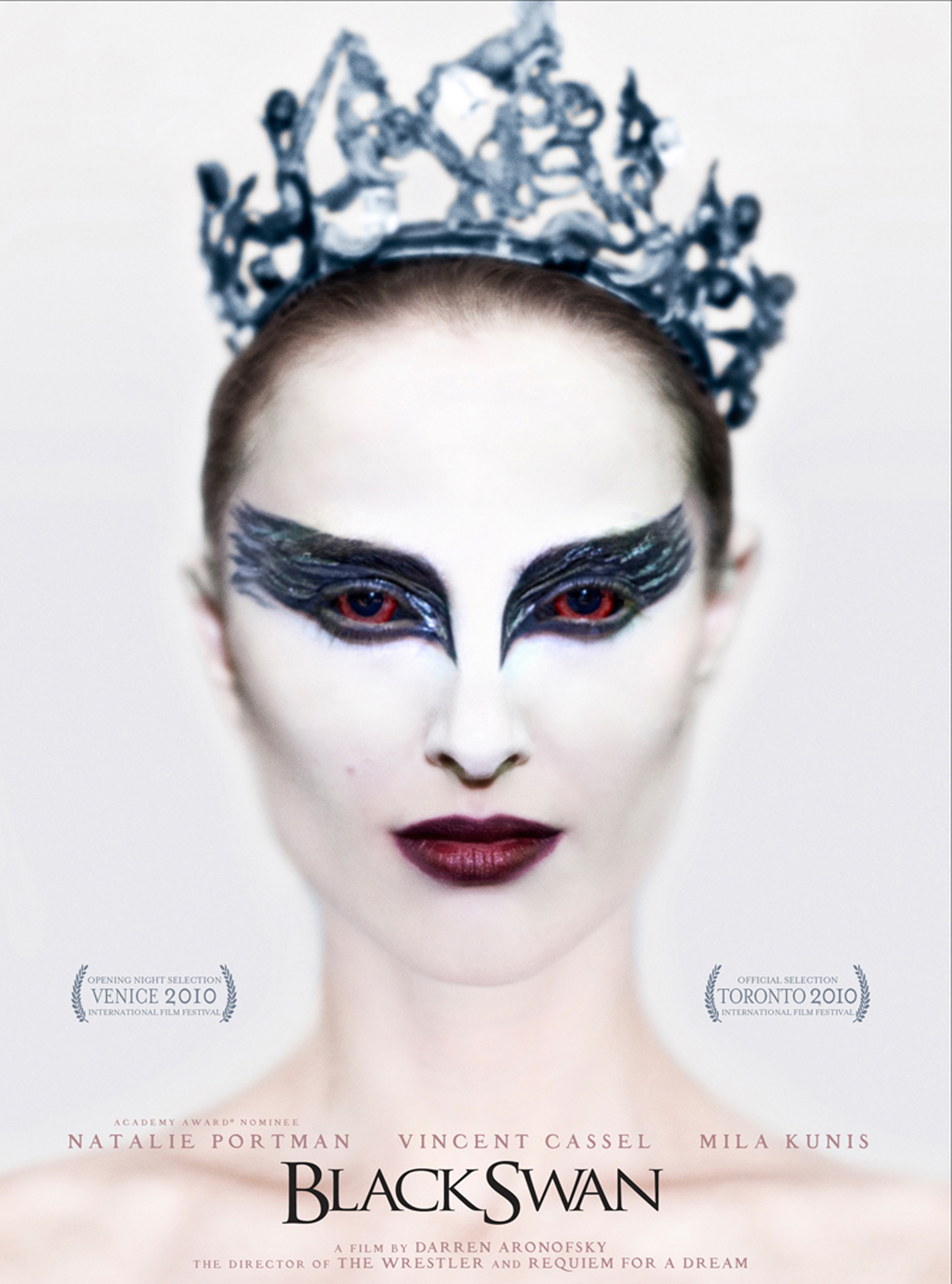
The typography used in 'Black Swan' is very effective because of the colours. The main feature of this film poster is the close up of the protagonist, this does mean that the title is quite small, and is definitely not something will be distinguishable with the film however it is effective because of the bright white colours used on the poster. This contrasts with the black letters, which due to the fact that they are capitals portrays quite a strong, powerful idea. This film poster has no tagline, and the font used for the actor's and director's name are the same as the title but with a greater space between each character making them seem different. The names shown on the poster do not stand out because of the pale red colour used, showing that the creators of the film poster want to keep the focus on the close up image of the protagonist.


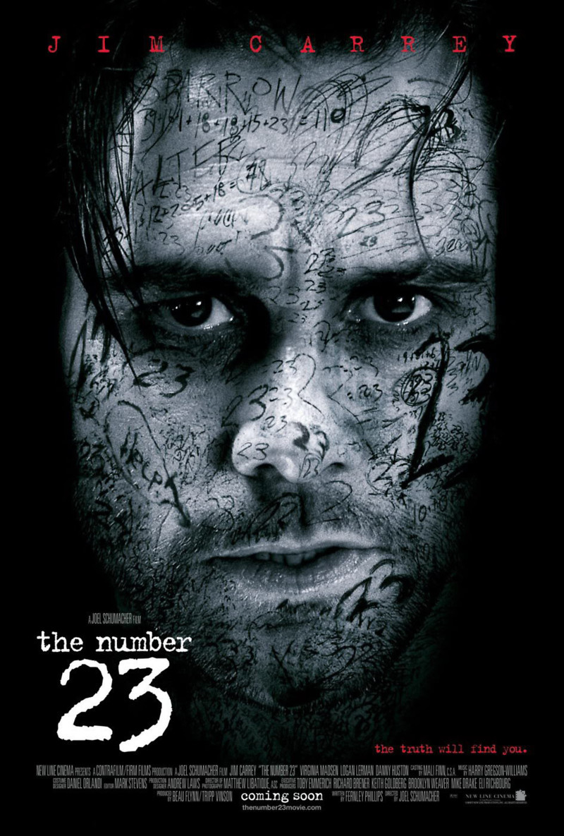
In this poster the typography is varied. Jim Carrey's name is displayed in red and is very big at the top of the poster showing that the creators of the poster want to draw the audience's attention to their protagonist. This is combined with the close up shot of him as the main image in the poster. The idea of this and the tagline being in red suggest that there is danger in the film and to the actor that Jim Carrey will be playing. The title is not in capitals which is a contrast to the typography used at the top of the poster, is suggests that the attention should be on the number '23' instead of any words, which is why it is scrawled all over the face in the poster. The use of white font has been used to contrast angainst the dark, almost black background, this works really well as it draws in the eye of the viewer and makes sure it is clear from a distance.


In this film poster the same typography has been used for the tagline, title and actor's name. The difference between them is that the tagline is in black and is very small. This is obviously not what the creators want to draw the most attention to. The main actor's name is in a medium sized font and is in white, again creating a contrast so it stand out and is just above the title. We can therefore tell from this that the film makers want to reach out to fans of the actor and get them to watch the film. The actual title of the film is still in white and is much bigger. 'Mind' has been made ever so slightly bigger but is connected to the rest of the title showing how the typography has been manipulated.

For our film poster it is likely that we will have a dark area due to the nature of our genre and plot, so I believe that by using a white font will be the most effective as it will be clear and draw the reader in. A convention of film posters is that the tagline is red, so we could use this too elsewhere on our poster.

Sunday, 14 July 2013

Deconstruction of Posters- Natasha

Harry Potter 7: Part Two

 Image:

•The majority of the shot is taken up by the characters who are well-known.
•Characters are head-on which indicates a feud, however they are at an intimate distance showing that they probably have a long history.
•The wand in the middle separates them but indicates something supernatural in the genre.
•Supernatural green hints at the magical element, cloudy in the background indicates troubling times.
•Red flames at the bottom which shine on the character’s faces and the cuts on their faces shows that it’s going to be a passionate battle and there will be bloodshed.

Typography:

•No title and short, serious tagline which plays upon the fact that everyone knows what it’s all about. Also shows that it’s been long waited for.
•Has the date of it’s release.
•White text which contrasts against the dark background, it’s also in capitals which gives it a dramatic edge.
•Lacks any other text, makes it very simplistic yet powerful.

Human Centipede 2

Image:

•The background is very white which emphasises how disgusting the centipede looks.
•The white gives the impression that something pure and innocent is being destroyed/dirtied.
•The centipede is symbolic for the theme of the movie and reminds people of the first one.
•Automatically quite gruesome which indicates the genre.

Typography:

•Completely minimalistic, the tagline is in the centre and the centipede’s direction makes the eyes travel down to it.
•Tagline is small and it’s a bold statement.
•The full stop at the end makes it blunt and adds impact.
•The black contrasts against the white background and it is in capitals.
•The title of the movie has been abbreviated so it promotes fan ownership as the audience is meant to figure it out.
•Overall the poster is minimal and only has the basic information.

Sinister

Image:

•A drawing which looks like it has been scribbled down.
•Background looks blood stained which indicates bloodshed and trauma.
•The face is demonic and looks evil with very sharp eyebrows and allows the audience to know there is a terrifying antagonist therefore will attract the horror fan base.
•Uses the tradition horror colours of red, black and white, so the audience knows what to expect.

Typography:

•The title seems rather religious and archaic.
•Block capitals and white which stands out from the dark background.
•Tagline is small, rhetorical question. Mysterious element about it.