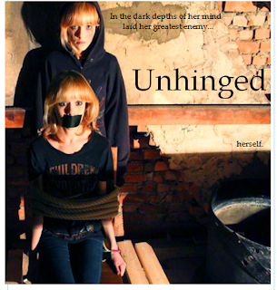
Option 1
This option features the title at the top of the image, in front of the wall, with the tagline split into three parts and separated in a broken up, staggered manner.Pros
This option makes the eyes travel across the poster as the words are staggered, which means they are more likely to take in the poster.
Has a fragmented feel with fits in with the genre.
Cons
The option makes the poster look a bit empty and sparse, especially as there is no wording at all in the second half of the poster.
Option 2
This option features the same method as above, howevr with the three parts of the tagline more spaced out.Pros
This option again has the effect of making the eyes travel across the poster, even more so as it is more spaced out.
The wording in the second half of the poster makes it look more full and dense, which makes it more professional.
Has a fragmented feel, which fits in with the genre.
Cons
The tagline being so spaced out makes it look unprofessional slightly as it seems too broken up.
Option 3
This option features the title at the top, but with the tagline in two parts, one slightly further down and across the page than the other one.Pros
This option makes the tagline stand out a little bit more and looks more professional as it is not so broken up. It makes the poster more dense.
The tagline is still staggered which gives the fragmented feel again.
ConsAgain the botto half of the poster is empty, however as it is mostly in shado this is somewhat unavoidable.
Option 4
This option features the title in the middle of the tagline, a third of the way down the image. The tagline is in two parts.Pros
This option again makes the eyes travel down the page.
It makes the poster look more interesting to look at as the title is not in the conventional place at the top, which suits the genre.
Cons
The title being in the middle of the tagline may make the reader confused as to what the tagline is.
Option 5
This option features the tagline in two parts in the top half of the poster, and the title in the bottom half, slightly tilted so it follows the line of the shadow.Pros
This looks slightly more interesting than having the title in the conventional position. It also fits in with the genre by having it slightly tilted as it indicates an aspect of a twisted mind.
Cons
The title is hidden by a shadow in on the left side, which makes it hard to read. Therefore, we would have to somehow edit it or make the title smaller to avoid this which may look unprofessional.


No comments:
Post a Comment