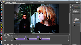
Because the background image for our poster features important points on both the left and right hand side, it makes it very hard to arrange everything while keeping it in place. Combining this with different screen sizes makes it almost impossible to position everything correctly, mainly the actual YouTube window for our trailer to be shown in. After researching for a little while, I found the magnet tool on the settings window of the YouTube window. This stuck it to that part of the background, I then checked on both a mac, windows computer at school, and my laptop that it stayed in position, solving our arrangement issues. I then applied this effect to other parts of the web page, such as the reviews and social networking links to ensure everything stayed in place.
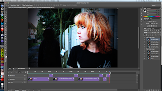
 After looking at websites made by previous media students, we noticed that they had made the most of their background and had used it to add some more exciting elements to the web page, such as a time lapse in the background. Our back ground image isn't really suited to this, however, we did think about trying to do something with our protagonist's imaginary friend. Since she is wearing a black jacket, it means that if we blacked out her face, it would look like a dark shadow approaching in the background. We decided a flickering effect would work quite well on our website.
Firstly, I used Photoshop to create a new version of our final photograph, where the imaginary friend was just a shadow in the background. I then had two potential methods of creating the effects with the two images, I could either set up a slide show in the background using both the images, however after trying this out, I realised that I couldn't get the two pictures to change quickly enough for it to look good, so I then created a gif in Photoshop using to the two images.

I preferred how this looked much more, and it meant only one file had to be uploaded to the website. Therefore I used this and it can now be seen on our published website.
There were also a few minor changes I made to the website, such as giving the reviews sources, and moving the end of the tag line to fit with the first half, as it became misleading, and was following the conventions of a poster rather than a website.


No comments:
Post a Comment