2) I used the Keyer tool on the protagonist clip, and then dragged on the image of the antagonist in the background. This made sure that the image of the protagonist was in front of the other clip, to avoid it looking unrealistic. I then had to export this clip before I could put a background image on.

3) I chose the background of the shot as a picture of a padded cell, as I thought this would look effective against her pacing as it would show her to be in a room which makes it look more 3D and effective than against a flat 2D background.
4) I put the 'Keyer' effect on the green screen image, which enables me to change the background.
 5) I used the 'crop' tool on the padded cell image, to remove the black borders around it as this made it look unprofessional. I cropped the image 16.5 pixels on the bottom and 16.5 pixels on the top, which made it perfect for the image.
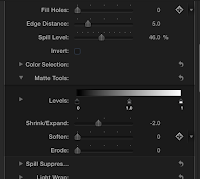
6) Then, I had to make sure the green screen image was smoothly in front of the image. I played around with the 'Keyer' tool and made sure that 'Fill Holes' was on 0, Edge Distance was on 5.0 and Spill level was on 45.%.
7) It still seemed after this that there was a grey hue around the head of the protagonist. Therefore, I used the Shrink/Expand on -2.0 to get rid of this issue.
8) I did the same thing on many other clips, playing around with the setting to make some elements transparent in order to see what style I liked best.
This is an example of using a different style of 'keyer' called 'Luma Keyer' which makes the image in front much more transparent and luminous. I thought this style could maybe be useful to convey the distorted, hazy nature of her mind.
Evaluation
Pros
- The pacing clip in front of the padded cell image is effective as it conveys how she feels trapped within her own mind and can't escape from her illness.
- Having the antagonist in the background standing still makes her seem ominous and therefore aids the psychological genre.
Cons
- If we were to film again, I would like to try and film with more of a Full Shot as it would maybe look more realistic, however this isn't much of a problem.
- The pacing clip is a little too slow for the montage as all the clips need to be fast to fit in with the fast, dramatic pace of the scene. Therefore, we need to speed up the clip in some way to fix this.


No comments:
Post a Comment