Danielle Blasse 7010 - Cloe Pace-Soler 7352 - Rebecca Holloway 7279 - Natasha Welch 7399
Townley Grammar School - 14109
Showing posts with label question 2. Show all posts

Monday, 31 March 2014

Evaluation Question 2 - Danielle

Evaluation Question 2

How effective is the combination of your main product and ancillary texts?

  • The combination of our teaser trailer and ancillary texts is effective as a cohesive package. During the planning and production stages of our trailer, website and poster we decided to avoid the conventional black, white and red colour scheme. Instead, we opted to adjust saturation of the images for our poster and website to illustrate the psychological notion of our trailer. This idea was established through trailer deconstructions such as Dark Water. 
  • Prior to producing our typography for our coursework we carried out multiple typography trials in aid to select the most effective typography to work with our trailer, poster and website. However, an issue that we did face was the manipulation of the text without it looking too unprofessional. We also carried out extensive font research of we had a bare basis to work with when manipulating our typography. We chose to use a font called Dark Ages as it was simplistic enough to manipulate. With the use of Photoshop we were able to achieve the typography we wanted by tiling, flipping and editing specific letters for it to fit the title “Unhinged” effectively, therefore we flipped letters around and manipulated their spacing on our poster and website conveying the detached nature that the narrative entails.
  • In terms of our typography for our tag line, we need to make sure that it is different from the typography that we used for our title. 

  • We decided to use the font called "OldStyle" as we thought it was basic enough to manipulate and it also fit in well with the rest of our chosen typography. I started off by opening up a new file in Photoshop and making sure that my canvas was transparent therefore allowing it to be transferred onto our poster without any fuss. When typing our tagline into Photoshop, we decided to separate "herself" from the majority of the tagline so it would give us the option to move it around our poster.
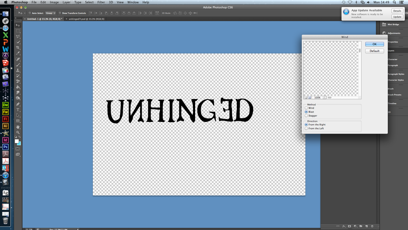
  • In order to manipulate our typography we applied a "wind" effect to our tagline. To do this we went to filter - stylize- wind and then selected wind from the menu going from the right. This made the typography look extremely worn out. This fits in well with our poster and our title as the mise en scene looks worn out as does our typography for our title. 

  • This is the finished typography. In terms of manipulation it doesn't show how it has been manipulated explicitly. Overall, this is not as effective as it looked in Photoshop, however it fits in extremely well with our poster. 
  •  With the use of Photoshop alone we were not able to achieve the typography that we had hoped for – we ran into problems such as not knowing which kind of typography fit our genre. We ended up only using the smudge tool to manipulate the typography by smudging and smearing the colour of the typography from the corners of the letters. From producing the typography shown on the right,  we were not convinced that it showed off our ability to manipulate typography or if it was in fitting with our genre enough. To overcome this we chose 3 different fonts from Dafont.com and manipulated them yet in accordance to our 3 ideas seen here none of them proved to be adequate enough to suit our package as a whole. After using various tutorials online that showed us step by step on how to achieve a typography that we wanted we applied the same procedures to our chosen font and were left with. 
  •  A cohesive media package requires the same typography to be utilised throughout all products, which we have done. We used the font Dark Ages as our foundation, as seen on the right, which we downloaded, from the well-known font site, Dafont. From this we were able to manipulate our chosen font however we pleased to fit our package. Due to our inexperience using Photoshop to manipulate text, we started by only using the smudge tool, which quickly proved to be inadequate if we wanted to stretch ourselves. Therefore we explored the endless possibilities of what we could do with our typography. After thoroughly researching our ideas, we decided to keep our manipulation to the text extremely simplistic as our ideas were beginning to seem too elaborate, making the text unclear to read and unfitting with our package. 

  • Overall, as a cohesive package our main product and ancillary texts compliment each other. In the sense that the trailer, poster and website carry the high saturation levels, same typography and incorporate the same title and tagline. 

Thursday, 27 March 2014

Evaluation Question 2 - Rebecca

2. How effective is the combination of your main product and ancillary texts?
When developing the various different areas of our products, we needed to ensure that they all linked together, to complete a professional looking promotional package for our teaser trailer, poster and website.


Colour Scheme
First of all, we ensured that the colour scheme of all our work fitted together well. During our research and planning stage, we noticed that one of the conventions of a psychological horror, was to have a fairly dark colour palette.

Colour Deconstruction
"The saturation isn't very high, and there isn't a great contrast either, however the brightness is still high enough so that the viewer can see all the features of the character's face. The lower saturation immediately gives quite a dark feel to the shot, by no means is this a happy experience, and the feelings of sadness, depression and pain could be portrayed through these colours. I think this is definitely a technique to consider when editing the final montage shots for our trailer, and to make a distinction between real life and our protagonist's imaginary friend"

"We immediately get a sense of dark foreboding atmosphere from this shot, and most of it is portrayed through the colours - this could be used as a build up in our trailer. The low saturation makes the scene quite dreary, however the contrast is very high in this shot, making the black and white stand out, and helps draw the audience's attention to the dominant parts of the scene. The colour temperature is also very low, and we can see this and the lack of saturation by looking at the washed out red door on the right hand side of the frame. The high contrast also makes some parts of the frame, especially the background appear in very dark shadows, creating a sense of danger and mystery in the shot"


Implementation
For this, throughout our teaser trailer, we edited the colours of several shots to make them appear darker, as well as shooting in dark locations, such as a loft, for the end scene where we witness the after effects of the kidnap. We then wanted to combine these dark colours with the images used on both our poster and website. For our poster, we decided to use a photo taken in the loft of the protagonist and her imaginary friend, as this suggests isolation and danger to the audience. We also like how this links to one of the most important scenes of our teaser trailer. For our website, we used a different image as the background, as wanted variety, however, so that our products link together, we used the same idea of our poster, and included both the protagonist and her imaginary friend in the same image. We also made the edges of the image very dark, to bring in the use of a darker colour scheme, showing conforming to the conventions of psychological horror.

Tag line
To ensure that the combination of our main product and ancillary texts is effective, we also had to ensure that the tag line was the same throughout all our products. We decided that we would not use our tag line in our actual teaser trailer, because we already had a sufficient number of titles throughout the trailer, and didn't think it would be appropriate to overwhelm our audience with text throughout the trailer. Therefore we needed to ensure that the tag line for both our website and poster was the same. This was simple enough, but we decided instead of having the tag line all on one line, we would split it, to make it more interesting for our audience. You can see how the tag line looked on the website before splitting here, and what it looks like after splitting here. We also split the tag line up on our poster, as we had slightly restricted room on the poster, so this was another benefit of having the tag line spread across several lines. You can see how the tag line appears here. This makes the combination of our products effective, because the audience will see a similar layout whenever they see our poster or visit our website, and this familiar layout will help them to remember our film, and want to watch the teaser trailer.

Typography
Throughout all three of our media products, it was really important to incorporate the same typography into each, so that they all look the same and you can tell they are part of the same promotional package. For this, we created our typography in Photoshop, and decided that we would have a font for our titles in the teaser trailer, an edited font for our title and tag line typography, and another very simplistic font for the rest of the website.

Here you can see how we went from a drawing to a basic design of possible typography, using the online service Pixlr Editor. This was good for playing with ideas, as it was easier to use than Photoshop and allowed us to practice with different typography manipulation before deciding on our final idea.

There was a while during the development of our typography where we played with the idea of using a inky looking typography, because we thought this would fit in well with our narrative and hint at the idea of kidnap. You can see here how we experimented with this idea. However, we wanted to make it look really professional, and this trial didn't meet our expectations, so we moved on and created this, which is much more uniform and fits better with the conventions found in typography of products also in the psychological thriller genre.

For our teaser trailer, we used the same font, 'Dark Ages' for all our titles, we felt that this fitted with the narrative of our teaser trailer, and it also fitted well with the font 'Old Style', which we used to make the tag line with. We also felt that the tag line and title had to be different, as we noticed this was a common convention of film trailers and posters. There were many stages during the development of our typography, as we encountered quite a few problems along the way.

Combining our three products
When comparing our three products, we wanted to make sure that there was consistency with how we had laid out various parts of them, such as the typography. This was the main thing we had to focus on when checking that the combination was effective, so we decided to utilise the space on the right of the poster and the website to place the title of our teaser trailer. This meant we could use the same positioning of all the letters, and our audience would be able to quickly identify that the website and poster were for the same film.


Monday, 24 March 2014

Evaluation Question 2 - Cloé

How effective is the combination of your main product and ancillary texts?
  • As well as a 60 second trailer my coursework group and I also had to create a website page and a poster which all had to effectively match one another. 
Reinforcing the Narrative
Trailer
  • We included the protagonist's imaginary friend in all of our media texts. Firstly in the trailer we did this through chroma keying. When creating our initial ideas we were set on one thing, including chroma keying in our trailer. We shaped our trailer and package to this key thing so we could play around with new effects. 
  • When first experimenting with chroma keying we used a smaller scale green screen and filmed with a mobile phone. This was extremely unprofessional but we were able to get to grips with how to work the chroma keying effect on Final Cut Pro through this.
  • We encountered simple problems such as not wearing green during the shoot as those sections would be removed with the rest of the green background when editing. We also realised that lighting was key to a professional effect and we have to avoid shadows as much as possible. 
  • Once we understood how to edit the footage we bought our own green screen and re-filmed with our camera on the tripod so it was steady as when initially filming our characters weren't in line with one another. This meant that when we combined them the videos both merged seamlessly and we were then able to progress into changing the background. We felt that chroma keying would encourage the audience to realise our protagonist was imagining these sequences. 
  • At the end we had a sequence in which the imaginary friend would walk in and whisper into the protagonist's ear. This made our protagonist's schizophrenic explicitly clear to the audience. 
  • We also then experimented further and started altering the backgrounds to more surreal, distorted images to explicitly show the audience these scenes are in our protagonist's mind. 
Poster

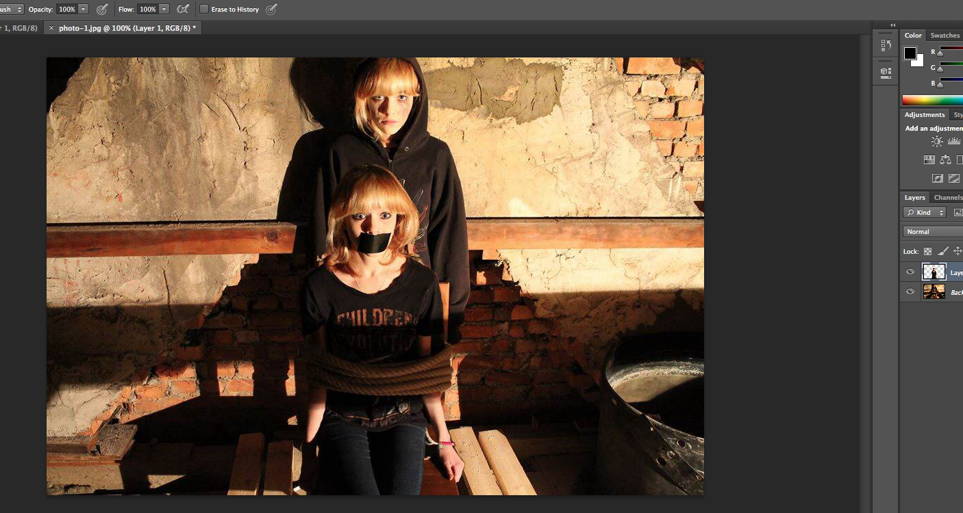
  • Our poster also includes the imaginary friend, this required the use of photoshop to lift one aspect of an image and move it to the other side. We used the 'lasso' tool to cut out our protagonist sitting on the chair and move her over to the second image in the loft. After rubbing out the individual pixels around her and adding some shadows so that it didn't seem like it had been stuck on we had our completed image. 
  • However, our initial image was landscape which did not suit our genre and so we had to alter it to portrait. After cutting both sides of the image and stretching it slightly to make it a4 the poster looked fine. 
  • Our final product was professionally layered and reinforced the narrative with the  inclusion of the imaginary friend. The gaffer tape over our protagonist's mouth clearly tells the audience that she is being controlled by her mental illness and that she is not the villain but the victim. 


Website
  • We also had the inclusion of the imaginary friend in the website image. 
  • When first taking the image we had to use a tripod so the image would be stable and merging the two images wouldn't be difficult. 
  • We had a focused image of our protagonist in the foreground so the audience was able to recognise who our main character was. 
  • We then included the imaginary friend in the background, we did this by retaking the photo with our actor further away from the camera. We then ensured that she was out of focus, therefore showing that although our protagonist's mental illness isn't obvious its always in the background of her mind. 
  • Finally, to add the psychological effect we added visual effects on the image and therefore our genre was clear. This was a gif which blacked the imaginary friend's face out occasionally, therefore adding in a surreal edge.  

Typography

Initial Typography


  • Typography was one of the main areas which underwent many changes. To begin with a font was chosen called 'Dark Ages' which we all quite liked. We then experimented with manipulating the typography in photoshop by blurring the ends of the letters so they looked like they were turning into vapour. 
Development
  • However we noticed quite quickly that although this did look creepy it did not really match our psychological genre at all and so we had to change it. 
  • We decided to go for a typography called 'Old Style' which was manipulated to seem eroded with the effect 'wind' at a 'blast' level. This meant that the typography now suited our genre. Additionally we also used the transform tool to flip certain letters upside down and to make them inverted. This reinforces our genre further as its connotes that something isn't quite right, which is what our title states as well. 
  • In order to ensure all our media texts were matching we had the same typography and effect on the website, poster and trailer.
Further Changes
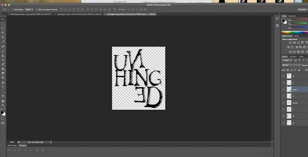
  • We then noticed we had different layouts of the title on the different texts, with the website having the title in white and in a single line, the poster having the title split up on three lines in black and the website having a mix of white and black on one line. This was bad for continuity and so we decided to change the title on the website on three lines and changed the colour to black. This meant that our products were seen as a package rather than separate pieces. 

Colour Scheme 

Initial Ideas
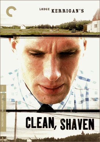
  • Initially we started out researching different colour schemes for psychological genre, and decided that the two examples given were our favourite colour schemes which would accurately suit our genre. We felt the neon colouring would clearly state that our trailer was psychological, however we also felt that the bright white of clean, shaven linked in with hospitals and would demonstrate that our protagonist suffers from a mental illness. 
Development
  • However when creating our website and poster images we strayed off from this as we felt that the content of the image was more important than the actual colours, and that our texts definitely came together as a package due to the presence of our protagonist and her imaginary friend in both images. 
  • Despite this we did have a theme of high contrast, saturation and darkness which made our images come together and match. Both images were altered to seem more grimy and psychological, with dark shadows being highlighted and certain areas becoming harder to see (e.g. the imaginary friend in the background.) 
  • We felt this was better than a 'colour scheme' as it was more professional. They did both follow a theme and have a similar texture to them, however the colouring is different.   
  • Despite this we did maintain the same colour scheme of black and white for the title and tagline, so that there was one main area that was exactly the same, therefore completely tying all our products together. 
  • This theme of black on white is also in the trailer with the titles and the final title at the end. 

Evaluation Question 2- Natasha

2) How effective is the combination of your main product and ancillary tasks.

Typography


Creation
All of our media products combine by using the same typography, which creates an iconic, reoccurring theme and a cohesive package. When we first began designing our typography, we came across one font in particular that we liked, called 'Midnight', as it came across as handwritten, and was quite bold, which would be eye catching on our poster. Then, we manipulated the font by using the smudge tool on photoshop, to put across the impression that the writing was being smudged down the page, which would reinforce the meaning of the title, 'Unhinged.' However, when evaluating the font, we decided that it did not suit the psychological aspects of our trailer, coming across too much like the typography for a slasher.

Development 


Therefore, we went back to the drawing board to create our current typography. Took inspiration from The typography that we theb created used the ‘OldStyle’ font, which we manipulated to turn the letters, ’N’ and ‘E’ backwards, reinforcing the warped, psychological genre, creating an effective overall typography which we used on each of our products, to back up the genre. We also used a 'wind' effect as this made the typography look worn, which suited the setting of the poster and yet again suited the genre. We thought that the typography would suit the poster image, the website image and would also look good on our trailer, creating an effective promotional package.

Final Changes- Poster 


We decided to change the layout for the wording by splitting up the word into three parts and layering them on top of each other, which made them even more effective in unison. This had a much larger impact and was also much more noticeable on first viewing. I also used the ‘Rotate’ tool so that I could make certain letters crooked which came across as though the letters had fallen onto one another, suiting the psychological genre much better.

Final Changes- Website
After we changed the typography for the poster, we realised that the layout was different on the website, which meant that together they did not create a cohesive package. In the poster and website, we initially used different layouts for the typography, with the title being laid out across three lines for the poster and only one line for the website. However, we decided that this meant the typography did not become memorable. Therefore, we created a transparent image of the typography as it was laid out on the poster which we could then import onto the website. 


Colour Scheme

Research

When researching into promotional packages for real media products, we realised that it was important for the all the products to have a cohesive colour scheme. We did a lot of research into different colour schemes of psychological thrillers to see what conventions there were in terms of colour. We found that more traditional films, like 'Psycho', used a minimalistic palette predominantly using black and white across the package. However, more modern films such as 'Enter The Void' made use of a wide range of bright colours. We liked this idea as it connoted surrealism, which is a big theme in our trailer. However, we decided to settle on a darker colour scheme to make sure that the tone of the product was serious, to suit the narrative. 


Development- trailer

Therefore, when planning the colour scheme of the trailer as a whole, we thought it was important to make sure that the overall product came across as fairly dark. When editing many scenes from our trailer, we made use of the colour board, which allowed us to deepen the shadows of the video clip. On top of this, I used visual effects such as 'Cool Tones' and 'Day into Night', to make some footage darker, and with cooler bluer tones. We thought this suited the psychological genre much better.

Development- Poster

When planning the image for our poster, we had to keep in mind that we needed to suit the colour scheme of the trailer. We thought it would be effective to take the photograph in the loft. Many of our initial trials were not successful mainly due to the high key lighting. We thought that by taking the photography in the loft, we could avoid any natural light. This meant that we could buy a lamp which we placed in the corner of the room to create our own light source. This was effective as it meant that the shadows in the image were prominent and creepy, suiting our genre.


Development- Website


After editing the images of the actor together into the same image, we found that it was important to match the colours in the website image to the colour scheme of the poster. The palette we used in the poster, was made up of a dramatic contrast between dark and bright colours which suited the surreal genre. We edited the website image so that the exposure was low, and the contrast and saturation of the image was higher, which made the dark colours appear much darker. On top of this, we used an effect which faded the edges of the photography to black, reinforcing the dark colour scheme. 

Narrative (Imaginary Character)


Research

When researching promotional packages as a whole, we found that an important convention was for each product to reinforce the narrative of the film. This was mainly done by including the key characters from the narrative. In our case, this meant that we were inclined to include the protagonist and her imaginary friend in each of our products. However, this was a difficult task due to them both being portrayed by the same actor. 


Development- Trailer

All of our media products reinforce the narrative by including the imaginary character, a major part of our psychological genre. In our trailer, we did this by using chroma keying, which allowed us to feature the actor twice in the same shot. Therefore, we could feature shots such as a full-shot of the protagonist pacing, with her imaginary self looming in the background. This showed the audience it was this imaginary character that was causing the protagonist a significant amount of suffering. Although this was one of our initial ideas for our trailer, the actual process of creating the chroma keying scenes seemed overwhelming at first, and we had to undergo a lot of research before we knew how to do it. In the planning stages, we had to decide whether we wanted the scenes to seem realistic or surreal. However, we decided that it would be too complicated to create a realistic chroma keying scene as we would have to incorporate real life props in front of a background so that is came across as professional. Therefore, we chose backgrounds which would give them impression that the audience is seeing into the protagonist's mind, which created a more effective product overall as it suited the psychological genre.


Development- Poster

In the poster, we included the imaginary character by layering a picture of the protagonist tied to a chair on top of a shot of the imaginary character standing up behind her. The editing process was difficult for this image as the lighting was unconventional as it came from the right, rahter than above or in front. This meant that when layering one image on top of the other, we had to make sure that tha shadows did not seem unrealistic, and had to meticulously erase the shadow of the foreground image so that it did not inflict upon the background. However, the overall poster image was effective as it depicted certain important aspects of our trailer. For example, it portrayed the imaginary character as having complete power over the protagonist, and showed through the mise en scene -ropes and tape- that she is trapped by the character, and thus her illness.

Development- Website

Finally, in the website image we also included the imaginary character, featuring her in the distant background whilst in the foreground there was a close-up profile shot of the protagonist. However, the lighting of the image was not initially very effective as we made the mistake of doing the photoshoot during the day. This meant that the lighting was high-key (see image), not suiting the narrative or genre of the trailer very well. Therefore, it was important to edit the colouring and lighting of the image before utilising it as the background. Altogether this process was worth it as the outcome was an effective promotional package with each product reinforcing an important element of the narrative, and creating a reoccurring theme. 


Surrealism


Trailer


An important element of the main trailer is surrealism, shown mainly through the chroma keying scenes which show the deteriorating state of the protagonist’s mind. In the initial stages of our trailer, we were doubtful about how to create the chroma keying scenes, however after a great deal of research we found that the best software to use was Final Cut Pro. We recorded many trial versions before finally editing these scenes, by importing our footage, selecting the keying effect and then importing a background for the foreground footage. We decided to reinforce the idea of surrealism by making use of unrealistic background images. For instance, in one shot we use an image of pills as the background. We also used visual effects on the background image to increase the saturation of the colours, which made the image have more of an impact, and also make them slighty distorted, using the effects, 'Bad TV' and, 'Earthquake.' This gave a surreal edge to the overall scene.

Website

We utilise this element in our website image by making the background image a GIF. This allowed us to make the image flicker between the full shot of the imaginary character in the background to a shot of a black shadow in the background. At first, this was not as effective as the GIF flickered too fast, which made it look a bit too programmed, which removed the effect that we wanted. Therefore, we changed the GIF timeline so that it flickered to black less frequently, making it seem more like a trick of the eye. This gives the impression that the character isn’t real, giving a surreal psychological effect which combines with the trailer effectively.