2) How effective is the combination of your main product and ancillary tasks.
Typography

Creation
All of our media products combine by using the same typography, which creates an iconic, reoccurring theme and a cohesive package. When we first began designing our typography, we came across one font in particular that we liked, called 'Midnight', as it came across as handwritten, and was quite bold, which would be eye catching on our poster. Then, we manipulated the font by using the smudge tool on photoshop, to put across the impression that the writing was being smudged down the page, which would reinforce the meaning of the title, 'Unhinged.' However, when evaluating the font, we decided that it did not suit the psychological aspects of our trailer, coming across too much like the typography for a slasher.
Development

Therefore, we went back to the drawing board to create our current typography. Took inspiration from The typography that we theb created used the ‘OldStyle’ font, which we manipulated to turn the letters, ’N’ and ‘E’ backwards, reinforcing the warped, psychological genre, creating an effective overall typography which we used on each of our products, to back up the genre. We also used a 'wind' effect as this made the typography look worn, which suited the setting of the poster and yet again suited the genre. We thought that the typography would suit the poster image, the website image and would also look good on our trailer, creating an effective promotional package.
Final Changes- Poster
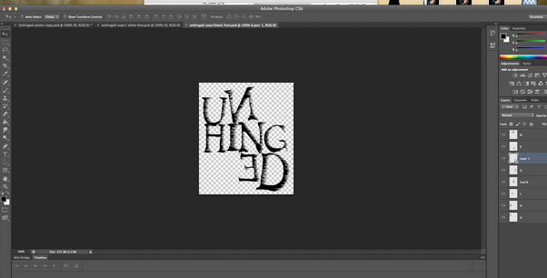
We decided to change the layout for the wording by splitting up the word into three parts and layering them on top of each other, which made them even more effective in unison. This had a much larger impact and was also much more noticeable on first viewing. I also used the ‘Rotate’ tool so that I could make certain letters crooked which came across as though the letters had fallen onto one another, suiting the psychological genre much better.
Final Changes- Website

After we changed the typography for the poster, we realised that the layout was different on the website, which meant that together they did not create a cohesive package. In the poster and website, we initially used different layouts for the typography, with the title being laid out across three lines for the poster and only one line for the website. However, we decided that this meant the typography did not become memorable. Therefore, we created a transparent image of the typography as it was laid out on the poster which we could then import onto the website.

When researching into promotional packages for real media products, we realised that it was important for the all the products to have a cohesive colour scheme. We did a lot of research into different colour schemes of psychological thrillers to see what conventions there were in terms of colour. We found that more traditional films, like 'Psycho', used a minimalistic palette predominantly using black and white across the package. However, more modern films such as 'Enter The Void' made use of a wide range of bright colours. We liked this idea as it connoted surrealism, which is a big theme in our trailer. However, we decided to settle on a darker colour scheme to make sure that the tone of the product was serious, to suit the narrative.
Development- trailer

Therefore, when planning the colour scheme of the trailer as a whole, we thought it was important to make sure that the overall product came across as fairly dark. When editing many scenes from our trailer, we made use of the colour board, which allowed us to deepen the shadows of the video clip. On top of this, I used visual effects such as 'Cool Tones' and 'Day into Night', to make some footage darker, and with cooler bluer tones. We thought this suited the psychological genre much better.
Development- Poster

When planning the image for our poster, we had to keep in mind that we needed to suit the colour scheme of the trailer. We thought it would be effective to take the photograph in the loft. Many of our initial trials were not successful mainly due to the high key lighting. We thought that by taking the photography in the loft, we could avoid any natural light. This meant that we could buy a lamp which we placed in the corner of the room to create our own light source. This was effective as it meant that the shadows in the image were prominent and creepy, suiting our genre.
Development- Website
 After editing the images of the actor together into the same image, we found that it was important to match the colours in the website image to the colour scheme of the poster. The palette we used in the poster, was made up of a dramatic contrast between dark and bright colours which suited the surreal genre. We edited the website image so that the exposure was low, and the contrast and saturation of the image was higher, which made the dark colours appear much darker. On top of this, we used an effect which faded the edges of the photography to black, reinforcing the dark colour scheme.
Research
 When researching promotional packages as a whole, we found that an important convention was for each product to reinforce the narrative of the film. This was mainly done by including the key characters from the narrative. In our case, this meant that we were inclined to include the protagonist and her imaginary friend in each of our products. However, this was a difficult task due to them both being portrayed by the same actor.
Development- Trailer
 All of our media products reinforce the narrative by including the imaginary character, a major part of our psychological genre. In our trailer, we did this by using chroma keying, which allowed us to feature the actor twice in the same shot. Therefore, we could feature shots such as a full-shot of the protagonist pacing, with her imaginary self looming in the background. This showed the audience it was this imaginary character that was causing the protagonist a significant amount of suffering. Although this was one of our initial ideas for our trailer, the actual process of creating the chroma keying scenes seemed overwhelming at first, and we had to undergo a lot of research before we knew how to do it. In the planning stages, we had to decide whether we wanted the scenes to seem realistic or surreal. However, we decided that it would be too complicated to create a realistic chroma keying scene as we would have to incorporate real life props in front of a background so that is came across as professional. Therefore, we chose backgrounds which would give them impression that the audience is seeing into the protagonist's mind, which created a more effective product overall as it suited the psychological genre.
Development- Poster

In the poster, we included the imaginary character by layering a picture of the protagonist tied to a chair on top of a shot of the imaginary character standing up behind her. The editing process was difficult for this image as the lighting was unconventional as it came from the right, rahter than above or in front. This meant that when layering one image on top of the other, we had to make sure that tha shadows did not seem unrealistic, and had to meticulously erase the shadow of the foreground image so that it did not inflict upon the background. However, the overall poster image was effective as it depicted certain important aspects of our trailer. For example, it portrayed the imaginary character as having complete power over the protagonist, and showed through the mise en scene -ropes and tape- that she is trapped by the character, and thus her illness.
Development- Website

Finally, in the website image we also included the imaginary character, featuring her in the distant background whilst in the foreground there was a close-up profile shot of the protagonist. However, the lighting of the image was not initially very effective as we made the mistake of doing the photoshoot during the day. This meant that the lighting was high-key (see image), not suiting the narrative or genre of the trailer very well. Therefore, it was important to edit the colouring and lighting of the image before utilising it as the background. Altogether this process was worth it as the outcome was an effective promotional package with each product reinforcing an important element of the narrative, and creating a reoccurring theme.
Colour Scheme
ResearchWhen researching into promotional packages for real media products, we realised that it was important for the all the products to have a cohesive colour scheme. We did a lot of research into different colour schemes of psychological thrillers to see what conventions there were in terms of colour. We found that more traditional films, like 'Psycho', used a minimalistic palette predominantly using black and white across the package. However, more modern films such as 'Enter The Void' made use of a wide range of bright colours. We liked this idea as it connoted surrealism, which is a big theme in our trailer. However, we decided to settle on a darker colour scheme to make sure that the tone of the product was serious, to suit the narrative.
Development- trailer
Therefore, when planning the colour scheme of the trailer as a whole, we thought it was important to make sure that the overall product came across as fairly dark. When editing many scenes from our trailer, we made use of the colour board, which allowed us to deepen the shadows of the video clip. On top of this, I used visual effects such as 'Cool Tones' and 'Day into Night', to make some footage darker, and with cooler bluer tones. We thought this suited the psychological genre much better.
Development- Poster
When planning the image for our poster, we had to keep in mind that we needed to suit the colour scheme of the trailer. We thought it would be effective to take the photograph in the loft. Many of our initial trials were not successful mainly due to the high key lighting. We thought that by taking the photography in the loft, we could avoid any natural light. This meant that we could buy a lamp which we placed in the corner of the room to create our own light source. This was effective as it meant that the shadows in the image were prominent and creepy, suiting our genre.
Development- Website
After editing the images of the actor together into the same image, we found that it was important to match the colours in the website image to the colour scheme of the poster. The palette we used in the poster, was made up of a dramatic contrast between dark and bright colours which suited the surreal genre. We edited the website image so that the exposure was low, and the contrast and saturation of the image was higher, which made the dark colours appear much darker. On top of this, we used an effect which faded the edges of the photography to black, reinforcing the dark colour scheme. Narrative (Imaginary Character)
Research
When researching promotional packages as a whole, we found that an important convention was for each product to reinforce the narrative of the film. This was mainly done by including the key characters from the narrative. In our case, this meant that we were inclined to include the protagonist and her imaginary friend in each of our products. However, this was a difficult task due to them both being portrayed by the same actor. Development- Trailer
All of our media products reinforce the narrative by including the imaginary character, a major part of our psychological genre. In our trailer, we did this by using chroma keying, which allowed us to feature the actor twice in the same shot. Therefore, we could feature shots such as a full-shot of the protagonist pacing, with her imaginary self looming in the background. This showed the audience it was this imaginary character that was causing the protagonist a significant amount of suffering. Although this was one of our initial ideas for our trailer, the actual process of creating the chroma keying scenes seemed overwhelming at first, and we had to undergo a lot of research before we knew how to do it. In the planning stages, we had to decide whether we wanted the scenes to seem realistic or surreal. However, we decided that it would be too complicated to create a realistic chroma keying scene as we would have to incorporate real life props in front of a background so that is came across as professional. Therefore, we chose backgrounds which would give them impression that the audience is seeing into the protagonist's mind, which created a more effective product overall as it suited the psychological genre. Development- Poster
In the poster, we included the imaginary character by layering a picture of the protagonist tied to a chair on top of a shot of the imaginary character standing up behind her. The editing process was difficult for this image as the lighting was unconventional as it came from the right, rahter than above or in front. This meant that when layering one image on top of the other, we had to make sure that tha shadows did not seem unrealistic, and had to meticulously erase the shadow of the foreground image so that it did not inflict upon the background. However, the overall poster image was effective as it depicted certain important aspects of our trailer. For example, it portrayed the imaginary character as having complete power over the protagonist, and showed through the mise en scene -ropes and tape- that she is trapped by the character, and thus her illness.
Development- Website
Finally, in the website image we also included the imaginary character, featuring her in the distant background whilst in the foreground there was a close-up profile shot of the protagonist. However, the lighting of the image was not initially very effective as we made the mistake of doing the photoshoot during the day. This meant that the lighting was high-key (see image), not suiting the narrative or genre of the trailer very well. Therefore, it was important to edit the colouring and lighting of the image before utilising it as the background. Altogether this process was worth it as the outcome was an effective promotional package with each product reinforcing an important element of the narrative, and creating a reoccurring theme.
Surrealism
Trailer

An important element of the main trailer is surrealism, shown mainly through the chroma keying scenes which show the deteriorating state of the protagonist’s mind. In the initial stages of our trailer, we were doubtful about how to create the chroma keying scenes, however after a great deal of research we found that the best software to use was Final Cut Pro. We recorded many trial versions before finally editing these scenes, by importing our footage, selecting the keying effect and then importing a background for the foreground footage. We decided to reinforce the idea of surrealism by making use of unrealistic background images. For instance, in one shot we use an image of pills as the background. We also used visual effects on the background image to increase the saturation of the colours, which made the image have more of an impact, and also make them slighty distorted, using the effects, 'Bad TV' and, 'Earthquake.' This gave a surreal edge to the overall scene.
Website

We utilise this element in our website image by making the background image a GIF. This allowed us to make the image flicker between the full shot of the imaginary character in the background to a shot of a black shadow in the background. At first, this was not as effective as the GIF flickered too fast, which made it look a bit too programmed, which removed the effect that we wanted. Therefore, we changed the GIF timeline so that it flickered to black less frequently, making it seem more like a trick of the eye. This gives the impression that the character isn’t real, giving a surreal psychological effect which combines with the trailer effectively.
No comments:
Post a Comment