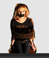
In our last filming session, we completed a photoshoot in the location of the loft, as we thought this would be a good setting for the poster, being where the climax of the trailer takes place. I came up with the idea of having the protagonist tied up to a chair, with tape over her mouth with the anagonist standing above her, as this is the position that the victim is in during the last part of the trailer and so it would connote that the victim is not the only one at in threat due to her condition.
1) First of all, I opened both images on photoshop. I then used the 'lasso' tool and select around the image of the protagonist, trying to keep it close to her outline.
 2) The, using the 'select' tool, I dragged this part of the selected image onto the background image, which was the image of the antagonist.
3) The image initially did not match up with the background smoothly and so I made the background invisible and used the eraser tool to erase around the edges of the protagonist, very precisely so that it would look good.
4)Then, I used the crop tool to make the image portrait. I did this as the convention for most psychological films have a portrait poster and we thought it was very important to keep in line with our genre. I cropped the left side of the wall as this had less space than the right, and we also found the prop of the black bucket effective.
5) Then, I changed the colouring of the image using the colour balance tool, making the colour balance -33, 00, +33, which gave it a subtle blue hue which fit in more easily with our colour scheme.
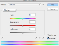
 6) I changed the contrast of the image to slightly more saturated, to give a more intense effect. I explored with the 'hue' tool, to see what it would look like with a more chill blue hue, however I did not think this was very effective.
Evaluation
Pros
- The final image is pretty impressive as it fits in with all the requirements.
- It suits the genre well as it shows explicitly the character and her imaginary friend, with gives an insight into the plot of her having a mental illness.
- The props and positioning of the characters hint that one has power over the over, as well as indicating that she is trapped by her illness, and can't do anything about it.
- The location of the image is a part that will be used in the trailer, so it comes together as a package well.
- The lighting is low key and indicates tension within the plot.
- There is good spacing to fit in the title and tagline on the wall, which is effective.
Cons
- The large amount of shadow in the image will make it hard to add text in all areas, however the shadow is also very effective to the visual look.
- The shape of the poster is not thin and tall enough to be the conventional size of a poster, but this will be very hard to overcome and so we will probably keep it how it is.


No comments:
Post a Comment