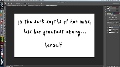
For our main title, we adapted our previous version and again smudged out the letters ad rotated certain letters to add to the sense of disorientation felt by the characters in our teaser trailer. We also used the sharpening tool to add white noise to the inside of the letters to give it an eroded appearance.
I then started word on the tag line, which we will be able to position on the website and the poster, in front of any background, and once we have chosen our final images we can manipulate it further to fit in with the surrounding images. This could mean splitting the text up differently or having it at an angle. I decided to smudge all the text in a downward motion to make it appear in a similar way to ink, which ties in with our ideas for the trailer's title typography.
I then started to make a version for the titles which will appear in the trailer, however these are using our first versions of the wording and will be re-done at a later date.
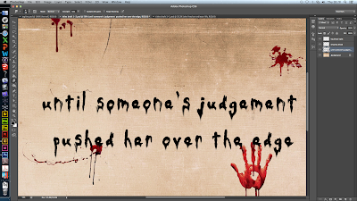
We started off using a brown paper background and the chosen font, Daubmark, without any manipulation. I then went through every letter and smudged it down, I wanted to create the idea of ink on paper, running down, showing it was freshly written, perhaps subtly indication the protagonist has been writing down her thoughts.I then went back over all the letters with a much finer smudging tool to make it look like there were very fine drips across the page.
This is what the final title looks like, and we want the first title in the trailer to have a clean piece of paper, showing that at the beginning of the plot, everything is quite innocent, but towards the end we want the paper to gradually become splattered in more and more blood, hinting the horrific end of our plot.
We searched on the internet for some blood splatters we could apply to the paper in the titles. Again, the wording would be changed in the final versions, but we wanted to make sure it worked before progressing further. In the screen shot above we took the blood splatter and applied a filter called 'sponge' to the blood splatter so that it wouldn't look out of place on the paper.
Here we positioned another splatter and carefully smudged it into some of the typography so that it looks like it is fresh, and also showing our skills of text manipulation.
We also used a hand print because in one of our initial shots in the loft scene, we used a hand print, so this helps link it all together.


No comments:
Post a Comment