
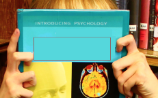
 When filming in the library, we took a few shots of the protagonist and a book to convey her quiet and bookish nature. We specifically chose a book which was about psychology and the brain, so that we wouldn't have to edit out any irrelevant pictures and it would be good to indicate to the audience the genre of the film. For some images, we made the protagonist simply hold the book and look away or at the camera, but for some we made her hold the book over her head. We thought this would be effective as it would give the impression that she's 'lost her head' and as the book will feature the title of 'Unhinged' it would convey that it has taken over her brain and mind.
  1) First of all I created a rectangle to cover over the title of the book, so that we could therefore replace it with our title and typography. I used the colour picker and chose the exact colour of the book to do this so that it would blend in and not look unprofessional. This proved to be a bit tricky as the actor's hands were in the way of the text, however I could not go over the hands with the rectangle, and so I had to go around this by using more than one.
 2) Then, I inserted the typography of our title over the rectangle. I did this by selecting File > Open and then opened the image of it on a transparent background. Then I used the Select tool and moved it onto the current image.
 3) The title of the movie came out too big to fit onto the book, which didn't look very professional. Therefore, I used the free transform tool to make it smaller, and also make it look taller and thinner so that it was more suitable for the image.
 4) Then, I inserted the names of the group at the end of the book, using the Text tool. I used the colour black and the font that we decided on for the tagline, which was 'Daubmark'.
5) After this, I inserted the tagline, using the 'Daubmark' font again. I made this white as it stood out better from the background, which I darkened using the Brightness/contrast tool to make this even better. Then, I used the text wrapping tool to make it slightly arched, which adds a bit more interest.

No comments:
Post a Comment