Method
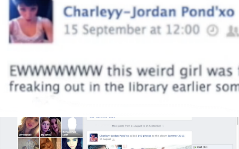
1) I had to create an image of the necessary facebook comment zoomed in on the screen.This proved to be a tricky process as when I first tried to do this on photoshop, the comment was too long on the screen. Therefore, I had to edit the image by duplicating the zoomed in screen shot and layering the images on top of one another so that you could read the whole comment. I had to erase around the edges of the top layer to ensure that it had smooth edges and looked professional. 2) Then, I imported the image into Final Cut Pro, and put dragged it in position so that it was the background of the footage of her sitting on the laptop. However, this was still not very effective as the protagonist was sitting directly in front of the comment. So, I decided to make the footage of the protagonist disappear so that the audience could read the comment.
 3) Therefore, I split the footage of the protgagonist on the laptop into two parts. Then, I moved the second part along so that it would not be featured at the same time as the close-up of the comment.
4) I had to put on the 'Keying' effect on the second part of the footage filmed in front of the green screen so that the background would come back when the comment disappears.
5) I made the image of the comment longer so that it was long enough for the audience to read. Eventually, I made it 2.0 seconds long to make it effective.
6) Finally, I put on the 'Static' transion 'Style B' on either side of the image of the facebook comment to make it fit in with the sequence effectively.
Evaluation
Pros
- This new version makes it easy for the audience to read the comment as the protagonist's head is no longer in the way, making it clear to read. It is also larger and stays on the screen for longer. This makes the narrative much more clear for the audience and we will not have so many problems of people misunderstanding the relationship between the two characters.
- Using the Static Transition 'Style B' twice, rather than 'Style A' looks much more professional, rather than overusing various different effects, which looks a bit childish. I think it also suits the psychological, distorted effect that we want for the genre.
Cons
- Having the protagonist disappear for a while may seem a bit unprofessional and random, however there is not many other options for us after receiving feedback that the protagonist being in the way is a problem for the narrative.
- The facebook comment could be seen as lingering on the screen for too long, which may ruin the pace of the trailer, however it is still important for the audience to understand the narrative.
No comments:
Post a Comment