Danielle Blasse 7010 - Cloe Pace-Soler 7352 - Rebecca Holloway 7279 - Natasha Welch 7399
Townley Grammar School - 14109

Monday 30 September 2013

Planning our film poster

Film Title Choices:

  1. Unplugged
  2. Disconnected
  3. Unhinged
  4. The Broken Truth
  5. Trapped
  6. From the Shadows
  7. Between the shadows 
  8. Forgotten
  9. Fractured Mind
  10. Double Vision
  11. Double Demons

Skills in the group:

  • Rebecca - typography
  • Danielle - photoshop main image
  • CloĆ© - Photography
  • Tasha - photoshop framing

Image ideas and manipulation:

  • Photo of protagonist doubled, ghostly. hinting at the imaginary friend
  • Protagonist being strangled by herself
  • Reflection of evil self in glasses/eyes. 
  • For certain titles, they could be made to look like wire shaped like the name we pick and then a plug socket in the corner. 

Friday 27 September 2013

Photoshop - cracked skin


I decided that learning to edit cracks onto someone's face might be useful for our poster, so I looked up a tutorial on youtube which is embedded at the end of this blog.

Steps for creating cracked skin:

Step 1) To being with I had to find an image of someone's face with nothing going on in the background to make it easier to edit. I also had to find an image of either cracked skin or dry cracked earth.

Step 2) I then opened these images up on photoshop and made the woman's face the background of the image.

Step 3) I then had to make the cracked earth less opaque by making it more transparant so it didn't just sit over the top of the photo and so that the browney colour of the earth wasnt visible and only the cracks were.

Step 4) Once I did this I had to 'wrap' the image of the cracked earth around the face to give it a more 3D look and to make it more realistic.

Step 5) Although this did make it look realistic, it still wasn't tight around the face and there was some of the image that was on the background of the image, therefore I then had to liquidify the cracked earth to get rid of all of the image that wasn't on the face.

Step 6) Although this did look quite effective, many of the cracks were over her eyes, nose and lips which didn't look quite right, therefore I then had to liquidify again to move the cracks so they wrapped around the features effectively and looked realistic.

Problems I faced:
I did encounter a few problems along the way such as:
- trying to get the liquidifying tool to work, as it wasn't allowing me to click on the tool although I had followed the instructions correctly.
- making subtle changes with liquidifying tool, I was too rough with pushing the image around and so it made the image all bumpy and made it sit badly on her face.
- trying to make the cracks look more realistic and make them wrap around the features, I found this more difficult to do as all the cracks were going over her eyes and lips which wouldn't look     realistic.


Thursday 26 September 2013

Research: Sound

Research: Sound

Through the many film deconstructions that have been completed between us, the use of sound in all, has inspired us to use similar characteristics to form an idea on the sound that we are willing to incorporate into our trailer.

A major part of our trailer is the scene with the green screen and with this we hope to use transitions that set apart the different green screen content in a way that is not too abrupt for the audience. Although, this scene is used to form the start of the hallucinations of the protagonist, therefore we would want to get this across. So using a cheerful transition sound effect will not convey this.  The sound effects below can be easily layered using Logic Pro to create a fuller sound, the further into the hallucinations the protagonist (Ebony) goes. 

As a trailer is only an slight indication and over view of the narrative wrapped up into a few minutes, the use of sound is vital, therefore choosing to only use diegetic sound would be a problem as it will be hard to build suspense of scare factors towards the end of the trailer itself. So with this in mind, using various sounds such as "psycho attack" and mystical ambiance we will be able to layer them bother together to create an extra dis orientating feel through the sound alone. Thus, increasing it's impact when edited with the footage.


A characteristic within all the films with a schizophrenic protagonist, the use of sound impacted a huge amount during their hallucinatory scenes. A prime example of this would be the flashback in The Soloist  as the protagonist gets up to leave his orchestra and we the hear the non diegetic sound of his thoughts criticizing him as he hurries way. The video to the left of this, will also get this effect across within our scene. 


However, this year we are aiming to produce sound that we have made purely for our trailer. As the sounds above such as the sinister whisper, are quite fitting with our trailer so we may want to use them to our own advantage. As they are under the creative common license we are able to use them, however to achieve the fuller and tension building sound that we are aiming for we can easily layer the sounds together to form a piece of non diegetic sound that runs plays continuously throughout the trailer rather than using a variety of just diegetic sound. During the editing process of the sound, we can also think about the use of silence in places, to add a sense of uncertainty about what the protagonist is capable of doing next. 


Location Research: Room for kidnapping

On our storyboard, we feature a final scene where the victim has been kidnapped and taken away. This scene will have be the climax of the trailer and reveal that there have been previous kidnappings and a lot of people have been endangered. It will not reveal explicitly that the protagonist is the kidnapper and so will beckon the audience to want to watch the film to answer these questions.

We want this scene to be set in a small, very dark, creepy looking room- preferably with metallic objects around to give a sense of discomfort and danger. It is my job to look around and look at the pros and cons of each location that we come across:


1)This image of a garage shows that the room is quite dark and has no natural light, which makes it suitable as the location as it makes it look dingy and creepy. There are metal poles on the floor and mechanical objects which make the room look hard and uncomfortable and the garage door looks harsh and intimidating. However, the room is quite obviously a garage and this detracts from the scariness of it as it doesn't look like an isolated area and comes across as easy to escape from. Many objects in the room would have to be removed in order for the mise en scene to be correct.


2) This image shows a small cupboard which we could use as an alternative option for the room. It is small which adds to the claustrophobic feel making it more creepy. The room doesn't have any windows or natural light which makes it dingy and the lighting low-key making it suitable for a scary setting. It is quite cluttered which again makes it tight and cramped. However, with the door shut it would be hard to film in the room without seeming unprofessional.


3) This image shows a shed. Yet again, there is no natural light, however this may be difference during the day and so we would need to film in this location after dark. The darkness of the room makes it suitable for a horror setting as it is very low-key. The room is full of mechanic tools and other things which makes it very dangerous looking. It is not obviously a garage/shed so it could come across as an isolated location, making it difficult to escape from and more chilling.


Filming Facebook Practice

For parts of our trailer, and possibly our green screen section, we would like to show our antagonist's Facebook profile, so it is as if it is being viewed by the protagonist. Almost like a POV shot. There are a multiple ways of filming this part and we have conducted this test to get an idea of what would work best for the trailer.

I have used Cam Studio for one clip and a handheld camera for another clip. We wanted to see the difference between them because the Cam Studio clip might work well for the green screen section, however it may not look very realistic. Here are the two clips:


Handheld Camera Filming
Here in this clip we can see what the test footage looks like when using a handheld camera. There are a number of points which can be made about this clip. Firstly, the camera naturally picks up some of the lines on the screen where the pixels are, however this does make it look like someone is actually watching through a laptop. In addition to this, I think it could look really effective if we used a series of jump cuts in a mini montage section focusing on different parts of the profile, as scrolling is a bit boring I feel, especially after conducting the test - it also presents the problem of not being able to scroll very well at the same speed continuously. 

I think that if we used a handheld camera, it would give us a high sense of realism and we could use the following shots. A close up on the name and profile picture, and extreme close up of the number of friends, a panning shot showing friend's comments on a status or picture, and then some full shots of the profile in general. I think this would make the section of the trailer a lot more interesting and add suspense, as you don't see everything straight away. 


CamStudio Filming
In this clip, filmed using the software Cam Studio, I feel like it isn't as effective for use in our trailer. If we want the Facebook profile to be really clear in our green screen section then this could be good because it is 'flat' and there is no unsteadiness in the filming. However, the quality isn't very good and it may become jumpy if we increase the quality when filming, so this needs to be considered. I think this option could be good for just showing the screen scrolling, but for variation in the shots it would not work, it would just look like we have inserted an image into our trailer instead of a video. 
For this reason I feel that we should film the final footage using a handheld camera as this will provide us with the option to use a variety of shots, as well as being much more interesting to look at while maintaining a high quality - matching with the other footage throughout our trailer. 

Facebook profile analysis


- When we finally decided I was going to be the victim in the trailer we quickly started editing my facebook.
-To portray a more 'vapid' and less socially aware person we used images of a rave as my cover photo, I also took a pouty profile picture where I was quite heavily made up and clearly ready to go out and party.
-I made it seem as if I had quite an active social life by getting people in my media group to post on my wall such as the one below, asking whether I have a certain item they left round mine after the party. I also made some random daily statuses to show that I use facebook quite a bit.

-Apart from this I also had friends asking me whether I was going out the party and so on, showing that my character enjoys going out and probably drinking with people of her age.
Statuses such as 'got a gorgeous dress from primark for only £10!' have been posted to show my love for clothes and my appearance.
- We chose the name 'Charleyy-Jordan Pond'xo' because firstly it's clearly not my real name as I've edited it by adding an extra y and by adding the xo at the end. This shows that I have a certain style and sense of personality. Secondly we chose this just because we felt it showed my character quite well and it was good to get an instant reaction as we wouldn't have enough time in the trailer to spend it trying to develop my character for the audience.


Typography Manipulation Testing

 In one of my previous blog posts, I identified the font 'Face you fears' as a possible font we might want to use for out typography. Now I have learnt some basic skills in how to manipulate text I decided to use Pixlr - a similar program to Photoshop but free. at home to see the outcome of manipulating the text.

Attempt 1
Here you can see the letters A - D before they have been manipulated.


I then decided that from my previous post where I incorporated text with the picture of rain, I wanted to try and recreate a similar effect, so I began work with the smudge tool.
Here you can see that I dragged, or smudged either side of the letter 'A' down, so it looked like it had been smeared on some paper or a surface, I think it adds some realism to the text.
Next I decided to do the same effect on the letter 'B', however in hindsight I would have dragged it down differently. I think that perhaps if we were to use this technique I would have to drag all of the bottom half of the 'B' down. as it doesn't really look realistic.
The same goes for the 'C' and 'D'. At the time I wasn't really sure which direction I should smudge it in. I think I found this easier in my Photoshop post because I was using a background image as a slight guide to my smudges. At least I can take this on board when we create our actual typography.

Here is the first attempt at my first manipulation of the 'Face your fears' font.

Attempt 2
  
 I decided to have another go at manipulating font, because I really wasn't happy with the original outcome. I decided to place the letters closer together, because that is how they will appear when written anyway, but also to try and use a much more subtle approach to manipulate the font.

I decided to pick out areas which naturally stuck out on the font and smudge them out a little, so it wasn't quite so neat and could give the impression of wear and tear, as if it was on a real surface. I was much happier this time round and I think the more subtle approach looks a lot more professional and this is necessary for our final typography.

Here you can see my gradual progression with the smudge tool and blur tool in Pixlr to smooth out edges and create a particular look. I personally think the image below looks a bit like it was scratched/written on paper with charcoal, by hand because of the smudged edges.

I was much happier with this outcome, and it looks more professional than my first attempt. However, I do not feel after this process that the 'Face your fears' font is necessarily the right choice for our typography. I do not think it looks as great when manipulated, so we perhaps need to try out some other fonts before settling on a final decision.


Evaluation of filming: 22/09/13

Date of filming: 22/09/13

Members present: 

Natasha and CloƩ. Not all members were necessary due to the small amount of filming that was planned. Both members were on time.

Scenes filmed: 


  • We filmed the scene in which the protagonist watches the girl who she stalks through her laptop. These shots are to be cross cut with the footage we took previously in the victim's bedroom, to show either side of the webcam and increase the creepy feeling around her stalking.
  • We didn't film the time lapse scene as the weather was too cloudy to see the sun clearly which would have removed the effect and so we decided to do it another day when it would be more successful.


Shots taken: 


  • We took many over-the-shoulder shots of the laptop screen over the protagonist's shoulder to show that she is watching her getting ready.
  • We took some profile shots and close-up shots of the protagonist's expression as she watched the victim.
  • We took extreme close-up shots of the protagonist's eyes, and as she was wearing glasses tried to make the reflection in the glasses show the footage, however this was difficult and the glare on the glasses made it hard to see the protagonist's eyes. This made us think about whether the chracter should wear glasses in all future scenes as we faced difficulties this time round.


Comments: 


  • We had to put the footage that we took onto my laptop in order to film the protagonist watching it and this was difficult as we had to make sure that there weren't any mise en scene errors, such as the play button on the screen as this would have made it obvious that the footage being watched wasn't live from the bedroom.
  • As well as this, it was hard making sure that each over the shoulder shot of the protagonist didn't feature the bed in the background as this would have made it obvious that we had changed location when editing it in with the footage we will take with the green screen.

Photoshop: Reflections in sunglasses

I decided to work on layering an image over another image of a person wearing sunglasses. I thought this skill could be helpful for our poster and website as it connotes that the person in the image is watching something, which we could make a scary image to show that what she sees in life is terrifying.

To begin with, I had to find a generic image of somebody wearing glasses and open it on photoshop. I made sure it was a big and clear image so that it would be easy to see the reflection inside the glasses.


I had to create a new layer to put over the background and name is "left lens" so that all the further instructions would be clear and I would not get confused by the multitude of layers. I had to select the inside of the lens using the markee tool.


I filled the new layer with the colour black, if the my foreground colour chosen in my palette was not black, I had to make sure this was corrected before moving on.


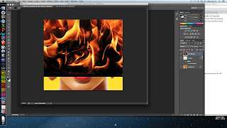
I inserted the image that I wanted to use as the reflection in the person's sunglasses. I chose a picture of a fire as this was easy to use considering it would not matter too much if the image did not join together to create a whole image. I had to rename this image as 'left reflection'.


 I made the left reflection a clipping mask for the left lens which made the image of the fire visible through the background image.


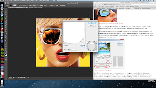
I selected the left lens layer and then added selected filter> distort> spherize and then set it to 75%. This made the image look more realistic as it had a spheric effect, as if a glasses lens.

I repeated all the same steps for the right lens which made the completed image of the reflection in the sunglasses.


Evaluation

  • The effect of the image in the glasses is effective as it allows the audience to see the expression of the character and also what they are thinking.
  • We could use this effect in the glasses or the eyes of the protagonist and potentially show an image of herself looking back at her- this would depict the narrative and give a surreal edge.
  • It looks a bit unprofessional and unrealistic so we would have to develop our skills a bit more. 


Wednesday 25 September 2013

Photoshop Practice: Manipulating Font

In this post I have been using Photoshop to practice font manipulation in preparation for our typography that we will use in our trailer, website and poster.

In this first image you can see how I have manipulated the first letter to have jagged edges and make it unique.
 In order to manipulate parts of the text, you have to convert it to a shape and then use 'direct selection tool' to manipulate points on the characters.
 Here you can see all the points which are available to be dragged out and around to create a different shape and style of the letter.
 Here you can see I have manipulated each letter in a slightly different style and increased the height of the 'b' and made the 'd' slightly slanted.
Here I went back to the original font and experimented with the smudge tool to make the top font almost appear as if it was actually written on the paper. This gave me the idea for using a font which looked slightly hand written, so if we needed to make it look like a hand written I would know how to do this.
 I then used the smudge tool on the font which looked hand written and made it seem as if the ink had smudged. I really liked this effect and decided to incorporate it with an image to improve the effect further.
I decided to use an image of rain on a surface and try to make the text which would appear to be on the image look like it was running down the screen.
I used the smudge tool again and followed the rain drops down so that when it met the text it appeared to be running down the glass.
This is the final effect, showing the progression of text manipulation.

Monday 23 September 2013

Photoshop Layering

Photoshop layering

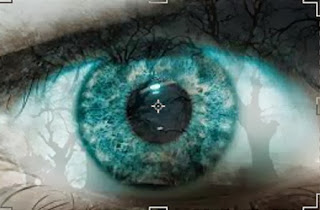
     To start with, I had to choose two images that i wanted to layer together to form one overall picture, with the use of Photoshop. I chose a close up image of an eye and an image of bare trees. I made sure that i chose two images that shared similar colours therefore not having too much of an obvious contrast.
  •  After finding my image of the eye, I saved it onto the desktop and dragged it into my blank document on Photoshop. 


  • Photoshop listed the photo of the eye as the background image. Therefore when adding the image of the tree into the document I had to create another layer to do so. To do this I had to select "create a new layer" from the bottom right corner of the tools panel. 
  • Once I had both the image of the eye and the trees as a layer in Photoshop, I was ready to manipulate them how I pleased. I wanted to create an overall photo that made the trees look like the canvas of the eye itself. 

  • In order to do this, I had to decrease the opacity of the trees, therefore making sure that they did not stand out too much when layered over the eye.
  • After decreasing the opacity, the trees covered the entire eye, however I was aiming to only cover the whites of the eye, to hint at a sense of someone lurking/following another person. 


  • As the image opposite shows, the image of the trees that are layered over the eyes, fit within the restrictions, so we can see that the base of the tree image curves into the waterline of the eye. 
  • However, the image of the trees seemed to be too dark once layered over the eye.


  • To overcome this, I reduced the opacity again and used the cropping tool located at the far left hand side of the screen to manipulate the image of the trees even further. 
  • By reducing the opacity of the trees I was able to achieve filling in the whites of the eyes with the trees with a bit more ease as it hardly covered the pupil as compared to the image above.
  • Since I decided to use two images that were similar in colour I was able to avoid the finished product looking rather disorientating.

Saturday 21 September 2013

Shooting Script for 22/09/13

22/09/13

The Scenes:
1) Here we will be filming the protagonist watching the victim through her laptop, to show that she is stalking her. 
2) We will also be doing a time lapse of the sunrise

Camera Angles & Shots:
1)
- Over the shoulder shot of her looking at the victim in her room
- Medium shot of the protagonist with the laptop on her lap. 
- Some close ups of her face
2)
- Here there will be a long shot of the protagonist sitting by a tree
- There will also be a closer shot of her drawing in her sketch book

Meeting time:
6:00 am

Those Attending:
Cloe and Natasha

Thursday 19 September 2013

Evaluation of Day - 15/09/13

Date of filming: 15/09/13

All members attended and were on time at the location.

Shots taken:
- Shot of the lights turning on as she entered the room showing it was on prior to her arrival
- Shots from the webcam from the same position as the character moved around the room and used the laptop.
- Close up shots of the macbook camera turning on.
- Shots taken from the camera such as: close ups of lips as she put on lipstick, over the shoulder shots while she was drying and straightening her hair, close ups of her feet and legs as she put on tights.

Other comments:
We spend a lot of the day rearranging the room so it matched the character, I think we did this rather effectively as we ensured that there was clutter around and so on.
I also feel that the filming day went well as we were able to get more than one angle in order to make the scene rather effective and to emphasise the fact that she is being watched from the macbook as the quality between the macbook and the camera was very different.

Pi trailer - typography deconstruction

0:09 - Name of movie comes up at the beginning, the pi symbol is on a black background and is white, however it has small grey marks within that move almost like a static TV. It then has a black strip roll across it, as if the signal is being disrupted.
0:12 - Here there is a bit of information about the movie, the award it received etc. The words are in block capitals and are in the centre of the screen. On the edges of the screen there are two dotted lines which come up else where on the transition screens, these give the effect of an old film reel. The black strip also rolls across the text here as well.
 0:18 - This text blurs into focus, with layers of the text separating in order to give it a ghost like/echoey effect. The words are again in block capitals and are in a greyish white, with the woman's name at the bottom in lower caps. The greyish white suggests that there was something once innocent that is no longer that.

0:44 - Black background with grey smoke in the background that swirls around while the text in the centre again has a ghostlike effect as different (more transparent) layers of the text are abruptly moving around the screen. This gives it a rather manic feel.


1:20 - The pi sign zooms towards the screen in less than a second and then stabilises and shrinks back, with the colours now in reverse as the Pi sign is black and the background is the greyish white that was the colour for all the font. The Pi sign keeps retreating until the screen darkens to black. This gives a rather foreboding feel to it and gives it a lot of meaning.


1:25 - The time of the release is then advertised in the same block capitals, with the same ghostlike effect on it.