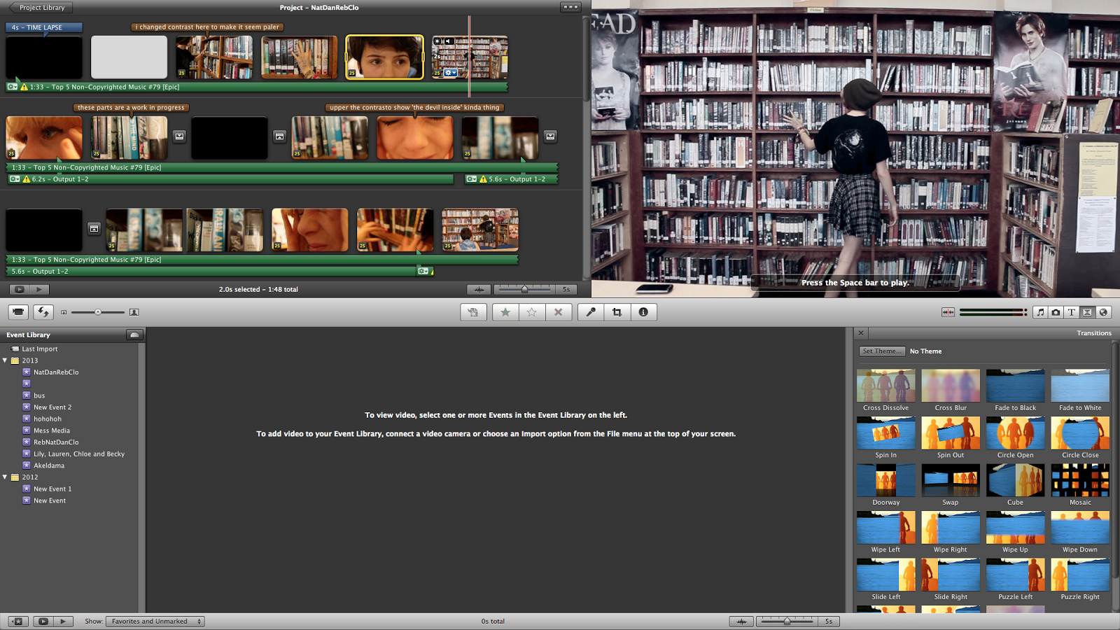
Danielle Blasse 7010 - Cloe Pace-Soler 7352 - Rebecca Holloway 7279 - Natasha Welch 7399
Townley Grammar School - 14109

Friday 29 November 2013

Creating the titles


Step 1: 
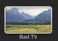
-To begin with I had to open a plain white background on final cut pro.
-The font we had decided to use here was Dark Ages.
-I started off by doing the titles one by one, and made it so that they progressively got more distorted.
Step 2:
-To being with I added the effect bad TV and made it very minimal so that the effect wasn't too much.
-With the second title I added the effect called 'earthquake' in order to make the white background shake.
Step 3:
-By adding 'Bad TV' to the later ones I made it so that the words got even more shaken in the later titles.
-I then added a few repeats of the words in a bigger font with the effect pushed all the way up in order to give it a creepy look and so that it would match the genre.
-The video shown is the final title.
For this we were inspired by a visiter who came into the school to demonstrate different effects we could do on Final Cut Pro.
He demonstrated to us various effects that we have used in the titles, for example 'Bad TV.'

Evaluation:
Overall we are happy with the titles and although we thought an image somewhere on the titles would look effective because we do not have the skills to make it look professional there is a risk that it will look bad.


Green Screen: Background

1) In order to edit the background onto the green screen image, I first had to record the facebook page. I did this using quicktime player and selecting File > New Screen Recording. This allowed me to film everything that was on my screen at the time.

2) I had to try many times to get the recording right, as it needed to be 8 seconds long to fit in with what we had already recorded as the background.

3) I edited the background footage on Final Cut Pro, by putting in the facebook footage, then dragging a black screen in. This would then show the background turning to black when the character shuts the laptop.

4) I used a 'static' transition in between the facebook footage and the black screen, to indicate towards the technological aspect.

5) I then exported this footage so that I could use it as the background image.

6) I created a New Project and dragged in the footage filmed in front of the green screen.

7) Then, I selected the effect 'Keyer' and dragged it on the footage. I could then change aspects of the effect so that it was more clear cut and looked more realistic.

8) Finally, I dragged on the exported facebook footage to be the background of the footage.

Evaluation 

Pros

  • The timing of the footage is just right as the static effect happens just the character shuts the laptop, which is effective.
  • The static transition is effective as it indicates that the image in the background is featuring what is on her screen, and also it gives a distorted edge.
  • The unrealistic, surreal look of the character in front of the images could be used effectively as it indicates that the scene is only in the character's mind, rather than real.
  • The scrolling movement is pretty smooth, rather than very jittery which make it look very unprofessional.
  • The mise en scene of the facebook wall is made to perfectly fit in with the character we were trying to portray, and includes images as well as text to make it realistic and visually appealing.

Cons

  • The background when it turns black looks a bit unrealistic as it contrasts with the bright lighting used on the character, however this would be very hard to avoid.
  • The scrolling may be a bit fast to read everything on the screen, however it was necessary to make it fit in with the time of the protagonist shutting the laptop, and we also didn't want the scene to be too long as it would drag on unnecessarily.

Evaluation of 28/11/13: Loft filming

Only two members attended. 
Shots taken:
- Here we did the final shot with Charley when she realises that she is tied up to a chair. 
- We did many variations of this: there were a few where when Charley would scream we'd zoom out to reveal her tied to a chair. We then did one zoomed in for the whole time and one zoomed out so we could see which version we preferred when editing. 
- We also did shots that put me to the right of the screen or in the centre in order to offer variation. 
- We also had some with a high angle and some without, though the high angle seems to be more effective as it makes the character seem more vulnerable. 

Overall we think that we will not need to film again in the loft, unfortunately we were not able to have dead bodies in the shot as we lacked actors to do it. We were particularly pleased with the lighting in this shot as the shadow in the background was especially effective and the fact its high contrast means it   matches the mise en scene in the shot. 

Poster Photoshoot and Editing


 In our last filming session, we completed a photoshoot in the location of the loft, as we thought this would be a good setting for the poster, being where the climax of the trailer takes place. I came up with the idea of having the protagonist tied up to a chair, with tape over her mouth with the anagonist standing above her, as this is the position that the victim is in during the last part of the trailer and so it would connote that the victim is not the only one at in threat due to her condition.

1) First of all, I opened both images on photoshop. I then used the 'lasso' tool and select around the image of the protagonist, trying to keep it close to her outline.

2) The, using the 'select' tool, I dragged this part of the selected image onto the background image, which was the image of the antagonist.

3) The image initially did not match up with the background smoothly and so I made the background invisible and used the eraser tool to erase around the edges of the protagonist, very precisely so that it would look good.

4)Then, I used the crop tool to make the image portrait. I did this as the convention for most psychological films have a portrait poster and we thought it was very important to keep in line with our genre. I cropped the left side of the wall as this had less space than the right, and we also found the prop of the black bucket effective.

5) Then, I changed the colouring of the image using the colour balance tool, making the colour balance -33, 00, +33, which gave it a subtle blue hue which fit in more easily with our colour scheme.

6) I changed the contrast of the image to slightly more saturated, to give a more intense effect. I explored with the 'hue' tool, to see what it would look like with a more chill blue hue, however I did not think this was very effective.


Evaluation

Pros

  • The final image is pretty impressive as it fits in with all the requirements.
  • It suits the genre well as it shows explicitly the character and her imaginary friend, with gives an insight into the plot of her having a mental illness.
  • The props and positioning of the characters hint that one has power over the over, as well as indicating that she is trapped by her illness, and can't do anything about it.
  • The location of the image is a part that will be used in the trailer, so it comes together as a package well.
  • The lighting is low key and indicates tension within the plot. 
  • There is good spacing to fit in the title and tagline on the wall, which is effective.

Cons

  • The large amount of shadow in the image will make it hard to add text in all areas, however the shadow is also very effective to the visual look.
  • The shape of the poster is not thin and tall enough to be the conventional size of a poster, but this will be very hard to overcome and so we will probably keep it how it is.


Evaluation of 20/11/13 - Loft Fillming

Only two members were present for the filming as it didn't require anymore.
Shots that were taken:
- We had close up shots of Charley's face as she was tied to the chair and was barely awake.
-We used a panning shot of her face as well to show different angles and areas of her face.
- We also used long shots to show her in the chair.
- Another shot we took of this was a POV shot of her slowly waking up, going in and out of focus and seeing blood on her hands.
Photoshoot:
-We then went on to doing the photoshoot.
-Here we did Natasha tied to a chair, similar to the position Charley was in.
- We had gaffa tape over her mouth and her hands strapped to her sides by rope.
- The shot here was a long shot, leaving enough room above her to have a second person.
- Once we got a good image we moved removed the gaffa tape and rope and smeared her eyeliner down her face, similar to the bathroom scene.
- We then got her to stand behind the chair and look menancingly over the top of it and then straight at the camera.


Thursday 28 November 2013

Montage Sound

Montage Sound

We are going to be using a montage scene at the end of our trailer to make sure that the plot comes across as detailed yet as quickly as possible. However, we need to bare in mind the sounds that we are going to be willing to use. As we do not all of our footage just yet and we still need to edit the montage scene, producing non diegetic sound for the montage scene will prove difficulty at the moment. Instead, we are paying close attention to the montage scenes in other psychological films such as, the butterfly effect and a beautiful mind. We have noted that they use suspenseful, atmospheric sound, with the use of jumps and dissonances in places of their choice to fit their trailer. 

With the use of the sound above, we can manipulate it to be a lot faster or slower dependent on the foundation track of the sound that we choose. This can help to produce a good scare factor within the trailer therefore having a big impact on our audience. Transition effects also tend to sound a lot better when layered on top of multiple sounds rather than on their own, allowing the suspense before it to be built up to a peak before letting it down again. 

Preferably all tracks would all be layered on top of each other, after we have manipulated some of them using Logic Pro to make them either faster or slower. The Dark Rhytmic Ambience sound effect experiments using fast and slow tempos allowing us to cut and move around the track as we please when it comes to editing all the tracks together. A montage scene is usually extremely fast paced therefore the tempo for all of the tracks will need to be increased. 

Another idea, would be to collate the sounds of all the objects around the protagonist as we enter the montage scene. Therefore the ticking of a clock would grow in volume, someone writing, and so on. Once these sounds are layered on top of each other they will create an extremely discordant sound resulting to a little discomfort, which is what we aim to achieve through the use of sound in the montage scene. This is a good transitional idea from the non diegetic sound being used in the larger parts of the trailer to the montage scene as it builds in sound and tension. The trailer will end with the death/torture of the antagonist as the protagonist spirals out of control - this is where the sound will suddenly come to a halt after a climax in sound and a scream will be sounded. 

Typography Ideas

Typography ideas

We produced our initial typography however, when it came to making our film poster we noticed that we didn't like our typography as much as we hoped to. It also did not seem effective in combination with our chosen film poster image and website image. In order to manipulate this typography we smudged the ends of letters U, N, H, I, N and D. Although we still didn't think this would work.

To overcome this problem, we had a few ideas in mind. For example we wanted to incorporate the psychological aspect of the film in the title too. We had the idea of manipulating the typography to make it look as if it was falling out of a pill bottle. However, we found that this may be too hard to fit into our colour scheme and we also experienced trouble in our attempt to edit out the pills in the bottle in aid to get the letters in. It looked extremely unrealistic so this typography didn't win with us either. 


For our final idea, we decided to choose a simpler font. Therefore, we would be able to manipulate it as much as possible hopefully without making it look too unrealistic. We chose a font called Decimel and used the smudged tool on Photoshop to smudge through is horizontal streak through it. We repeated this a through times but in the opposite direction to achieve a blurred effect. We were quite happy with this as a typography as it fit our colour scheme and was not too time consuming to manipulate as it was quite a simple font to begin with.

Editing the library scene

During one of our recent editing sessions, I made the following changes.

For the alleyway scene, we have to potential clips to use, and the one which we are most likely to use was a little wobbly, so I first applied stabilisation. However, this made the footage appear very blurry, so I reverted it back to how it was.
The next thing was a very simple step, I simply added a transition after the last library scene shot so that it fades to black, ready for the titles sequence.
While watching the library footage, I thought that it was actually quite boring, so I decided to try and change the colours to demonstrate the character's perception of the events unfolding, adding some dynamics to their personalities on screen.
For all shots watching our protagonists, and before she starts having a fit, I changed the white balance to a blue tone and reduced the saturation slightly, to make it appear like an average dreary day, where nothing seemed out of the ordinary.
Once our protagonists starts showing odd behaviour, I wanted to make this difference very clear to the audience, increase the exposure, saturation and contrast dramatically, to show the very unpleasant experience the protagonist is showing, and offering the audience an idea of what it is like.
I had two different settings depending on whether the camera was facing the protagonist's face, or a POV shot was being used. For the POV shots I again increased the exposure levels, contrast and saturation, but decided to increase the saturation even further. For all of these shots the white balance was normal.

Using this image and the one above you can compare the subtle but still noticeable differences between the colours, also the hints of red indicate the protagonist's slight panic in realising she has been watched.
After changing the colours, I noticed that our timeline didn't quite follow through, we watched Cloe's character watch the protagonist after she had actually moved along the bookcase, so I decided to use cross cutting editing to change this.
I split the clip and placed the close up shot either side of the establishing shot of the protagonist walking along beside the bookcase.
I felt like the editing session was very productive and hopefully will be able to incorporate the different colour schemes elsewhere in the trailer to portray the different perceptions of situations and make the trailer a little more original and interesting to watch.

Potential Website Image Editing

We wanted to edit together a couple of images we took on one of our photo shoots to see if it could be used for our website background. This post goes through the editing process of the photos and my evaluation of whether it could be used or not.

Firstly, we took one image with Natasha in the background of the image. We then cut around her, I am using Photoshop to complete this task.
Here I copied and pasted the cut out onto another photo, taken in the same place but showing the other character Natasha plays.
I then positioned the cut out in the correct place and slowly blurred the outline to make it blend in with the already blurred background of the new image. This makes it seem as if we both people in the same image.
I then started work on the actual colours of the image, to try and fit more to the conventions of our genre and also give a more professional edge to our photograph. I started by editing the contrast and brightness, increasing the contrast and decreasing the brightness slightly.
I then went into the filter gallery and adjusted the framing of where I wanted a vignette effect to be, so that the attention is drawn to the protagonists, instead of the location.
Next, I played around with the saturation, I wanted to create quite a vivid image in the centre, so boosted the saturation a little while making it have a few blue tones, fitting the conventions of our genre.

Here you can see me selecting the cool colour setting, so that it is a little more dark and a feeling of sadness comes through the image to the audience.


After this step, I again went and tweaked the brightness and contrast so that it suited the changes to the saturation I had made.


Here is the final image I created. I think it is great and could work well on our website, however we have to consider the different sized screens that will be used by our audience, and due to the placement of the characters this may mean they are covered up by our trailer and reviews of the website, perhaps just the top layer of the photo could be used, revealing just one character, or another entirely, but with the same kind of editing applied to it.

Friday 22 November 2013

Making a Gif


After editing the three layers together into one image, I repeated the same steps again with the characters in different positions. I thought that we could use all three images together to show each character in detail and have a dynamic background so I turned the three images into a gif.

1) First of all, I opened a new blank image and made sure it was the same size as the images I would be importing.

2) Then, I dragged the images I needed into the photoshop and selected accept.

3) Then, chose 'view'> 'timeline' in order to put them in the right order and speed.

4) I selected 'Create Video Timeline' and then the timeline of the images. I made the images go one after another and then decided what speed looked best. This time round I made it quite fast to see what the effect was like, but I may edit it to make it slower later on as this will mean the audience will be able to see the characters better.

Evaluation 

 This image isn't very effective because it doesn't fit in with the genre very well, so the individual images would have to be edited a bit more darkly or gloomily to fit in with this. As well as this, some minor lighting and positioning errors mean that the gif doesn't  look very smooth.


Monday 18 November 2013

Website Background Image Idea


We decided to play around with editing more photos that we took from the photo shoot in the alleyway by editing an image of one of the characters onto the image of two of the characters.
1) First of all, I opened the image of the victim and the Antagonist. Then, opened the image of the Protagonist and pulled this into a separate window.

2) Then, using the lasso tool I lassoed around the figure of the Protagonist, making sure to correctly outline the shape.

3) Then, I dragged this selected part of the image onto the background image of the two characters.

4) I had to make sure that the existing image around the selected part of the protagonist was erased so that it would blend into the background more effectively, so I made the settings so that I could only see this layer, and used the erase tool, zooming in closely to make sure that I could get each detail.

6) This helped me get my final image of the three characters in one image.

Evaluation:

Pros

  • It conveys the personalities of each character.
  • It features all the significant characters in the trailer which a conventional poster would usually do.
  • Features a setting that is used in the trailer which is conventional.

Cons

  • However, the image lacks any idea of a genre, as it doesn't not look particularly scary or psychological.
  • This could be improved with some editing on the colour, or by adding effects, but it would not look very realistic. 
  • On the whole it does not portray the plot or genre very well.
  • Does not look very interesting or remarkable at all.


Official Wording of the Titles

Official Wording of the Titles:

The first list is the one which was on the previous post which we decided to keep but apply a few tweaks to. 

Version 3
1) coping was easy
2) haunted by someone's thoughts
3) haunted by yourself
4) hunting the one that hurt you
5) Unhinged

The first thing we changed was the first line, the word 'coping' wasn't clear, therefore we thought that language more specific to illnesses would be more appropriate. Therefore the word 'medication' seemed like a better option as it definitely referenced the illness. 
We decided to change what person the text was in, and so we changed it to 3rd person as it follows conventions of psychological thrillers. We made the 4th line present in order to show that its ongoing and this is the main point of the overall film. We also did this to hint at the climax.  

Version 3
1) the medication worked
2) until she was haunted by someone's thoughts
3) she became haunted by herself
4) now she hunts the one that hurt her
5) Unhinged


Unhinged Typography: Version 2

 Unhinged Typography: Version 2

- We decided that we wanted two versions of our typography, one with the static graininess in the centre and one without so we could make an informed decision on which one was best.
- For our typography we had already decided that we wanted there to be a smudged effect as if the paint was blurring out.
- In order to do this I downloaded the font that we're using: 'Midnight'
- I then created a new file and typed in our title in the font.
- I had to type a word in a different text box so that I could rotate some of the letters such as the E and the N.

- I then used the smudge tool to drag out the edges of the words to create a smoke like effect.
- I also brought the edges of the 'N' in and the edges of the 'D' in to give an effect of smoke going round the 'N' and 'D'.


Sunday 17 November 2013

Editing the time lapse


- First we began by importing the file into iMovie, once it had loaded we sped up the file as fast as it would go. Here we encountered a problem as it was altogether 2 minutes long.

- Another issue we saw straight away was that (as I have already mentioned in the evaluation) the time lapse was minimal in it's movement as the sky was overcast and it definitely wasn't clear that the sun was going down.

- We reimported the file and sped it up again, and this time the overall time lapse was 17 seconds. This is still too long, however halfway through the filming there was disruption and a dog jolted the camera.

- Because the footage past that moment wasn't particularly different all the way through we decided to split the footage and cut out the part after the dog had bumped into the camera. 

- In the first part of the time lapse we can see some movement with the clouds in the sky, however unfortunately we do not think it is enough to be effective and it will probably have to be redone again.

- Our overall footage length was 5 seconds, which is an alright length for the time lapse. But despite this it will have to be redone as it is not clear that its a time lapse and we wish to recreate the previous time lapse we filmed.


Saturday 16 November 2013

Evaluation of the Time Lapse - 16/11/13

Only two members of the group were present for the filming as it only needed the actor and someone filming.

- For this time lapse we had a long shot of the actor sitting down with her back pressed to a tree while reading. 
- We wanted to have the sunset in the background however due to the bad weather it wasn't really as visible as we'd hoped. 
- We also had many passerbys in the shot which we will be able to edit out, however at one point a dog ran up to the tripod and jolted it which affected the footage overall. 
- We are hoping that when edited the jolt isn't as noticeable and the sunset is clearer. 
Overall the session was more successful than the last time lapse, but we are unsure as of yet if it will need to be redone.

We reattempted the time lapse however unfortuately there were issues once again with the footage as half way through the angle changes and the sun was already down by the time we got there as we had to film it straight after school. Therefore it is likely we are going to have to try again.

Friday 15 November 2013

Wording of the titles

Here are a few variations of what we could have for the text of the titles:

Variation 1
1) she lived an ordinary life 
2) until someone's judgement pushed her over the edge 
3) with her insanity worsening, and an evil presence in the back of her mind 
4) she began haunting the one that hurt her
5) now she can't stop
6) Unhinged

Evaluation: We decided that this variation was too explicit about the plot line, and it therefore became ineffective. We felt that they were also much too long, especially number 3 which has a comma separating the fragments of the sentence. The fact that these aren't very short and snappy means that there don't carry as much meaning and they are just a bore to read. Also although here we added another title slide, we have decided that it's likely that we do at least one less than that as the extra ones aren't necessary and will not really add to the trailer. 

Version 2
1) ebony was just an ordinary girl
2) until someone pushed her over the edge
3) her insanity worsened
4) and she hunted the one that hurt her
5) Unhinged

Evaluation: Here we felt that although version two is an improvement from number one, it still doesn't have the snappiness and meaning we want it to have. Once again it is too explicit about the plot line, which doesn't leave much mystery and is just a bit boring, especially as it is telling what is happening on the screen therefore meaning is deducted from it as it isn't bringing anything new into the trailer. A word that we particularly like is 'hunted' as we feel that it conveys our message properly so we tried to utilise it in the next version.

Version 3
1) coping wasn't hard
2) haunted by someone's thoughts
3) haunted by yourself
4) hunting the one that hurt you
5) Unhinged

Evaluation: This one was an improvement from the last as it wasn't as specific with the plot and it links more to the genre of our piece. We like the 'repeat and change' within this one as it is a common convention among psychological thrillers. However the problem with this one is the first line as its rather cheesy and doesn't match up with the rest of the sentences. Another thing we are planning to change is the word 'thoughts' on number 2 as we feel it isn't the right word and it's too non specific. We also feel like although it is likely we will use this version we will need to put in 'she was' or 'she is' in all of the sentences.

Version 4
1) invisible and unaffected
2) unravelled by the poison of prejudice
3) insanity unleashed
4) unearthly follower
5) Unhinged

Evaluation: Here we went for something completely different that was quite broad. An issue we had with this one was the 'poison of prejudice' as it was once again too explicit and made it too clear. We felt that number 4 was difficult to create and the word 'unearthly' didn't really fit in with the context. Finally we decided that we probably wouldn't be using this one as it is rather confusing and not effective. 

Evaluation of library 8/11/13


All members attended the filming session. 

Shots that were taken:
- Here we decided that we needed a few shots of the protagonist experiencing mental issues, we thought that shots that went in and out of focus would be effective for this as we took inspiration from 'The Escape Artist'.
- We took shot of Charley walking past Ebony with a disgusted freaked out look, so that we could show that Ebony was effected by what Charley did. 
- We also ensured that we took a few pictures for the poster that we could potentially use, we had a few of Natasha sitting cross-legged with a very high angel looking down on her in order to make her look vulnerable.
-We also had her in-between some bookshelves once again to make her look vulnerable.
- Overall we felt that the filming day was very effective as when edited together the shots portray the meaning we wanted and it is very disorientating.
- We feel like the lighting in the library at the time was very good and the fact that the scene was rather bright worked well with the sound we've edited in of a high siren and white noise.

Thursday 14 November 2013

Editing Post: Inserting Sound

Editing Post: Inserting Sound

After producing some non diegetic sound for parts of our trailer. I had to insert it into our trailer at the most fitting point of it. I made sure that my sound was converted to an mp3 file so in the iTunes library as it automatically syncs with iMovie allowing me to use my own sound. I found the sound that I wanted to use and dragged it over to the sequence that I had just edited.


After dragging the sound into place, I selected the audio options on the advanced tools below. I then aligned the frequency waves of the sound to suit the trailer. Therefore the sound we be effective and not build up to something that isn't there.


   Finally, after aligning the sound into place, I made sure that the sound faded in and out in a suitable manner. To do this, I selected the audio settings from the drop down menu after right clicking and adjusted the fade in and out to a sufficient point to which it was able to sit perfectly.