After previous practice with font manipulation, we decided that we didn't want to use the font 'Face Your Fears' as we firs thought. Instead we wanted to try the font 'Midnight' which we had considered in another blog post. In this post I will practice typography manipulation with that font and our actual name to get a better understanding of what will work best.
As a group, we decided to think about some initial ideas of what we wanted to include in our film name. We came up with the idea below, linking in the name with what it is saying. It would be nice if we could manipulated the letter 'D' to actually fall, as we have tried to show below, but we will have to research this in another blog post.

Above you can see how we wanted to reverse some letters and make some upside down to fit the connotations of our genre and give subtle hints about the plot of our trailer.

Using the photo editing service Pixlr, I first typed out our film name and then worked on separating each letter into a different layer so that I could manipulate each of them without ruining the whole word. I named each layer depending on which letter is contained, this would make it easier for me to switch between letters when manipulating them.
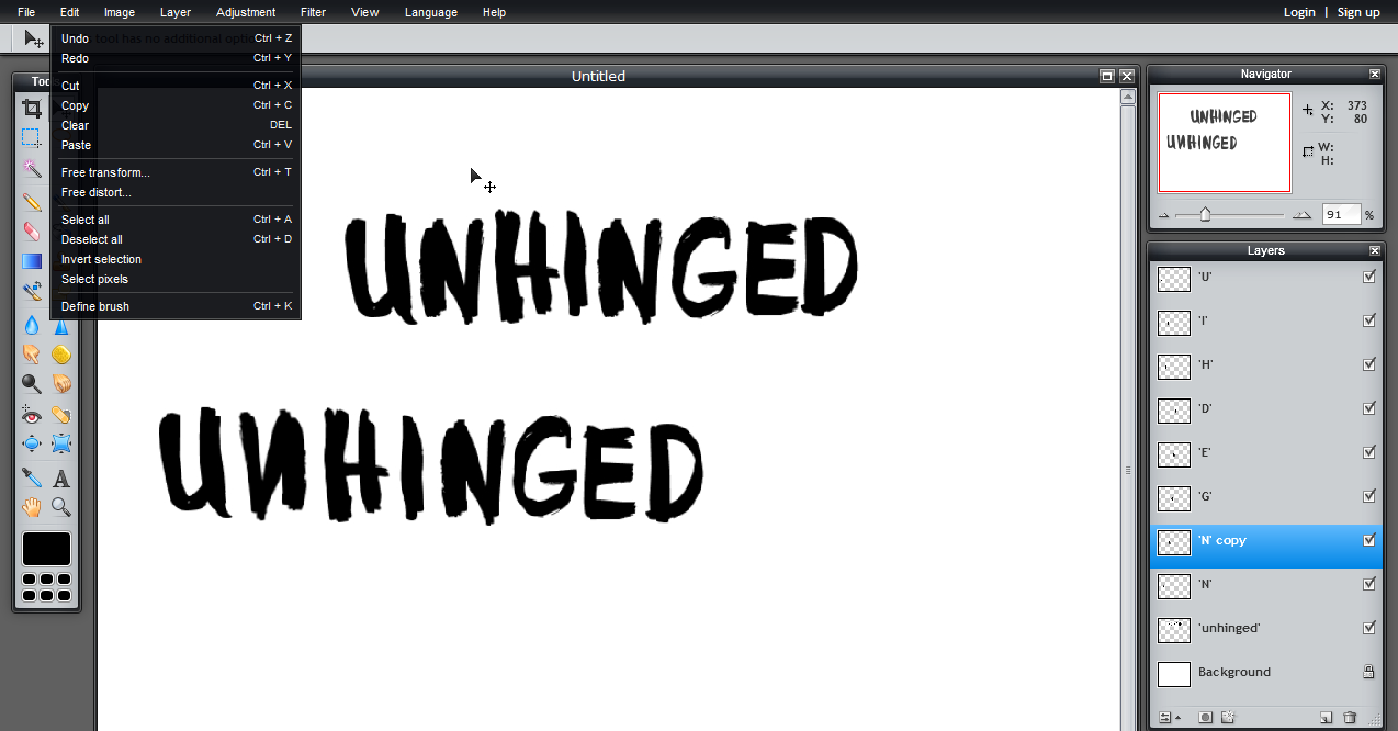
The next thing I had to do was work on how I was going to get the font looking like the ideas we had had in class, so that the typography would meet the connotations of our genre. In the picture above you can see the various different layers on the right hand side. I had selected one of the letter 'N's and then used the free transform tool in the menu. This allowed me to rotate and reflect the letter so that it would match our design, and didn't effect the rest of the word.

I then followed the same steps for some of the other letters. The reason we picked the letters 'N' and 'E' is because it is still easy for the audience to read, and they can still read it quickly, which is what we want when they are walking past our film poster for example. Although it does remain easy to read, it also signifies that something is not quite right, and suggests that there is something mysterious going on - it gives a hint into our protagonist's perception of the world.

After manipulating all the letters, I then merged all the letters into one single layer so it became one layer which i could manipulate completely.

Here you can see I just have three layers now, the white background, the original typography before manipulation and the new manipulated typography.
I then went over the new typography with the sharpen tool, found in the tool bar, because some of the edges weren't as crisp as they could be, and it is important we achieve a high quality image so we can use it on a bigger scale, such as on the film poster while maintaining a professional look.

This is what the sharpened image looks like, there is not much difference, and so I decided to select it all using the wand tool, also found in the tool bar because this would give us a very crisp edge and would also allow me to save it separately to a file.

Above you can see me using the wand tool.

Here is the finished typography. This is not the final version as we still need to see how it will be incorporated into our trailer, poster and website, however I am very happy with the outcome and believe that if we were able to include some animation on the letter 'D' it would look fantastic. There is a slight problem with the letter 'U' and 'I' as some white dots have appeared on the letters, so I will fix this when we have decided on a final typography.
No comments:
Post a Comment