Danielle Blasse 7010 - Cloe Pace-Soler 7352 - Rebecca Holloway 7279 - Natasha Welch 7399
Townley Grammar School - 14109

Friday, 25 October 2013

Storyboard: Final Scene

As we get closer to filming the last scene in the loft, where the victim is kidnapped by the protagonist, we need to create a storyboard, so that it is easy and clear on the day of the filming. As it is the climax of the trailer, we need it to match the soundtrack which will sound very dramatic and thrilling. We decided to have the soundtrack constantly increasing in pace and tension and then a moment of silence, followed by a loud noise and scream, therefore it was important to consider this when creating the storyboard.

  • We had to make sure it would create an impact on the audience, would be the scariest part of the trailer as it would be the part to keep the audience wanting to see more. 
  • Therefore, we decided to include something creepy/gory which we thought could quite easily be some dead bodies, as we have many people who could come along and be a dead body. 
  • The dead bodies would most likely be wearing black bags over their heads as this would be more creepy, and would make the acting especially easy, as well as adding to the mise en scene. 
  • However, it was important not to give away too much in this final scene, as well as throughout the trailer. 
  • So, we are concealing who kidnaps the protagonist and kills the bodies, which will hopefully create an enigma. In some scenes, we may exclude the protagonist's head or recognisable features to indicate that there may be another evil character and make the audience want to see what happens in the film. If the whole of the plot is given away in the trailer, it would not meet conventions. 

  • At this point, the camera would be zoomed up extremely close to the victim's face, which would give a hint of mystery about what is going on, and concealing what is happening would increase the tension and fear. 
  • We would then zoom out very fast, which may have to be edited in afterwards. We would make this match the diegetic sound of the scream from the victim.

  • The shot would then be loose enough to reveal a number of creepily placed dead bodies, which would have black bags on their heads. This would be the last shot of the trailer, and would create an enigma around the plot, as to why there are dead bodies. 


Photoshop Trial: Editing

As well as ghosting the image and editing an image of the protagonist inside her own eye, another idea was to have two images of the protagonist- with one standing dauntingly above the other to show the power relationship between the two and indicate that the imaginary self is controlling the other. Using the photographs that I took previously, I decided to try and edit this poster idea, to see how it looked and therefore help us decide whether or not to use it for the final poster image.

Steps
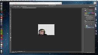
Step 1: first I used the lasso tool to bring the close up shot of Natasha over to the other image. 


Step 2: Once I had done this, I used the rubber tool to rub out the edges of the image that weren't needed and I finished with an image of Natasha's face.

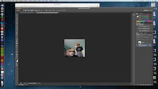
Step 3: I then cropped the image with Natasha standing so that there wasn't a big gap on the side of the image.


Step 4:
This then left me with this image, which i edited a bit by making the background image darker and by increasing the contrast, if this was our final image the background would probably be much more distorted in order to show that she is imaginary.

Use of sound in psychological film

Use of sound in psychological film

A beautiful mind

The use of non diegetic sound throughout the trailer begins with an extremely thin texture of sound. It sounds as if a riff played on a xylophone is playing and then gradually builds up to a thicker texture of a full ochestra as the trailer develops, revealing the mastermind that John Nash (the protagonist) is. If we wanted to incorporate this into our trailer we would have to think of ways to manipulate the music to suit the needs of our trailer. For instance, this music sounds triumphant at the beginning however it does not hint at a disequilibrium within the plot. If anything it sounds intriguing and inviting which invites an audience in. Digetic sound is also used, highlighting the predominant scenes in the movie howver, we would not be able to do this as it may take away a big part of the realism of our trailer. The non diegetic sound is also ongoing and develops into a more percussive and chaotic manipulation of the ochestral music as the schizophrenic element of the trailer becomes more apparent. Silence is also used in combination with a black screen to draw on a digetic line from the film itself. This is almost used as a soundbridge to link the disequilibruim and recovery of it together through sound as the non digetic sound switches from a spontanoues percussive sound to an uplifting orchestral sound that carries the trailer to the end.


Clean Shaven 

Layering of individual sounds are used at the beginning of the trailer to create a disorientating element. It also mimicks the sound of someone dragging or scraping something along a floor or hard surface. It also manipulates voices together to create a chaotic and busy mind. A montage scene is also used and repetition of voices and sounds of traffic and other daily ambient noises are used to get across the protagonists loss of grip on reality. Similarly to A Beautiful Mind diegetic dialogue is used too and draws on the line " it's not healthy to sit inside all day" again drawing on the concern of otheres about the protagonists mental wellbeing. As this diegetic sound comes to a close, we can hear ever so quietly in the background the use of strings to create a sinister sound.
 Unlike A Beautiful Mind, this trailer does not use a continuous track and it unlikely to have been scored as it sounds as if improvisation was used to produce the sound as some sounds would have been produced due to the manipulation that editing provides or playing the instrument differently. We can achieve a sound like this, possiby by layering sounds on top of each other such as various voices repeating phrases, ambient sound such as traffic etc.


The Soloist
The non diegetic sound used in this trailer starts off as being jazzy and soulful, with this it forms an accompaniment of the lower stringed instruments, such as Nathaniel's cello playing. The non diegetic sound becomes a lot more developed into the plot as Nathaniel is introduced and the sound becomes entirely focused on him as he plays his cello, showing his talent. Nathaniel's playing becomes the non diegetic sound for a few seconds as Mr Lopez looks into his story and we learn a small bit of context about Nathaniel. Diegetic is used too as a character asks whether Nathaniel is schizophrenic. As the trailer reaches the end, classical music takes over acting as a continuous soundtrack for the film. The trailer ends with diegetic sound of Nathaniel's playing. A creative element of sound that has been used in this trailer would be the contrast of the use of diegetic and non diegetic sound as it switches a number of times. Additionally, it also combines a flavour of music genres such as jazz, soul and classical music. Although our trailer does not have a focus of music as this one does, we can always bear in mind what different genres of music offers and layer them to create a continuous track that suits our trailer, as it's quite specific. 

Thursday, 24 October 2013

Website Image Initial Plan

Here is the initial plan for our website layout.
Currently we have not decided on an image for the background as we will probably have a photo shoot on one of our filming days during half term.

We have however come up with a initial idea for the layout of our website, ensuring it will all fit onto one page.


Here you can see we have incorporated social media links, critic's reviews and links to other pages, as well as the tagline, although the position of that is most likely to change as we aren't 100% happy with it. 

Poster Image Initial Plan

This post is looking at our initial ideas for the image we want to be used on the poster for our teaser trailer.

Here is our initial sketch.

For our film poster we will base it on one of the ideas Danielle used in her Photoshop posts, using the ghosting effect to having two images of the protagonist on top of each other, adding to the psychological feel. We will also incorporate the typography ideas I have come up with for the title of the film and tagline.

Evaluation of location scouting: Klinger factory

Last week we made a visit to a local abandoned factory, the Klinger factory. We visited with the hopes of being able to film there for our teaser trailer. As you can see, the front of the building was all boarded up, and a new fence had been placed after a fire in the spring. This was our first problem, so we had to search around the perimeter looking for another access point.
 After nearly an hour of searching, we found a overgrown pathway at the back of the building, we walked down along by a fence and found a gap. We walked through and scanned the area. Sadly, there was a clearing the other side of the fence, however there was a long drop, which would wouldn't have been able to get back out of in. In addition to this, there were also more wooden panels and metal fences surrounding the ground nearest the factory.
As we were leaving we saw this danger of death sign, so perhaps it was a good thing that we didn't manage to enter the factory, especially since the first floor had completely crumbled in the fire.


After location scouting I coincidentally found a newspaper clipping of the fire which had taken place in April at the factory!


Comparing typography

It is not only necessary to create the typography for the title and the tagline individually, but as well as this they must look good together in the website and poster package, in order to look professional. When looking at the typography of the name of the film and the tagline on a poster it is important that:
  • The two fonts and colours compliment each other.
  • The two fonts look like they are from the same film. 
  • The font of the title stands out more than the tagline, and so maybe more simple.
  • The two fonts are not exactly the same or too similar. 
  • Both fonts still stand out.
This is the typography for the title. It is in capital letters and some of the letters have been edited so that they are backwards. The main typography looks as though somebody has written it raggedly, which has been replicated by the tagline.
As both fonts have the ragged, handwritten effect, they do look like they are from the same film, and compliment each other well. 
The title of the film stands out more than the tagline as it is in capital letters, and much larger. As well as this, it is a block colour whereas the tagline is colourful and so it looks slightly different. This means that both the title and the tagline stand out against each other, and the contrast between the colour and the black is very effective- however the one with red and orange colouring looks much more effective to me as the colours indicate the danger and they stand out more, however this would obviously depend on the chosen colour scheme of the poster and website. For instance, if they colour scheme is of pale, washed out colours to convey a lifeless and empty side to the protagonist's lift, the second option would be more likely to be chosen as it is more faded, and slightly fades into the background. The smudge behind the wording also indicates a hazy aspect to the protagonist's mind. 


Evaluation of Day - 18/10/13

Evaluation of Day


Tasks to be done:

  • Film the protagonists shots in the mirror.

What we did: 


  • We decided to film some more scenes however we used the location of a bathroom in school. We used the bathroom primarily because of the use of the mirror and the creative shots that we could achieve.
  • Although, we found positioning of the camera to be a dilemma due to trying to avoid particular objects that were in our shot. Once we found the right angle, we used over the shoulder,close up and extreme close up shots to film the protagonist.
  • We then used an over the shoulder shot to film the protagonist in the mirror as her imaginary friend takes over. Although a problem that we encountered with this was that there were bathroom objects that had to be in shot. To overcome this, we are hoping to adjust the saturation of the footage so relieve the brightness of the yellow walls.

.

Shooting Script: Bathroom scene

Date of filming: 18/10/12

Scene to shoot: 

Scene with protagonist in the bathroom, hallucinating in the mirror. To hopefully be included in the montage sequence to add to the horror of the trailer, and reinforce the narrative of mental illness.

Members attending:


  • Cloe
  • Danielle
  • Natasha
  • Rebecca

Shots to include: 


  • Medium, profile shots of the protagonist's face as she watches the mirror.
  • Panning medium shots towards the mirror.
  • Closeup shots of the protagonist looking scared.
  • Extreme closeups of the protagonists' eyes etc.
  • Medium shot of the imaginary protagonist in the mirror.

Things to keep in mind:

Not to show that the imaginary protagonist has been clearly filmed separately.
Mise en scene, not clearly somewhere that the protagonist wouldn't likely be.
Colours representing the mood of the scene so that it increases the tension and doesn't take attention away from the protagonist.

Webcam Overlay photoshop

Webcam Overlay photoshop
Our trailer uses a webcam scene to convey elements of privacy within social networking. In order to achieve a realistic format we have to apply a webcam overlay to this footage.


A problem that we encountered when searching for a webcam overlay was that none of them had a transparent background. To overcome this dilemma we saved the image and opened it in Photoshop with a transparent background and used the eraser tool to erase the black background that was part of the original webcam overlay. This proved to be time consuming but it was a good alternative to using a webcam overlay that did not have a transparent background at all.


However, once we did this, we found a downloadable version of a webcam overlay that could be downloaded and applied to footage straight away. We simply imported the overlay into iMovie, making sure that advanced tools were switched on and then dragged it on top of our footage and selected "picture in picture" from the menu and finally adjusted the size of it around the frame of our footage. We had to make sure that the webcam overlay remained the same size throughout all the footage that we applied it to as it was clear when the size of it dropped.

Shooting Script for Loft Scene

Date of Filming: October Half Term 2013
Attending:
-Natasha
-Cloe
-Danielle
-Rebecca

Meeting Time: 12pm
Meeting Place: Natasha's House
Filming Location: Natasha's loft

Scenes to film:
Loft Scene

Shots to be included:
Close up of actors
Extreme close up of facial expressions and eyes
Establishing shot of loft

Friday, 18 October 2013

Poster image: Ghosting on photoshop (trial)

Poster image: Ghosting on Photoshop


After finding a  tutorial on how to create a ghost effect on Photoshop, we decided that after finding a suitable test image to try it out on - it would be effective as a poster image.

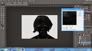
 I started by inserting the test image of our protagonist. I then used the "Pen" tool and outlined the protagonist therefore eliminating the background of the image. Following this, I selected the "mask" option at the bottom right had corner and then refined the mask, making it look less harsh and more realistic.


I then selected "filter" from the tool bar, "filter gallery", "stylize" and selected "glowing edges" which made the image appear black and the detailing of the image colourful. I then went to "filter" again, selected "stylize" and "diffuse" - "anisotropic" which made the colours a lot more predominant.


Then I selected "image" on the tool bar, "adjustments" and then "Channel Mixer" in order to select "Black and White with a Yellow Filter" from the list - this eliminated the coloured outlines on the image making it monochrome. After this, I went to the filter option, selected "stylize" and then chose "solarize" and then added "gaussian blur" to it and adjusting it to 7.8 so it gave off a convincing ghosting effect. 


We then duplicated the layer of the first image of the protagonist and set it alongside it - using the smudging tool to create a winded effect. However this proved to ruin the outcome of the image.
We then selected the filter option and then chose the wind effect to achieve the look that we were hoping for. However we wanted to convey that the two images drew a distinction somehow. 

To do this we chose invert from the adjustment panel on the right hand side and applied it to layer copy 6 and it changed it to a white version. Although, this was not the look we were hoping to achieve. In order to over come this next time we will have to do a trial run on a smaller object.


Poster Editing: Trial

I looked at the pictures that Cloe took and decided to play around with the idea of an image in an eye which Danielle started before with an image of a generic eye and a forest. I decided to take it further simply by using a picture of the actual Protagonist's eye, so it would be more like how the final poster would turn out to be.
I decided to edit an image of the protagonist screaming inside the eye to indicate that there are two versions of her and that she is trapped inside her mental illness and can't escape.

Steps:

1) To start with, I opened both images up in Pixlr, the editing software I used in place of photoshop, for the ime being.

2) I made the second image smaller, so that it would be the right sixe to fit inside the eye.

3) I used the lasso tool around the second image, then used the select tool to move it across into the first image of the eye.

4) I used the Free Distort tool to move the image inside the eye properly, and also distorted the image a little but stretching it to make it look a bit more creepy.

5) I used the erase tool all round the edges of the second image so there was none of the background inside the eye which would have made it look unprofessional.
In the layers box, I reduced the opacity of the second layer so that it was half transparent, making the eye visible behind the layer on top. This also made the shininess of the eye visible which made it look much more realistic.

Evaluation:

The image is okay for a starter but we wouldn't use it as a final image for the poster as it looks quite comical and the image inside the eye doesn't look as distressing as it could. The image doesn't quite convey the emotions that we would like in our poster as it doesn't look very dark, not depicting the horror side to the trailer.

Poster Photography: Trial

-To begin with we thought it would be effective to have tasha facing her imaginary friend as if its a face off between them.
-In the real image we'd probably make sure they were wearing different clothing and they had different hairstyles.
-We thought this could be rather effective as it would clearly show that our trailer is linked to mental illness.
- Here we did a long shot so that her whole body was in the image.

- Another idea of ours was to layer two images of tasha and to have one of her much closer to the camera, looking backwards, and another one further away looking down at herself. 
- This would once again suggest that our trailer is about schizophrenia.  
- I did a high angle so that the 2nd Natasha that is looking over the 1st one would look more threatening, and the close up shot of the 1st one would make the audience relate with her rather than the imaginary friend so that the audience is more sympathetic to her case.

- This image was the one Natasha edited with an image of her screaming. 
- We thought we could have tasha trapped in her own eye to show her having an imaginary friend and to suggest that our trailer is about schizophrenia. 
- I decided to therefore take a close up shot of her eye, this would show emotion in the poster and would make the audience relate with the character.

Thursday, 17 October 2013

Tag Line Inital Typography Manipulation

For the tag line typography, I decided to look for a different font because when we looked at different film posters, a convention found was that the name of the film and the tag line were in different typography.

After a bit of searching I found several  extra fonts which we could consider for our tag line typography.

One font called Lakeshore Drive has the look of being hand written but is a different style, it seems to be much more delicate from our name typography and could add an interesting edge to the poster. It could suggest very subtlety to the viewer that when all seems to be okay, there is actually a darker force at work in our film trailer. Using our initial tag line idea, here is a sample of the font.

Another possible font I found was Daubmark font, which has a similar feel to our main typography but it all in lower case, this could work quite well as it will contrast but there will be a definite link between the two pieces of typography. I personally think this is a more likely font than the previous example. 


I decided to go ahead with this font and have a go at manipulating it in the Pixlr Editor. 
First of all I went over all the letters and coloured them in to make them completely black as there were a few white pixels within the letters, and I drew the ends of letters, such the 'p' because that had been cropped off. 


I then used the select tool to transfer the manipulated letters into a new canvas to start making them slightly blurry at the edges, because this will fit with Danielle's initial poster idea design. 


I then saved the image and switched to Pixlr Express where I changed the focus to the word 'darkest', the plan would be to do this for each 'dominant' word in the final tag line we choose. This will draw the audience's attention to certain words. 


I decided that another technique that could be used is changing the focus horizontally because it would effect all words, and could actually work better on a whole sentence. 


I then used an overlay within the editor to apply to both ends of the words. This works really well because it means the word 'darkest' is literally the darkest thing in the tag line, adding emphasis and drawing the audience to certain parts. The colours at the end could be changed depending on what the colour scheme of our poster, website and trailer will be. I also did one with the colour red as this is often more associated with horror, whereas the blueish one could fit more with the psychological part of our plot.



Colour scheme of the package


Red, Black, White - More traditional

horror. An example of this is Psycho which clearly shows us that it is for more traditional slasher horror as Psycho is an older film. We probably wouldn't be using this colour scheme because it connotes a bit too much horror and doesn't have a lot of psychological connotations to it. It also suggests that there is going to be a lot of blood in our movie which isn't the case for us.

Blue and White - Clinical. An example of this would be the machinist, which is rather clinical and minimalistic, this could be an option for us as it does connote some kind of psychological issue, however it could be that the minimalistic effect isn't enough for our group.

Blue, Red, White - mixture of clinical and horror. An exmaple of this would be paranormal activity. This effect is more modern as it has horror mixed in with the more clinical side of modern horror, this could be suitable for us but as there isn't going to be much blood in our trailer this might be misleading
Neon multicoloured - more modern, delusional, psychological, surreal. This could be quite suitable for us as it clearly demonstrates the breakdown of the mind, though it might suggest an mind more influenced with drugs rather than someone with a mental health issue
Majority white, faded, little colour - bleak life. An example of this is Clean, Shaven. This seems like a rather effective colour scheme as it is similar to the colours of a hospital so it could show that her illness is following her around. Also the bright white makes the man fade into the background which could portray the burden he carries. This could be another possible idea for the colour scheme of our poster. 


Tagline initial ideas

For our film poster it is vital we have an effective tag line, it should compliment the name of our film and also give hints about the plot. When considering possible ideas for the tag line we thought about several themes including paranoia, killing and death. We also thought the idea of an imaginary friend, the idea of a victim and evil should try to be used too. We came up with quite a few ideas, however we have not made a final decision. It is likely several of our ideas will merge together to create our final tagline.

Our Ideas

  • I thought it was over. . . it wasn't.
  • The torment never stops
  • Who am I?
  • Am I me?
  • Are you me?
  • I used to fit in, now I don't
  • I'm on a downward spiral.
  • "I used to fit in" "Now you don't"
  • Never have I been so alone yet so surrounded.
  • I am my only friend.
  • In the dark depths of her mind, laid her greatest enemy... herself
  • What happens when you lose the battle with your own insanity. 
When discussing the ideas as a group, we decided that the first few ideas aren't good enough to be a tagline, they are all too cheesy and too simple. We liked the idea of portraying the protagonist being isolated but never left alone by her imaginary friend. This is where probably the best ideas "Never have I been so alone yet so surrounded" and "In the dark depths of her mind, laid her greatest enemy...herself" come into play. For now, we will choose the second one, but this is not likely to be our final decision. 


Evaluation of the Day - Library Scene - 11-10-13

Evaluation of the Day

Tasks to be done
  • Film shots from the perspective of the antagonist 
  • Re-do shots from protagonists perspective due to unsteadiness


Last time we shot from the protagonists perspective however when watching the footage back it was extremely unsteady even if when we tried to stabilize it during the editing process. To overcome this we tried to film the scene at a slower pace allowing the camera to be held steadier as it had to be hand held to shoot this. We would then speed up during the editing process to add a more hallucinogenic feel to it.


We shot the antagonists scenes using p-o-v shots and over the shoulder shots as she watches the protagonist enter library. Additionally, we got a number of other shots of the antagonist as she watches the protagonist enter to add to the effectiveness of the trailer. Although, the library became considerably busy and there were a lot of students in our shots.


Monday, 14 October 2013

Attic Location: Research


I decided that I would extend my location research on the attic by taking some shots of the Victim in the location to see what kind of angles and camera movements we could use, whether the lighting was effective and therefore whether we would want to use the location overall:

Pros:

  • The pros of the location were that the decoration was very effective, with the wooden beams and brickwork which looks ragged and dangerous, making the room look very creepy. 
  • There was some natural lighting which made it easy to get some good shots, but the low positioned lamp also helped get some very effective shots and made the lighting low-key and creepy, which I liked. 
  • The beams made it easy to get some different shots, such as high angle shots with gave a more innocent and hunted look to the Victim, and made it creepier. This gives us a lot more legroom to be creative with our filming for instance with difference shots and movements.
  • Overall, the space looked pretty creepy and we would have enough space to pull off our planned scene in the location.

Cons:

  • There was not too much space due to the boiler being in the way, therefore we would not have as much space as we would if the boiler were not there, or if we used another location. This inhibits us somewhat in terms of camera angles and shots. 
  • The window means that we would most likely have to shoot the scene during the night, which is a little bit difficult but not something we couldn't achieve. 

Mise en Scene:

  • We would have to clear away a lot of items to make sure they weren't in the shot. This would also give us a lot more room to be creative with filming. This could be time consuming but necessary.
  • We could move a few creepy props into the shot- ropes, chains, gags for instance. We would also have two or three dead bodies lying on the floor in the shot.
  • We could splatter some red paint on the walls, and even put a red handprint to replicate the struggle that many of the victims would have put up when they were kidnapped by the protagonist. 

Thursday, 10 October 2013

Editing our time lapse

The time lapse filming went great, we had perfect weather and were all able to attend, however in the process of transferring the footage from the camera to the computer we have encountered a few problems.

Above you can see the finished edited time lapse. The actual footage is great and we are really happy with it, however, the quality when converting the footage from the camera to the computer has reduced dramatically.

We filmed for around 24 minutes, and I have sped up the footage to around 24 seconds. This will be good to use in our trailer as it gives an insight into what out protagonist's personality is like. Due to the problem with the quality we need to have another look at what we can do with the footage, because it is too valuable to waste. We are going to try adding a few effects in iMovie soon to see if we can show it for even less time and make it 'fit in', otherwise we will have to try converting it again to see if the quality improves. The quality is the same before and after being sped up.

This is our other attempt at the time lapse. We really liked this location and especially the framing. However, we encountered problems with the saving process and the file became corrupted, so we only have 14 seconds, which isn't enough to speed up into a time lapse. Therefore, we would like to attempt this again in that location.

Location for Kidnapping Scene: Shortlist of ideas

After some research we found that the factory in Dartford was not only very hard to find, but had a high chance of no longer existing and therefore we started looking around for a new location for the last scene. We decided to come up with a list of multiple locations with details on location and their appearance according to either pictures I've taken or found on the internet. I felt that I learnt from rushing too quickly into deciding on a location before looking around at other options and making sure the location was available. One of the downsides to the internet, I found, was that many of the websites about 'derelict' places are out of date largely and so a place which apparently is abandoned on the site could have been destroyed or reoccupied in recent years, meaning some more extensive research must take place before hand.

1) Klinger Factory 

This is a video of the Klinger Factory in Sidcup. We would use one of the interior rooms for the scenes.

Practical Usability:

  • Although it is quite close, an exact location is hard to find on the internet and so we would have to go into further research in order to find out where it is. A past group have used the factory and so we could ask them for advice on finding the location.
  • In recent months, there has been a fire at the location and according to reports some of the first floor has been destroyed which means that we may not be able to film there, if the rooms on the lower floors aren't accessible.
  • Fencing has recently been added to the site following the fire. Many people online say it is not easily accessible because of this unless you are experienced in climbing and exploring different urban areas. This could be an extreme issue as we would have props - such as a chair- actors and filming equipment with us when we go to film.
  • There are people who often go to visit the factory as well as tramps and squatters which may get in the way of filming.


Appearance: 

  • The factory would be a good option to use as the interior rooms look rundown and ragged, as well as isolated which adds to the fear factor. 
  • The only issue would be that we would be more likely to use the factory during the day due to it being a difficult one to get into and so it may reduce the effect of the location.


2) Holy Trinity Convent

This is an abandoned trinitarian convent in Bromley. We would use one of the interior rooms of the location.

Practical Usability: 

  • The location is fairly close being in Bromley, however an exact location is still unknown. Again, we could ask the previous group as they visited it after thinking of using it instead of the Klinger Factory.
  • A major issue of the convent is how to get in it as according to reports online, you need to climb through a window in order to get in, which proposes difficulty when with a horde of actors with props and filming equipment.


Appearance: 

  • The appearance is effective as although the rooms are run down and look pretty isolated, they have a lot of religious features and architecture which adds to the edge of the horror genre. 
  • This may seem a little at odds with the psychological genre however.


3) Dungeon

This is an unused room in the school building which does not have any natural light in and may be suitable.

Practical Usability: 

  • This location would be the easiest to use as it is on the school premises and so we would easily be able to transport props and actors, especially when the whole media group and the actors would already be at the school before filming.
  • We may have to film after school however which would require permission. As well as this, the room may be used for other things on occasions and soon could be transformed into an Art storage room which would completely ruin everything.

Appearance: 


  • The room doesn't have any windows and so there is not much natural lighting which adds to the creepy effect. 
  • As well as this, the white, ragged brick walls give a scary edge to the room with the bare wooden floor. I like the ladder as well as it conveys that the location is underground and unreachable. 
  • However, there are a lot of things being stored in the room and this could cause difficulties.


4) House loft

Practical Usability: 


  • This location would be fairly easy to use as we know the location well and would easily be able to make our way there. 
  • Each actor and member of the group would have to make their way to someone's house, which would not be too difficult. It would also be fairly simple to transport props to.


Appearance:

  • The appearance of the loft is pretty creepy as the brickwork is in an upside down V formation which is unusual, and as well as this there are parts in the wall that have been broken away, as well as black marks running down the walls. This makes it look very ragged and creepy.
  • The lighting is very low key which would suit the mood of the last scene and the light is obviously coming from one source and so the plan of having the victim blinded by the light would work pretty well. The light being in an unconventional spot also creates very creepy looking shadows when someone puts their hand across it, which we could work into the trailer.
  • The beams across the loft would work pretty well as we could incorporate them into many effective panning shots and even use them to get higher angles when shooting the victim.