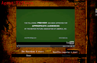
- This website is suitable for the genre because it becomes clear immediately it is in the horror genre. This is made clear by the background - an image of a woods in grey and white, looking very isolated and appears scary. The tagline also fits into the horror genre, "Some kidnap to protect... They kidnapped for revenge" as it suggests there is a victim and a threat, possibly a human or creature, until you watch the trailer it is unclear.
- It is suitable for the target audience because it features scary content and doesn't make it too childish by including games for example, as some animated children's films may do.
- The choice of image works well, it is effective as it helps make the genre of the film trailer clear to the audience and draws them in. It also immediately makes it clear that some of the events of the film occur in a wooded area, which can be seen when watching the trailer on the home page. The image gives a professional impression to the audience as it is very eerie and has obviously been edited to achieve the old appearance and misty look. It is appropriate as it doesn't give too much away and isn't distracting from the other content on the website.
- The teaser trailer is embedded well and starts as soon as the webpage loads, however, unless you make it full screen the trailer plays in a very small box which could make it hard to see some of the details of the trailer.
- The title of the film is very clear, in capitals at the top of the screen at all times. They have also used a nice transition when the webpage first loads to make it come down from the top, adding to the professionalism.
- The size of the font is very big, which does make it clear however I feel it makes it appear slightly less professional. In addition to this, the text in the 'About' section is black, which makes it slightly hard to read in front of the background. However, the red colour used for all the page links is red, which helps connote ideas found in the horror genre, in this case blood, and also stands out against the grey background image. The size of the social network links are also very big which make them look slightly out of place as they do not fit in with the colour scheme. Perhaps by making them slightly smaller or moving them further down the webpage slightly is would have made the website look more professional.
- There are no critics reviews found on the webpage, which takes away from the professionalism.
- The social links, despite being very large are all useful and links to the main sites, such as Facebook, YouTube and Twitter, there is also a downloads page making the website interactive.
- The overall colour scheme works well, as it helps enforce the horror genre and makes it seem quite creepy. The grey background allows the red text to appear quite bold which encourages the viewer to click around the website and find out more.
- The site is very user friendly, it is easy to navigate and access all the areas without encountering any problems.
- The website it suitable for the genre as the sound playing as the website opens leads us to believe it is horror, as does the background.
- suitability for genre
- suitability for target audience
- effective/professional/appropriate choice of image
- teaser trailer embedded and starts automatically?
- title of film clear and professionally embedded into website
- suitability of size/font/colour of links
- use of critics reviews
- inclusion of social networking/interactive opportunities
- overall colour scheme
- user-friendly
- This is suitable because the red colour scheme and hand print make it clear it is the horror genre to the viewer, and gives it a professional feel.
- suitability for genre
- suitability for target audience
- effective/professional/appropriate choice of image
- teaser trailer embedded and starts automatically?
- title of film clear and professionally embedded into website
- suitability of size/font/colour of links
- use of critics reviews
- inclusion of social networking/interactive opportunities
- overall colour scheme
- user-friendly


No comments:
Post a Comment