2. How effective is the combination of your main product and ancillary texts?
When developing the various different areas of our products, we needed to ensure that they all linked together, to complete a professional looking promotional package for our teaser trailer, poster and website.
Colour Scheme
First of all, we ensured that the colour scheme of all our work fitted together well. During our research and planning stage, we noticed that one of the conventions of a psychological horror, was to have a fairly dark colour palette.
Colour Deconstruction
"The saturation isn't very high, and there isn't a great contrast either, however the brightness is still high enough so that the viewer can see all the features of the character's face. The lower saturation immediately gives quite a dark feel to the shot, by no means is this a happy experience, and the feelings of sadness, depression and pain could be portrayed through these colours. I think this is definitely a technique to consider when editing the final montage shots for our trailer, and to make a distinction between real life and our protagonist's imaginary friend"
"We immediately get a sense of dark foreboding atmosphere from this shot, and most of it is portrayed through the colours - this could be used as a build up in our trailer. The low saturation makes the scene quite dreary, however the contrast is very high in this shot, making the black and white stand out, and helps draw the audience's attention to the dominant parts of the scene. The colour temperature is also very low, and we can see this and the lack of saturation by looking at the washed out red door on the right hand side of the frame. The high contrast also makes some parts of the frame, especially the background appear in very dark shadows, creating a sense of danger and mystery in the shot"
Implementation
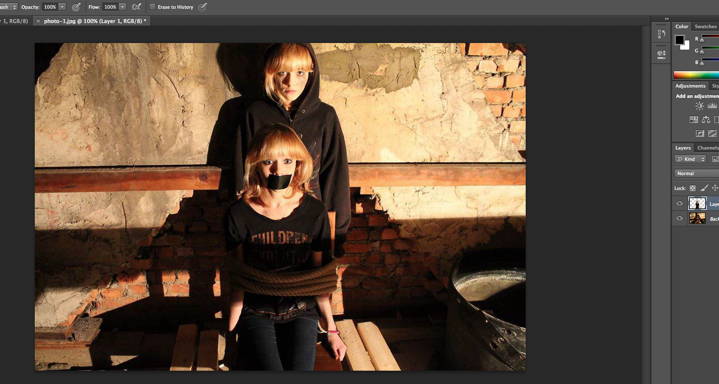
For this, throughout our teaser trailer, we edited the colours of several shots to make them appear darker, as well as shooting in dark locations, such as a loft, for the end scene where we witness the after effects of the kidnap. We then wanted to combine these dark colours with the images used on both our poster and website. For our poster, we decided to use a photo taken in the loft of the protagonist and her imaginary friend, as this suggests isolation and danger to the audience. We also like how this links to one of the most important scenes of our teaser trailer. For our website, we used a different image as the background, as wanted variety, however, so that our products link together, we used the same idea of our poster, and included both the protagonist and her imaginary friend in the same image. We also made the edges of the image very dark, to bring in the use of a darker colour scheme, showing conforming to the conventions of psychological horror.
Tag line
To ensure that the combination of our main product and ancillary texts is effective, we also had to ensure that the tag line was the same throughout all our products. We decided that we would not use our tag line in our actual teaser trailer, because we already had a sufficient number of titles throughout the trailer, and didn't think it would be appropriate to overwhelm our audience with text throughout the trailer. Therefore we needed to ensure that the tag line for both our website and poster was the same. This was simple enough, but we decided instead of having the tag line all on one line, we would split it, to make it more interesting for our audience. You can see how the tag line looked on the website before splitting here, and what it looks like after splitting here. We also split the tag line up on our poster, as we had slightly restricted room on the poster, so this was another benefit of having the tag line spread across several lines. You can see how the tag line appears here. This makes the combination of our products effective, because the audience will see a similar layout whenever they see our poster or visit our website, and this familiar layout will help them to remember our film, and want to watch the teaser trailer.
Typography
Throughout all three of our media products, it was really important to incorporate the same typography into each, so that they all look the same and you can tell they are part of the same promotional package. For this, we created our typography in Photoshop, and decided that we would have a font for our titles in the teaser trailer, an edited font for our title and tag line typography, and another very simplistic font for the rest of the website.
Here you can see how we went from a drawing to a basic design of possible typography, using the online service Pixlr Editor. This was good for playing with ideas, as it was easier to use than Photoshop and allowed us to practice with different typography manipulation before deciding on our final idea.
There was a while during the development of our typography where we played with the idea of using a inky looking typography, because we thought this would fit in well with our narrative and hint at the idea of kidnap. You can see here how we experimented with this idea. However, we wanted to make it look really professional, and this trial didn't meet our expectations, so we moved on and created this, which is much more uniform and fits better with the conventions found in typography of products also in the psychological thriller genre.
For our teaser trailer, we used the same font, 'Dark Ages' for all our titles, we felt that this fitted with the narrative of our teaser trailer, and it also fitted well with the font 'Old Style', which we used to make the tag line with. We also felt that the tag line and title had to be different, as we noticed this was a common convention of film trailers and posters. There were many stages during the development of our typography, as we encountered quite a few problems along the way.
Combining our three products
When comparing our three products, we wanted to make sure that there was consistency with how we had laid out various parts of them, such as the typography. This was the main thing we had to focus on when checking that the combination was effective, so we decided to utilise the space on the right of the poster and the website to place the title of our teaser trailer. This meant we could use the same positioning of all the letters, and our audience would be able to quickly identify that the website and poster were for the same film.
1. In what ways does your media product use, develop or challenge forms and conventions of real media products? Throughout the development stages of our teaser trailer, poster and website, we had to research thoroughly into the various conventions of our genre, psychological thriller.
Teaser Trailer 'Enter the Void' Deconstruction
Firstly, we carried out many deconstructions on films from the same or similar genre, focusing on picking out what the conventions of our genre were. One deconstruction I found to be quite a large source of inspiration for us, was 'Enter the Void'. In my deconstruction of this, a prominent feature I focused on was the use of flashbacks throughout the film, one point really stood out to me, where the flashbacks were used in a montage sequence, quickly showing various parts of the protagonist's earlier life. I believe that this was an inspiration we used in our teaser trailer, because during the end part of our trailer, we have edited together a montage sequence, including flashbacks from earlier in our film's narrative and increase the pace of the montage rapidly.
'Girl Interrupted' Deciding to focus on mental illnesses
Since our teaser trailer focuses on a character with schizophrenia, we also had to research films that covered characters will mental illnesses. For this, I deconstructed the trailer of the film 'Girl Interrupted'. While deconstructing this trailer, I noticed how those with mental illness were not treated with the same respect as 'normal' characters, and they seemed to adopt a childish nature, as can be seen with the character Lisa.
Deconstruction
Throughout the film's trailer, we get a huge sense of the prejudice against the people inside the mental hospital, they are not treated like normal human beings.
"Patients do not seem to take their time at the facility very seriously and this is shown by the introduction of Lisa, who is wearing a bright yellow shirt and has a cat puppet. This shows a very childish nature, especially with the addition of her diegetic dialogue "Look at me!" Wanting attention and playing with the puppet, however the mise en scene suggests that she is probably happy if not excitable"
"The typography used when Susanna has arrived is very important, as the word 'Claymoore' is in red capital letters, which could suggest to outsiders there is some sense of danger, however the underlying message could be that the staff are taking action to help those inside"
"Linear narrative is used heavily at the end of the trailer, helping to increase the pace and add a little suspense just so that the viewer wants to find out more of the narrative." Implementing conventions into our trailer
We tried to incorporate this into our teaser trailer, and this helped us conform to the prejudice representation used in films of those within films. From the very beginning of our trailer, we see how our protagonist is judged immediately by those around her, prompting her to watch the character who judged, and try to get some kind of closure, while battling her mental illness alone, which only makes the situation worse. This challenges the convention we saw used in 'Girl Interrupted', where all the characters in the trailer that have mental illnesses stick together and help each other through whatever is thrown at them.
Instead in our trailer we highlight to the extreme how some people with mental illnesses can be isolated, thus leading them to do things they seem to have no control over, in our case kidnapping the girl who judged her. It shows how when left completely isolated, it can feel like there is no way, only allowing themselves to become overwhelmed with negative thoughts, which we represent through an imaginary friend.
Website
As part of creating our website, we had to research the best kind of layouts for a promotional website and also what content should be included on it. During this research, we looked at other A2 Media promotional websites, and looked at what was good and bad about each of them. From this research, I found that the conventions of websites were to make the genre of the film obvious straight away, often using the background image and typography to achieve this.
Conventions of film websites appropriate to our genre
- Genre suitability
- Suitable for target audience
- Embedded teaser trailer, starts playing automatically
- Clear title of film
- Suitable font colours, and link colours
- Social network links
- User friendly
- Critics reviews
This website is suitable for the genre because it becomes clear immediately it is in the horror genre. This is made clear by the background - an image of a woods in grey and white, looking very isolated and appears scary. The tagline also fits into the horror genre, "Some kidnap to protect... They kidnapped for revenge" as it suggests there is a victim and a threat, possibly a human or creature, until you watch the trailer it is unclear.
The teaser trailer is embedded well and starts as soon as the webpage loads, however, unless you make it full screen the trailer plays in a very small box which could make it hard to see some of the details of the trailer.
The social links, despite being very large are all useful and links to the main sites, such as Facebook, YouTube and Twitter, there is also a downloads page making the website interactive.
The overall colour scheme works well, as it helps enforce the horror genre and makes it seem quite creepy. The grey background allows the red text to appear quite bold which encourages the viewer to click around the website and find out more.
Development
We developed on this convention by using a background that we think makes the genre clear, as we see our protagonist looking back towards her imaginary friend, who is the source of much of her confusion and violent actions. Another convention of websites was to feature the actual teaser trailer embedded somewhere on the web page, and to have it play automatically once the page has loaded. We have conformed to this convention, as it it vital we have this content on our web page, because it links our promotional products together.
Poster
Research
A large part of the poster, and the website and trailer is typography, and before we could start designing any of our own typography any of these, especially the poster, we had to research what was already out there. From the posters I found that the typography for the different elements of the poster such as the title and tag line are largely the same, but with small differences. We conformed to this idea, and chose very similar looking fonts but with similar effects applied in Photoshop so that they link together nicely. We found that most of the posters used quite dark colours with a bold contrast, something we took on board with our poster by using a dark location for the photo shoot.
Dominant eye in centre of the poster, drawing audience's attention here
Web address in bold at the bottom of the poster
Typography in capitol letters
Tagline links to dominant image
Costume appropriate for time.
Development
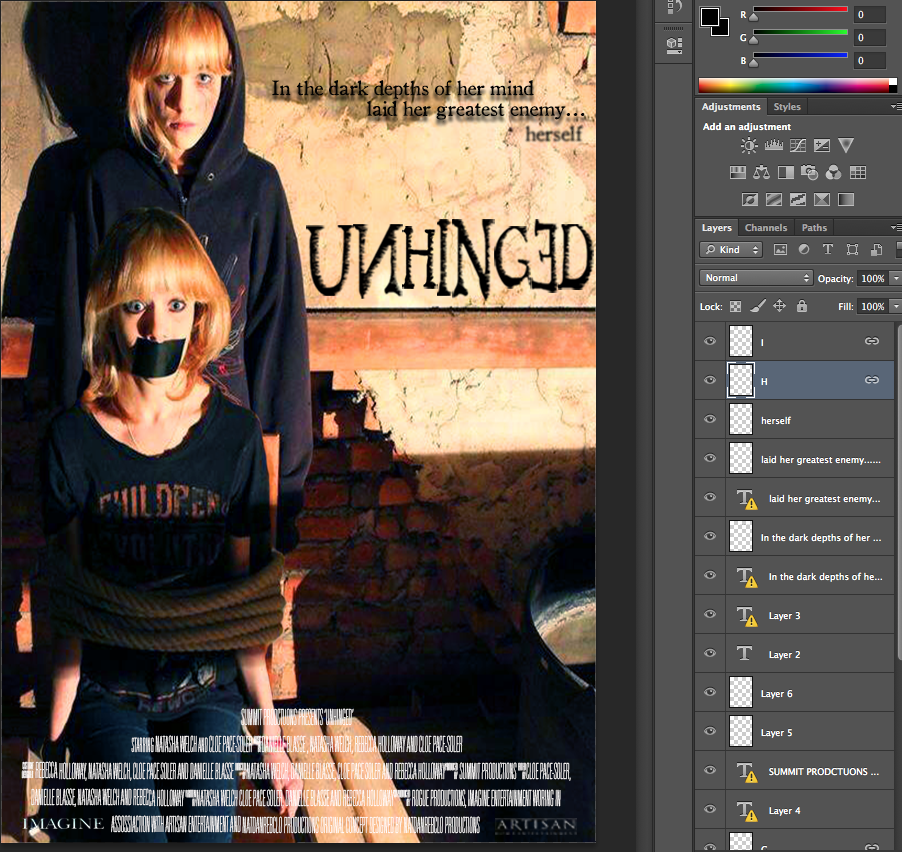
A common convention of the posters we examined was that the tag line is always a lot smaller than the main title, so we conformed to this convention, making it much smaller and ensuring that the title is what grabs the audience in. In addition to this, the majority of posters have the protagonist's face present on the poster, and this is the dominant feature. We conformed to this idea mostly, however we decided to have two faces, both our protagonist and her imaginary friend edited in, this would be the dominant of our poster, and conforms to the dominant feature linking to the tagline. We thought that because this was slightly different from the normal conventions it would grab our audience as they'd be intrigued to find out why there were two identical people on the poster.
3) What have you learnt from your audience feedback.
Survey Feedback
Production
Feedback
When initially planning for our media products, we conducted a survey in order to help us make some important decisions about the production process.
For instance, we asked our target audience: "would it be effective to use two cameras to achieve multiple angles?". Over 80% of responses claimed that, "Yes," it would be effective to make use of different cameras, and that it would not be too complicated.
Development
Therefore we implemented this during our storyboarding stages. We took this into consideration in the scene where the protagonist stalks the victim via webcam by utilising the digital camera and the webcam camera to get a variation in shots and angles.
This meant that we had a wider variation of shots and angles to use in the post-production stage, leading to a more professional overall product which really shows off our skills. We also developed this idea by adding in an overlay of a recording symbol on the footage recorded by a webcam. This emphasised the fact that it had been recorded by the protagonist and so have a creepy twist.
Mise en Scene
Feedback
As well as this, we asked our target audience about the costumes for both the actors, asking "what style would be best for our character?"
The majority of respondents answered, ’Grungy look’, which we took into consideration when deciding on costume choices for our protagonist, which we documented thoroughly.
From this feedback, we went away and created, 'wardrobes,' for each of our characters.
This was due to our trailer form, which meant that we would include various scenes from across the timescale of the film and so the characters would not be wearing the same costume throughout.
When filming our scenes, we had a collection of costumes which we could go to easily which we knew suited our character profiles. This made the production stage of the process a lot easier.
From the feedback we received about the styles of our key characters, we were able to make 'character profiles' to help us get a clear idea of what they were like and what mise en scene we wanted to surround them with. For our victim, we decided to make them have a mainstream style and typically 'girly.' We kept this mind when choosing the bedroom for this character.
Development
Once we had chosen the bedroom for the character, it was imperative that we changed the mise en scene. One of our main issues whilst filming was our location of the bedroom as the mise en Scene of the room was not suitable for the character that we wanted to convey.
We immediately decided that major changes would need to take place within the room to make it suit the character, primarily by removing various items which clashes with the personality of the victim. This included all of the books on the bookshelf as we didn't perceive the character to be very interested in reading fictional works, the guitars in the corner of the room as we thought although she could be musical, these would distract from the main points we wanted to put across about her character.
Then we went about adding in items that we thought portrayed our chosen character. We printed off posters of mainstream musicians and actors and stuck them over the walls and wardrobes. We wanted to give the room a cluttered effect and so we asked everyone in the group to bring round pink objects, makeup and shoes which we scattered around the room. We put beauty products on the shelves and threw different types of shoe on the floor in a random order so that it did not look too meticulously placed.
Title
We also utilised audience feedback when considering the name of our film. We initially had a long list of film title choices which we were deliberating.
We cut this list down to 6 options and then conducted an informal survey by asking around and creating a tally for the number of support for each name.
Finally, I created a pie chart which showed explicitly the popularity of each potential title. This helped us considerably when choosing the name as it meant we got an unbiased view, and we eventually settled on the most popular name which was, ‘Unhinged.’
Feedback: draft trailer
Narrative
Feedback
After we completed our trailer, we wanted to receive feedback to know what tweaks to make.
We uploaded the trailer onto youtube with a list of questions in the description, to help us get an idea of what we needed to change.
One thing that became obvious to us straight away was the unclarity of the narrative, as many comments expressed uncertainty for instance, "Something about a girl who is haunted by someone...?"
Changes
Therefore, we decided to make the title slides longer and edited them so that they were 2 seconds each, as they were originally too fast to be able to read as we did not want to go over 60 seconds. However, we decided that we were more focused on the audience understanding the narrative and made some essential changes.
These allowed the audience to read the titles clearly, which meant they could absorb what the narrative is.
This also allows them to understand the initial equilibrium shown through the title, 'The medicine worked', which is lost in the middle, explained via the title, 'Then she was haunted by someone's thoughts.'
Feedback
Linking in to the unclarity of narrative, we received a lot of comments about one scene in particular. This was the scene where the protagonist is seen scrolling down the Facebook page of her stalking victim, and witnessing many malicious comments - which appear in the background via chroma keying.
Many people did not think that the malicious comment which upsets the protagonist is clear enough, suggesting, "The narrative would make a lot more sense if the facebook status was longer and larger."
Before the feedback, the comment was zoomed in a little bit and stayed on the screen for about 1 second. On top of this, the protagonist's head was directly in front of the wording. This meant that an essential part of the narrative was unclear as the audience could not understand what discrimination pushed the protagonist over the edge.
Changes
Therefore, we made some vital changes. I utilised photoshop to create a close-up of the comment as a large image.
Then, I imported it into Final Cut Pro and edited the scene so that the protagonist would disappear from the foreground so that the audience could clearly read what the comment said.
I also made this shot much longer than it was originally, to give time for the audience to read as it. It was important to ensure that effective transitions were used either side of this shot to make it fit in smoothly, and so I used ‘Static’ transition, ‘Style B’.
Sound
Feedback
We also received a lot of feedback about the sound, such "sound needs to be tweaked" and the sound, "needs cleaning up as at certain points the layering was a bit off." Therefore, we thought it important to focus on the soundtrack when changing things around.
Before this feedback, the transition from the previous scene into the montage was a bit unprofessional and rigid. The non-diegetic soundtrack before the montage consisted of a soft, melodic piano track which very abruptly changed into fast-paced 'boom' sounds. Looking back, we did not think this was a very effective transition.
Changes
Therefore, we made use of the ‘boom’ sound effect leading up to the montage, layered over the piano soundtrack. This prepared the audience for the change in tone, rather than surprising them all at once and created a gradual sense of anticipation.
We also added a ‘woosh’ sound effect just before the montage, to add to the suspense and prepare the audience for a distinct change. We also faded out the piano soundtrack rather than end it abruptly, so that it would a more subtle change in sound.
This meant that the sound of the overall product seemed more professional and intricately layered so that although the change in tone at the montage still had a major impact and created tension, it did not seem out of place and transitioned smoothly.
Feedback: draft poster and website
Typography
Feedback
We also received some feedback concerning our poster and website, which we took into careful consideration. Our audience was concerned that the title of our poster was not large enough, making it not conventional of a film poster and also making it not very noticeable.
Originally, the title was laid out along one line, which meant that it was squashed up in order to fit into the available space. This did not make use of the space on the poster and made the overall poster seem a bit empty and unprofessional.
Changes
Therefore, I duplicated the file and changed it by making the title ‘Unhinged’ on three lines rather than one, and manipulating it so that it was slightly crooked. This made much better use of the space on the poster and conformed to the conventions of a psychological thriller much more.
Development
However, we also then had the problem of the website, as the layout was then different to the poster which didn't create an effective promotional package combined.
Therefore, we had to make sure it was also the same style on the website, creating a transparent image of the title on photoshop which we could import onto Wix.
This made our products combine effectively as a cohesive promotional package which was also more conventional of the psychological genre.
How effective is the combination of your main product and ancillary texts?
As well as a 60 second trailer my coursework group and I also had to create a website page and a poster which all had to effectively match one another.
Reinforcing the Narrative
Trailer
We included the protagonist's imaginary friend in all of our media texts. Firstly in the trailer we did this through chroma keying. When creating our initial ideas we were set on one thing, including chroma keying in our trailer. We shaped our trailer and package to this key thing so we could play around with new effects.
When first experimenting with chroma keying we used a smaller scale green screen and filmed with a mobile phone. This was extremely unprofessional but we were able to get to grips with how to work the chroma keying effect on Final Cut Pro through this.
We encountered simple problems such as not wearing green during the shoot as those sections would be removed with the rest of the green background when editing. We also realised that lighting was key to a professional effect and we have to avoid shadows as much as possible.
Once we understood how to edit the footage we bought our own green screen and re-filmed with our camera on the tripod so it was steady as when initially filming our characters weren't in line with one another. This meant that when we combined them the videos both merged seamlessly and we were then able to progress into changing the background. We felt that chroma keying would encourage the audience to realise our protagonist was imagining these sequences.
At the end we had a sequence in which the imaginary friend would walk in and whisper into the protagonist's ear. This made our protagonist's schizophrenic explicitly clear to the audience.
We also then experimented further and started altering the backgrounds to more surreal, distorted images to explicitly show the audience these scenes are in our protagonist's mind.
Poster
Our poster also includes the imaginary friend, this required the use of photoshop to lift one aspect of an image and move it to the other side. We used the 'lasso' tool to cut out our protagonist sitting on the chair and move her over to the second image in the loft. After rubbing out the individual pixels around her and adding some shadows so that it didn't seem like it had been stuck on we had our completed image.
However, our initial image was landscape which did not suit our genre and so we had to alter it to portrait. After cutting both sides of the image and stretching it slightly to make it a4 the poster looked fine.
Our final product was professionally layered and reinforced the narrative with the inclusion of the imaginary friend. The gaffer tape over our protagonist's mouth clearly tells the audience that she is being controlled by her mental illness and that she is not the villain but the victim.
Website
We also had the inclusion of the imaginary friend in the website image.
When first taking the image we had to use a tripod so the image would be stable and merging the two images wouldn't be difficult.
We had a focused image of our protagonist in the foreground so the audience was able to recognise who our main character was.
We then included the imaginary friend in the background, we did this by retaking the photo with our actor further away from the camera. We then ensured that she was out of focus, therefore showing that although our protagonist's mental illness isn't obvious its always in the background of her mind.
Finally, to add the psychological effect we added visual effects on the image and therefore our genre was clear. This was a gif which blacked the imaginary friend's face out occasionally, therefore adding in a surreal edge.
Typography
Initial Typography
Typography was one of the main areas which underwent many changes. To begin with a font was chosen called 'Dark Ages' which we all quite liked. We then experimented with manipulating the typography in photoshop by blurring the ends of the letters so they looked like they were turning into vapour.
Development
However we noticed quite quickly that although this did look creepy it did not really match our psychological genre at all and so we had to change it.
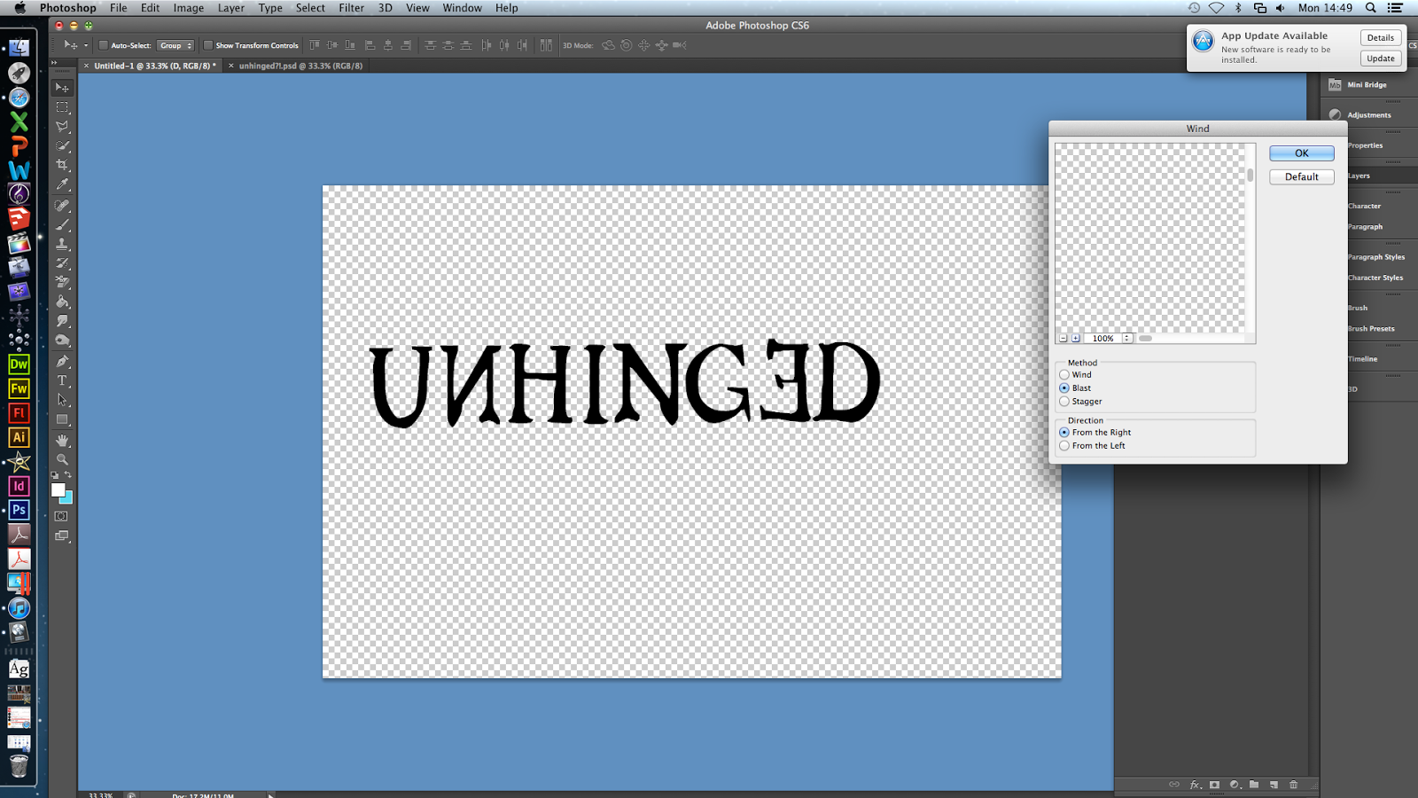
We decided to go for a typography called 'Old Style' which was manipulated to seem eroded with the effect 'wind' at a 'blast' level. This meant that the typography now suited our genre. Additionally we also used the transform tool to flip certain letters upside down and to make them inverted. This reinforces our genre further as its connotes that something isn't quite right, which is what our title states as well.
In order to ensure all our media texts were matching we had the same typography and effect on the website, poster and trailer.
Further Changes
We then noticed we had different layouts of the title on the different texts, with the website having the title in white and in a single line, the poster having the title split up on three lines in black and the website having a mix of white and black on one line. This was bad for continuity and so we decided to change the title on the website on three lines and changed the colour to black. This meant that our products were seen as a package rather than separate pieces.
Colour Scheme
Initial Ideas
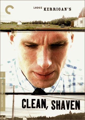
Initially we started out researching different colour schemes for psychological genre, and decided that the two examples given were our favourite colour schemes which would accurately suit our genre. We felt the neon colouring would clearly state that our trailer was psychological, however we also felt that the bright white of clean, shaven linked in with hospitals and would demonstrate that our protagonist suffers from a mental illness.
Development
However when creating our website and poster images we strayed off from this as we felt that the content of the image was more important than the actual colours, and that our texts definitely came together as a package due to the presence of our protagonist and her imaginary friend in both images.
Despite this we did have a theme of high contrast, saturation and darkness which made our images come together and match. Both images were altered to seem more grimy and psychological, with dark shadows being highlighted and certain areas becoming harder to see (e.g. the imaginary friend in the background.)
We felt this was better than a 'colour scheme' as it was more professional. They did both follow a theme and have a similar texture to them, however the colouring is different.
Despite this we did maintain the same colour scheme of black and white for the title and tagline, so that there was one main area that was exactly the same, therefore completely tying all our products together.
This theme of black on white is also in the trailer with the titles and the final title at the end.
3.)What have you learnt from your audience feedback?
Feedback from the survey
We initially sent out a survey to ask second opinions on the plot line of our trailer.From this we made many key decisions that were linked to our trailer.
Firstly when creating our trailer we felt it would be effective if our protagonist was to be spied on, however deciding which camera would be best to do this on was difficult. This was one of our first questions to our audience.
This feedback told us that the preferred camera would be a laptop camera and so we took this on board when filming the scene in which she is spied upon.
Development
We took this on board when editing our footage from our bedroom scene as we realised that we have to make it obvious she was being recorded from a laptop.
This meant that we had to download a 'REC' sign and make it transparent through photoshop. Once we had done this we then imported it into iMovie in the corner of the video.
Secondly, we were unable to decide whether subtle or obvious discrimination would be better in order to correctly portray our message. When we asked our audience the majority of answers thought that a subtle type of discrimination would be preferred, we felt that this was better as it would show the audience that the trigger for mental illness doesn't always have to be obvious.
Development
We took this on board when filming our footage and brainstormed different angles we could utilise to demonstrate that our protagonist had really been hurt despite the discrimination being quite subtle.
We did this through a close up of our protagonist's face, while our antagonist walked past the camera. This meant that it was clear the antagonist was leaving the room straight after the protagonist's mental breakdown, and the audience would then see the protagonist's expression and how this had impacted her.
We felt this was necessary if we were to include more subtle discrimination as otherwise it wouldn't have been noticeable that our protagonist was hurt and the meaning would have been lost.
Finally we weren't sure if having the protagonist wear a mask would be freakier for the audience. However when we asked them they felt that the imaginary friend shouldn't wear a mask or animal ears. We felt that this was also a good idea as if we had used a mask it wouldn't have been as obvious that we were using chroma keying for some of our scenes.
Title
We also gained feedback on what our title should be.
After giving our audience a selection of titles our trailer could be called, we clearly saw that the winner of these was 'Unhinged.'
We felt it was important to listen to the audience as the title is key to attracting attention from them.
Feedback from YouTube comments
We then completed our trailer and asked people to feed back on YouTube. This gave us a lot of helpful feedback.
One main issue that many picked up was the facebook scene as many said the mean comment that triggered our protagonist wasn't clear. Because this scene is crucial in understanding our trailer, the fact the audience were missing this because it wasn't clear meant they weren't able to fully understand.
Development
We therefore made this scene longer by a few seconds and had a close up of the keywords flash up along with non diegetic sound of 'freaking out in the library' so the message was clear.
We this shot up for a few seconds after this so that it was completely clear, and then followed this by our protagonist slamming the laptop down to clearly show she was hurt by the comment.
By having her imaginary friend say 'Charley' we then clearly showed a link between her mental health and the discrimination. This demonstrated a cause and effect which was key to our meaning.
Secondly, people found it difficult to follow the story because they found the titles were too short, therefore we made them all two seconds long and shortened any transitions so they weren't taking away length from the titles. This meant people had enough time to read what was being said and full understand our narrative.
Suggestions were also made about various other bits to cut out. For example one comment (shown above) stated that a shot where our antagonist goes towards the webcam makes it seem like the antagonist and the protagonist are friends and they are communicating. This is clearly not what we wanted to show as our antagonist was being spied on in that scene. Therefore we took this advice on board and removed that part of the scene.
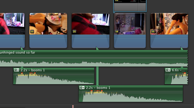
Comments were also made about how the montage scene was a bit unexpected due to the sound, for example they said that it jumped straight in without any warning.
Development
We therefore made tweaks to this so cinematic booms were introduced much earlier in the trailer. This meant having subtle deep bassy sounds throughout the bedroom scene, so we could slowly raise the tension. This proved problematic as we had to make sure the 'booms' were at the same point as the beat in the piano song we had in the background. In the lead up to the montage we had to slowly decrease the volume of the piano music as many found this was anti-climatic. We then inputted a high pitched 'whooshing' sound that increased the tension just before the montage therefore warning the audience of the climax that was coming up. The high pitch noise ended just as the booms began therefore leading the audience straight into the montage scene. This meant that the montage scene wasn't as unexpected and so it signalled to the audience that we were nearing the climax of the trailer.
4.) How did you use media technologies in the construction and research, planning and evaluation stages?
As a group we used many media technologies in the construction, research, planning and evaluation stages of our media products. The points mentioned below are areas I personally did.
Editing
Titles
Wording of the Titles
Creating the wordings of the titles was a difficult task that the whole group had an input in. I came up with variations that we could use and as a group we attempted to alter these variations to suit the genre and narrative. Our titles needed to be obvious due to the fact our trailers's narrative was a bit complicated. The wordings of the titles was key to ensure the audience's comprehension of our trailer and so I spent a lot of time redrafting these phrases.
Once we had the final wordings of the titles we could start making our titles.
Initial attempts
When first experimenting with different styles of titles we drifted down a more slasher horror route which didn't match our genre.
We started out by having an 'old paper' look for our background, the font we used looked like calligraphy and after using the 'smudge' tool looked like it was leaking down the page. We then added in blood splatters such as a hand and blurred the ink and blood together. Although these titles did seem rather effective, they did not match our genre at all and would have stood out when watching the trailer.
We also edited these on photoshop and so they would have been still images, this would have meant that none of the words would have been duplicated and they wouldn't have been very distorted.
Development and creating our final titles
When deconstructing films and trailers the titles for both Number 23 and Pi stood out to us and we felt like recreating a similar effect for our own trailer.
For example throughout Number 23's trailer there were images and signs constantly flickering up onto the screen. We felt this had a psychological effect which would reinforce our trailer and so we attempted the similar effect on our titles.
Pi's trailer had the words in the title double and smudge together, we felt this was also very effective and would reinforce our genre. The doubling of words clearly connote that something is mentally disturbed or something isn't right, and as our genre is a psychological thriller we felt this was suitable.
To create them I first opened final cut pro and chose a plain white background as we felt this would best match our colour scheme and general package. Then, using the same typography as the tagline 'Dark Ages' I wrote in the phrases I had created.
After this I decided that having our titles gradually get more and more distorted would reinforce our narrative as it would represent how our protagonist's mental illness gradually gets worse through the trailer.
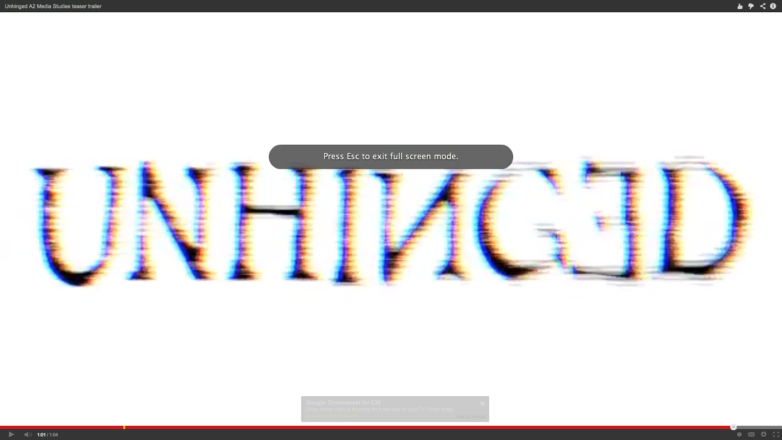
On the first three slides I applied effects called 'projector' and 'bad TV' and gradually increased the amount on each slide. In the final slide before the montage and climax I increased these effects to full and then repeated the word 'herself' which was layered over the title and was competely distorted.
I also created the final title at the end of the trailer which said 'UNHINGED' and 'COMING SOON.' This required much more precision as I felt it would look effective if the title's colours were inversed for a milisecond before going back to the original title. I repeated this a few times and had to alter how long each slide would flash up for. I also applied 'projector' and 'bad TV' on both the background and the actual title so that the whole image looked completely distorted. So that this would have a lasting effect I layered the non diegetic sound 'metal impact' which was used throughout the trailer. This meant that the ending linked in with the rest of the trailer and the title was forceful when it appeared at the end.
Bedroom scene
I also edited the scene in which our protagonist is stalking our antagonist with a partner. For this scene we felt that close up shots of our antagonist slipping on some tights would be effective as it would be quite an intimate shot, making the scene creepier.
We also had a shot in which our antagonist was removing her nightgown, but cut it before the nightgown fell off so that the audience could understand what was going on.
This was then cross cut with shots of our protagonist on her laptop watching our antagonist get dressed.
We had a contrast between shots taken from the laptop and shots that we took on teh camera due to the differing colour levels and levels of quality between the cameras. The hand held camera was also higher in saturation and so we felt that it added substance to this scene.
We were able to achieve effective angles with the hand held camera such as an ariel shot of our antagonist drying her hair, this made the scene more dynamic and creepy. This scenes were cross cut with the full shot of the room filmed on the webcam.
I also had a part with the mise en scene of the bedroom, we completely changed the room to suit our character by removing all the books on the shelves and replacing them with makeup. We also asked all members to bring pink items and scattered shoes and bras around the room. Once we had done this we printed our images of Justin Bieber and One Direction and stuck them up on the walls. This meant that we could fully develop our character and were able to completely show what our antagonist was like to the audience.
Final Tweaks
Finally I made additional tweaks throughout the whole trailer, for example using the trimming tool to cut down milliseconds off individual clips therefore making the whole trailer just over a minute.
Audio Audio of newsclips
The audio in the montage scene was key in raising the tension for our final jump and had it been done badly our final scene in the loft would have seemed random and ineffective.
We firstly felt that including the audio of newsclips in our montage scene and layering them so they became overpowering would be effective as it would allow the audience to experience what is going on inside our protagonist's head.
In order to do this I had to research for these news clips, and after downloading them I had to select the part of the footage I wanted and detach the audio. This meant that I was free to place the audio wherever I wished. I duplicated a few of these clips and added in more. The types of news clips I chose were ones linked to mental health, for example one clip clearly stated 'schizophrenia.' This meant that our audio explicitly linked in to our narrative, so the audience would be able to understand our trailer is about mental illness.
Once having layered all the sounds over one another I was finished with the structure of the audio. However I felt that it was missing something and some clips sounded too 'normal.' Therefore I experimented with various sound effects Final Cut Pro provide such as 'Monster' or 'Alien.' This meant that I was able to distort the voice and the overall montage scene would be creepier and would defintiely raise the tension. I then went about finding effects that created an echo so that these clips would really sound overpowering and would explain that our protagonist is tormented by her thoughts.
Cinematic 'booms'
However even though the news clips I had inserted made the montage scene scarier, the scene was missing cinematic 'booms' that would speed up by the end of the scene.
The process of finding and inputting suitable booms was problematic for us as we were for a while we couldn't find a short, powerful boom. Eventually we found a suitable one on youtube and downloaded this. I then had to drag these 'booms' into the right place in the montage scene.
This process was problematic as I had to do this by ear and so made a few errors which was time consuming.
I had to make sure each boom would arrive slightly faster than the previous one in order to increase the tension for the ending. After trial and error I had finally finished a piece that successfully raised the tension and that didn't sound strange.
Filming
Green screen
One scene I filmed was the green screen where the protagonist first sees her imaginary friend.
We firstly needed to buy the green screen, after doing this we set up the filming area by hanging the cloth on a black flat. I then shortened the tripod to adjust the height of the camera as our protagonist was seated on the floor.
We had to ensure the green screen was correctly lit and there weren't many shadows as this would have posed a problem for us later on in editing. I had to check that the green screen was okay through the camera and ensure that our protagonist's head was correctly framed.
Because editing green screen can be problematic if the footage is incorrect, I drew a line where our actor acting as the protagonist wasn't allowed to pass. This was halfway down the screen, the other side was reserved for the imaginary friend.
I had to keep refilming this scene as occasionally our actor would push the boundries and if we merged these images together the two characters would have been overlapping.
The framing of the camera was key, as was ensuring that the camera was steady and at the same angle each time. This was because if the two sets of footage were different, it would have been obvious when we merged them together, as we learnt from our trial.
Bathroom scene
I also filmed the scene within the bathroom where the protagonist drags her makeup down her face. This location was problematic due to the mirror, as in many shots the camera could be seen. I had to experiment with different angles to get the most effective shot without being seen in the mirror. This required the use of the tripod to get the camera at the right height and I had to use the zoom and focus function.
Bedroom scene
I filmed parts of the bedroom scene, this being an over the shoulder shot of the protagonist watching the antagonist in her bedroom and a tilt of the protagonist on her laptop. These scenes were also difficult to film as often the camera was caught in the reflection of the laptop screen, and so I had to experiment with different angles in order to avoid this.
Additionally I also used the focus function to focus in and out of the footage on the laptop screen, which made the footage more dynamic and interesting overall as it wasn't just a boring shot.
Time lapse
I also filmed the time lapse. This required setting up the camera on the tripod and ensuring that the protagonist was correctly framed and you could see her.
Although this was simple, we had to refilm this many times as the camera often died or various other problem occurred such as the sun disappearing over a cloud or a dog bumping the tripod.
We finally got our time lapse after refilming it 4 times, and were pleased with the result.
Poster
Initial Design
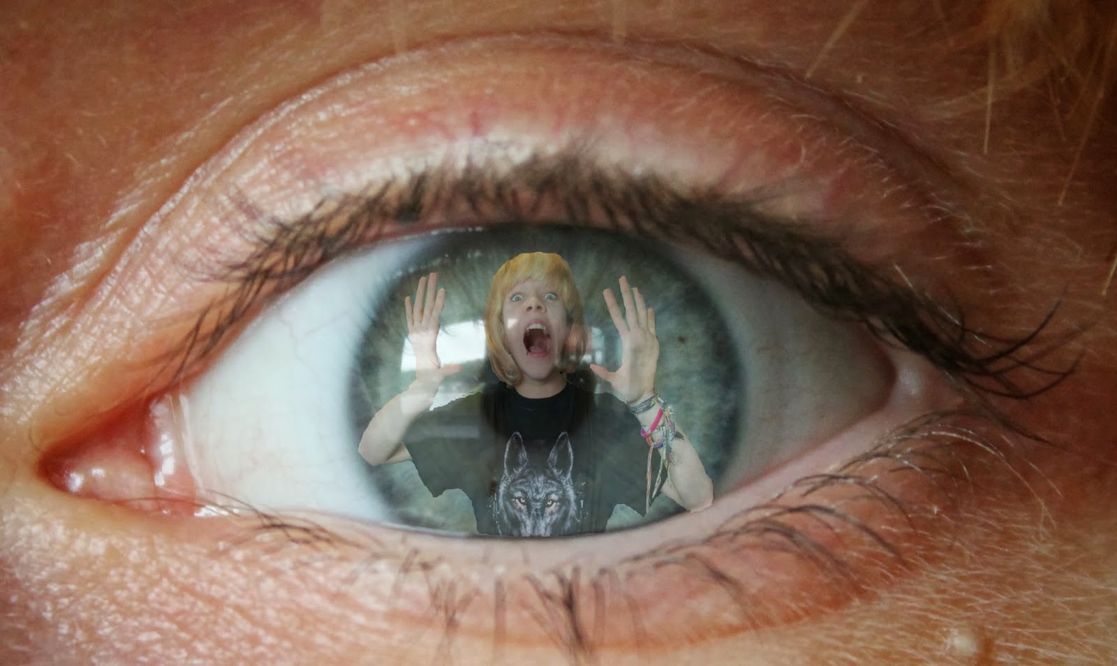
I also had a big part in making and developing our poster. To begin with we experimented with different effects available on photoshop. I took pictures of our protagonist and positioned her so that in some it looked like her imaginary friend was looming over her.
The example shown on the left is a close up picture of our protagonist's eye, I then also took a picture of our protagonist screaming with her hands up, this meant that edited together it would look as if she was trapped inside herself.
After experimenting with effects we decided as a group that we would like the inclusion of our imaginary friend in the poster. We first learnt about this when editing the images I had taken together.
Our poster creation and development
When it came to making our actual poster we had a few pictures to choose from. We decided to use the images taken in the loft as the lighting and overall message of the image suited our genre perfectly.
The images were merged together and I then took control of the typography on the poster. When creating the tagline I duplicated the sentence and staggered the two lines, I then used 'field blur' on photoshop to blur the bottom line so that it created a shadow. Although this was effective, it made the text much harder to read from afar and this had to be undone.
I then created the cinematic information at the bottom, this gave the poster a more professional look and so the poster was more believable.

 "We immediately get a sense of dark foreboding atmosphere from this shot, and most of it is portrayed through the colours - this could be used as a build up in our trailer. The low saturation makes the scene quite dreary, however the contrast is very high in this shot, making the black and white stand out, and helps draw the audience's attention to the dominant parts of the scene. The colour temperature is also very low, and we can see this and the lack of saturation by looking at the washed out red door on the right hand side of the frame. The high contrast also makes some parts of the frame, especially the background appear in very dark shadows, creating a sense of danger and mystery in the shot"


 For our teaser trailer, we used the same font, 'Dark Ages' for all our titles, we felt that this fitted with the narrative of our teaser trailer, and it also fitted well with the font 'Old Style', which we used to make the tag line with. We also felt that the tag line and title had to be different, as we noticed this was a common convention of film trailers and posters. There were many stages during the development of our typography, as we encountered quite a few problems along the way.


