Danielle Blasse 7010 - Cloe Pace-Soler 7352 - Rebecca Holloway 7279 - Natasha Welch 7399
Townley Grammar School - 14109

Thursday, 27 March 2014

Evaluation Question 4 - Rebecca


4. How did you use media technologies in the construction and research. planning and evaluation stages?

Filming
Throughout out filming process, we had two major parts which required media technologies, we had to record a screen on a computer, and use a green screen. For the green screen, we had to use our storyboard to work out how to film in front of the green screen correctly. It took us several attempts until we got the shots we wanted from the green screen, but the end result we came up with during the editing phase was worth it.

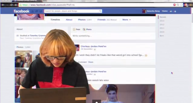
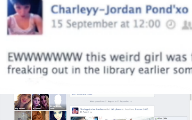
During part of our teaser trailer, in the background, the audience can see a Facebook profile scrolling in the background. We filmed our actor in front of the green screen, and to record the profile, we used software called Cam Studio. When using Cam Studio, you can change the quality, the area of the screen you want to capture, and of course what is on the screen. For this, we used one of our current Facebook profiles and customised it, so it looked as if it was our victim's own Facebook profile. This included changing the name, profile picture, and adding many fake posts to the profile, so that it fitted in well with the mise en scene of our teaser trailer. Here you can see our practice of using the software, before final editing had taken place.

Editing
For our teaser trailer, we predominately used iMovie for all of our editing, this is because we had a lot of experience in using iMovie and didn't have to waste time learning how to use the software. In iMovie we arranged all our clips into the correct place, added our sound and was able to trim down clips so our teaser trailer was no longer than 1 minute long.


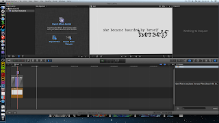
In iMovie, as well as editing the length of the clips, and adjusting the overall narrative, we were able to edit the colours of some of the clips. We felt this was necessary to change the feel of the teaser trailer, and make it conform with the conventions of our genre. In this blog post, you can see how I edited the colours of the library scene, so that it became clear to our audience that our protagonist sees and lives life differently to the other characters in the trailer, and the red tinge also connotes danger, which follows our protagonist throughout the trailer.

However, we wanted to really impress with our editing, and this meant we had to do some editing outside of iMovie and import it in. For this, we used Final Cut Pro, as it has many more capabilities than iMovie and suited our needs for the montage sequence, green screen and titles.


Montage Editing
For the editing of the montage sequence, we wanted to use many visual effects for the various clips here we had included, and Final Cut Pro was perfect for this. We were able to import all the clips we wanted, ranging from the ones we had filmed to the news footage, linking to the mental illness idea. Within Final Cut Pro, we were able to add effects, transitions and sound we had recorded to the montage, using more effects on top of the sound to distort it in the areas necessary. We found it much simpler to edit the montage sequence in Final Cut Pro, and it meant we had less restrictions placed on us which we would have had if we'd just used iMovie. Once the montage sequence was complete, we exported it and imported it into iMovie, positioning it in the correct place. You can read more about creating the montage

Green Screen Editing
Our green screen editing also took place in Final Cut Pro, because we found it to look very unprofessional in iMovie. We did a couple of trials before deciding on using Final Cut Pro, as we attempted it in iMovie and also Premiere Pro, however, we had more access to Final Cut Pro, and it was user friendly, hence why we made our decision to use it.
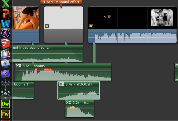

Sound
For the sound of our teaser trailer, we had to record our own sound effects and compose a soundtrack for the trailer. We had various inspirations for the sound used in our trailer, and researched the sounds used in various trailers, as can be seen here.

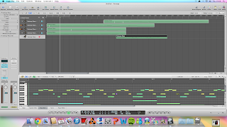
We first looked at various sounds we could incorporate into our teaser trailer, as we had different parts which needed catering for, such as the green screen section, montage, and ending. The media technology we used mainly was Logic Pro, as we had experience in this and found it easy to layer the sounds we wanted to experiment with.


Once we had recorded, and layered and edited our sound, we imported it into iMovie, to position it onto the clips which make up our trailer. This meant we had to decided what parts of the original sound to keep, and which parts to mute, so that only the soundtrack could be heard. We managed to complete all of this in iMovie, however, for the montage section we went back to Final Cut Pro, as it allowed extra precision in the short, face paced clips. iMovie wouldn't have allowed us to be this precise, and since we were exporting the sound and audio from the montage out of Final Cut Pro, it made sense to do it all at the same time.

One problem we did encounter at first when editing our sound was matching it up correctly with the titles and news footage clips throughout our trailer. We were able to simply drag and drop the sounds into the correct places, however once we imported files from various software into iMovie, such as the montage from Final Cut Pro, and soundtrack from Logic Pro, the overall soundtrack of our trailer became out of sync in places, and we had to merge the overlapping parts so they flowed into one another. Also this was a lengthy process as we had to keep replaying parts of the trailer to ensure it was correct, we did manage to do it in the end and are very happy with the outcome.

Titles
Throughout the development of our teaser trailer, we changed our titles many times. After deciding what they were going to say, we had to decide how we were going to present them on the page.

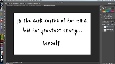
At first we decided to work on our titles within photoshop and went for a look which included the title appearing on an old piece of paper, made to look as if it was hand written with blood dripping over it. We achieved this look by beginning with a white background and one by one importing new layers, one for each letter of every word allowing manipulation of the typography, and then a layer for each drop of blood and the background, so we could add fluidity between the 'ink' and the blood.

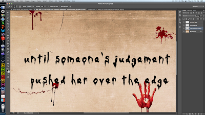
Here you can see the final product of our first attempt at creating the titles. However, we realised some problems with this method. Firstly, because we had created them in photoshop, it would be very hard to export them with the background and blood stains and successfully add effects within Final Cut Pro with it still looking professional. We also thought that the old piece of paper didn't conform to the conventions of our genre well enough, and perhaps gave the impression it was more of a slasher than a psychological thriller. Due to this, we started work on our next attempt of the titles.

For our second attempt, our first major change was to begin work within Final Cut Pro. We then decided to use a very simple background for the titles so that the emphasis would be more on what the titles said, rather than the background, and also it would bring our audience's attention to the effects we applied within Final Cut Pro. We decided that since our cultural link is mental illness and privacy, the effect 'Bad TV' within Final Cut Pro may give our titles the effect we needed to conform more to the conventions of our genre. We liked how this version of our titles much more, and so decided to import them into iMovie and include them in our final teaser trailer.

Poster design
For our poster, we used Photoshop heavily throughout the whole development, as it suited all are needs and would help us achieve a professional outcome. First of all, we used our initial plans as a base and expanded this out, completing several drafts of our poster.


We had several photo shoots throughout the time we were filming, and managed to get a few different photos we could work with and use as a base. In this draft, you can see how we used a photo taken in the library location, featuring our very first typography. We felt that this was a good idea, but upon editing it using Photoshop, we didn't think it looked very professional. So instead, we used the layers in Photoshop to have both a photo of our protagonist and her imaginary friend, in the same shot, which would later be the same thing we did for our website image.


Throughout the development of our poster, we had to focus on typography, because this is a major feature of the poster. For this, we again used Photoshop, and went through many different versions of typography that we had manipulated. First of all, we chose a font we felt fit well with our narrative, and then used some of the many filters and effects you can apply to the layers in Photoshop to manipulate it, so it was truly our own. Photoshop gave us the freedom to alter our typography once we had already placed it, as we found this was necessary quite late in the process because our poster wasn't looking professional enough. The biggest change you will notice that happened to our poster is the placement of the title, at the beginning it was just in one line, but the end product features it spread over three, looking like the letters are balanced upon each other and a shelf in our background image. We were able to incorporate this layout onto our website too.

Another part of typography that was important to develop for our poster, was the development of the tag line, where we again used Photoshop in the same way, because it allowed us to manipulate the text using the same 'Wind' filter as the main title was. This meant that the typography fitted together well and helped us to make it look professional.

Website design
For the development of our website, we were able to use several different media technologies alongside each other. We host our website on Wix, which allows us to edit the template of our website, the placement of all the elements on our website, and link to our social networks and teaser trailer.

Our website came a very long way from our initial ideas, and in order to complete it the way we did, we had to start with a plan of what we wanted. Following this plan, we were able to choose a background image to work with, which we hoped would be the background of our website.

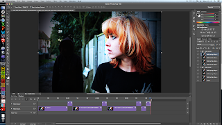
In order to do so, we again had to use Photoshop to edit the image we wanted to use, in this post, you can see the editing I did, to create a viable image for use on our website. Photoshop allowed me to stitch two images together, while still looking professional, and edit the colours. I thought this was vital, because before editing, the photo looks very dull and not interesting, so by increasing the contrast and saturation, we were able to radically change how this image looked.

A feature we wanted to include on our website was a moving background, and we decided to do this by having the protagonist's imaginary friend appear and disappear from the background. We thought that on a website this would catch our audience's attention. In order to complete this, you can see how in this post, I created a gif using the time line tool in Photoshop, and saved it as the website's background on Wix.

Typography
Typography of course is another big part of the website, and was vital that we used the same as the poster and our teaser trailer, to create a professional package. We had many different versions of our typography, and it all stemmed from a plan we made at the beginning of the process. Here you can see how we went from a drawing to a basic design of possible typography, using the online service Pixlr Editor. This was good for playing with ideas, as it was easier to use than Photoshop and allowed us to practice with different typography manipulation before deciding on our final idea.

There was a while during the development of our typography where we played with the idea of using a inky looking typography, because we thought this would fit in well with our narrative and hint at the idea of kidnap. You can see here how we experimented with this idea.


However, we wanted to make it look really professional, and this trial didn't meet our expectations, so we moved on and created this, which is much more uniform and fits better with the conventions found in typography of products also in the psychological thriller genre.

Using the typography that had been manipulated for the poster, I was able to make slight adjustments, again using Photoshop, so that the images were transparent, and therefore would be successfully placed on our website without and grey backgrounds ruining our web page. You can see in my final post about the website, how I used the final typography and imported it into Wix, positioning it following a similar design as the poster, while ensuring the content was all in place on our web page. We used YouTube to have our teaser trailer playing in the middle of our web page.

Evaluation Question 3 - Rebecca


3. What have you learnt from your audience feedback?
Throughout the development of our three products, it was important that we gathered feedback from our audience so that we could be sure we were taking on the constructive criticism to make our final promotional package as professional as possible.

Survey
In December 2013, we decided to send out a survey to our peers to find out how effective areas of our narrative would be. We first planned a series of questions to ask within the survey, and then analysed the results.

In our survey analysis, we decided to ask a question to our audience by focusing on one area of our research, privacy.  we discovered some a range of results. When asking our potential audience which kind of camera would be good for showing the victim of our trailer being spied on, we found that a macbook or CCTV would work best. We decided to use a mac book as we had one of these within our group which we could use as a prop within the trailer.

After gathering these results, we used Photoshop to try and create the ideas our audience were looking for:


We also looked into how we were going to tackle our cultural link to metal illnesses and privacy issues, within the teaser trailer. In order to research this we asked the question 'Do you feel that the discrimination at the beginning should be subtle and barely noticeable, or very clear?' We thought this would be useful for us as we would be able to determine when to introduce our cultural link into our trailer. We found that overall it should be introduced quite subtly.

Above you can see the storyboard created from this research.We decided to add the library scene into our trailer, as we thought this would be a good way to introduce the idea subtly as our audience had suggested. It would then become more extreme, as you can see here:


After we had gathered all the results from our initial survey in December, we continued to film the rest of our teaser trailer and worked on planning how we incorporate our research ideas into our editing. In January we managed to create a draft of our trailer, incorporating the ideas given to us from the trailer as best we could. This allowed us to publish the version on YouTube ready for us to receive more feedback on our work for improvement.

YouTube Feedback
Here are some of the responses we received:

From this comment, we learnt that the genre of our film is very obvious from our teaser trailer, however our cultural link of discrimination against those with mental illnesses is perhaps not as clear as we had hoped. However, we can see that our use of media technologies seems to come across in a professional and effective manner, which is definitely a good thing.
Again, here we can see our genre is clear, however our narrative is very unclear to our audience. The idea of our protagonist being schizophrenic isn't clear enough or perhaps we don't have enough time to show our audience this in 1 minute.
From this comment, again is is clear that our narrative is not clear to the audience, but the locations do draw the viewer into our trailer, as they want to know why the characters are there. We have learnt that our sound isn't always perfect but have since been able to go back and improve the layering in iMovie.
This comment tells us that we have a few weaker areas, again the narrative is an issue, and we need to remove a few shots in order to make it clearer for our audience. It is perhaps the fact that we vary from location to location so much that it becomes confusing.
We learnt from this comment that our genre is clear, and that it is clear the protagonist is mentally ill, even if they don't realise she is schizophrenic. We learnt that our montage sequence really helps cement the idea of mental illness, however it is quite obvious we have used a green screen for parts of it.

Finally from this comment we learnt that again, it is obvious our protagonist is mentally ill, and the use of various shots such as the Facebook scene and web cam parts are really effective. This is good for us because we know that people are picking up on our cultural links.

Results and Improvements
Overall you could say that from our audience feedback we have been quite successful in the areas of editing, filming and sound. However it is clear we do have a slight issue with people understanding what our narrative is. This could be fixed by removing some shots which are possibly misleading to the audience, and that would hopefully help the whole teaser trailer flow better. What is apparent is that our montage sequence has been successful, because when people have realised the protagonist has a mental illness, it is often because of the montage. Another thing that was noted is that in some parts the green screen didn't come across as successful as we would have liked, but we did this to the best of our ability using the tools we had available to us.

From these results, we were able to go and improve on areas of our teaser trailer, we removed shots that were unnecessary and could be too confusing for our audience. We change the ordering of some shots and tried to implement the green screen footage with the other footage as best we could so that it didn't look out of place.

Evaluation Question 2 - Rebecca

2. How effective is the combination of your main product and ancillary texts?
When developing the various different areas of our products, we needed to ensure that they all linked together, to complete a professional looking promotional package for our teaser trailer, poster and website.


Colour Scheme
First of all, we ensured that the colour scheme of all our work fitted together well. During our research and planning stage, we noticed that one of the conventions of a psychological horror, was to have a fairly dark colour palette.

Colour Deconstruction
"The saturation isn't very high, and there isn't a great contrast either, however the brightness is still high enough so that the viewer can see all the features of the character's face. The lower saturation immediately gives quite a dark feel to the shot, by no means is this a happy experience, and the feelings of sadness, depression and pain could be portrayed through these colours. I think this is definitely a technique to consider when editing the final montage shots for our trailer, and to make a distinction between real life and our protagonist's imaginary friend"

"We immediately get a sense of dark foreboding atmosphere from this shot, and most of it is portrayed through the colours - this could be used as a build up in our trailer. The low saturation makes the scene quite dreary, however the contrast is very high in this shot, making the black and white stand out, and helps draw the audience's attention to the dominant parts of the scene. The colour temperature is also very low, and we can see this and the lack of saturation by looking at the washed out red door on the right hand side of the frame. The high contrast also makes some parts of the frame, especially the background appear in very dark shadows, creating a sense of danger and mystery in the shot"


Implementation
For this, throughout our teaser trailer, we edited the colours of several shots to make them appear darker, as well as shooting in dark locations, such as a loft, for the end scene where we witness the after effects of the kidnap. We then wanted to combine these dark colours with the images used on both our poster and website. For our poster, we decided to use a photo taken in the loft of the protagonist and her imaginary friend, as this suggests isolation and danger to the audience. We also like how this links to one of the most important scenes of our teaser trailer. For our website, we used a different image as the background, as wanted variety, however, so that our products link together, we used the same idea of our poster, and included both the protagonist and her imaginary friend in the same image. We also made the edges of the image very dark, to bring in the use of a darker colour scheme, showing conforming to the conventions of psychological horror.

Tag line
To ensure that the combination of our main product and ancillary texts is effective, we also had to ensure that the tag line was the same throughout all our products. We decided that we would not use our tag line in our actual teaser trailer, because we already had a sufficient number of titles throughout the trailer, and didn't think it would be appropriate to overwhelm our audience with text throughout the trailer. Therefore we needed to ensure that the tag line for both our website and poster was the same. This was simple enough, but we decided instead of having the tag line all on one line, we would split it, to make it more interesting for our audience. You can see how the tag line looked on the website before splitting here, and what it looks like after splitting here. We also split the tag line up on our poster, as we had slightly restricted room on the poster, so this was another benefit of having the tag line spread across several lines. You can see how the tag line appears here. This makes the combination of our products effective, because the audience will see a similar layout whenever they see our poster or visit our website, and this familiar layout will help them to remember our film, and want to watch the teaser trailer.

Typography
Throughout all three of our media products, it was really important to incorporate the same typography into each, so that they all look the same and you can tell they are part of the same promotional package. For this, we created our typography in Photoshop, and decided that we would have a font for our titles in the teaser trailer, an edited font for our title and tag line typography, and another very simplistic font for the rest of the website.

Here you can see how we went from a drawing to a basic design of possible typography, using the online service Pixlr Editor. This was good for playing with ideas, as it was easier to use than Photoshop and allowed us to practice with different typography manipulation before deciding on our final idea.

There was a while during the development of our typography where we played with the idea of using a inky looking typography, because we thought this would fit in well with our narrative and hint at the idea of kidnap. You can see here how we experimented with this idea. However, we wanted to make it look really professional, and this trial didn't meet our expectations, so we moved on and created this, which is much more uniform and fits better with the conventions found in typography of products also in the psychological thriller genre.

For our teaser trailer, we used the same font, 'Dark Ages' for all our titles, we felt that this fitted with the narrative of our teaser trailer, and it also fitted well with the font 'Old Style', which we used to make the tag line with. We also felt that the tag line and title had to be different, as we noticed this was a common convention of film trailers and posters. There were many stages during the development of our typography, as we encountered quite a few problems along the way.

Combining our three products
When comparing our three products, we wanted to make sure that there was consistency with how we had laid out various parts of them, such as the typography. This was the main thing we had to focus on when checking that the combination was effective, so we decided to utilise the space on the right of the poster and the website to place the title of our teaser trailer. This meant we could use the same positioning of all the letters, and our audience would be able to quickly identify that the website and poster were for the same film.


Evaluation Question 1 - Rebecca

1. In what ways does your media product use, develop or challenge forms and conventions of real media products?

Throughout the development stages of our teaser trailer, poster and website, we had to research thoroughly into the various conventions of our genre, psychological thriller.

Teaser Trailer
'Enter the Void' Deconstruction
Firstly, we carried out many deconstructions on films from the same or similar genre, focusing on picking out what the conventions of our genre were. One deconstruction I found to be quite a large source of inspiration for us, was 'Enter the Void'. In my deconstruction of this, a prominent feature I focused on was the use of flashbacks throughout the film, one point really stood out to me, where the flashbacks were used in a montage sequence, quickly showing various parts of the protagonist's earlier life. I believe that this was an inspiration we used in our teaser trailer, because during the end part of our trailer, we have edited together a montage sequence, including flashbacks from earlier in our film's narrative and increase the pace of the montage rapidly.


'Girl Interrupted'
Deciding to focus on mental illnesses
Since our teaser trailer focuses on a character with schizophrenia, we also had to research films that covered characters will mental illnesses. For this, I deconstructed the trailer of the film 'Girl Interrupted'. While deconstructing this trailer, I noticed how those with mental illness were not treated with the same respect as 'normal' characters, and they seemed to adopt a childish nature, as can be seen with the character Lisa.

Deconstruction
Throughout the film's trailer, we get a huge sense of the prejudice against the people inside the mental hospital, they are not treated like normal human beings.

"Patients do not seem to take their time at the facility very seriously and this is shown by the introduction of Lisa, who is wearing a bright yellow shirt and has a cat puppet. This shows a very childish nature, especially with the addition of her diegetic dialogue "Look at me!" Wanting attention and playing with the puppet, however the mise en scene suggests that she is probably happy if not excitable"

"The typography used when Susanna has arrived is very important, as the word 'Claymoore' is in red capital letters, which could suggest to outsiders there is some sense of danger, however the underlying message could be that the staff are taking action to help those inside"
"Linear narrative is used heavily at the end of the trailer, helping to increase the pace and add a little suspense just so that the viewer wants to find out more of the narrative."
Implementing conventions into our trailer
We tried to incorporate this into our teaser trailer, and this helped us conform to the prejudice representation used in films of those within films. From the very beginning of our trailer, we see how our protagonist is judged immediately by those around her, prompting her to watch the character who judged, and try to get some kind of closure, while battling her mental illness alone, which only makes the situation worse. This challenges the convention we saw used in 'Girl Interrupted', where all the characters in the trailer that have mental illnesses stick together and help each other through whatever is thrown at them.

Instead in our trailer we highlight to the extreme how some people with mental illnesses can be isolated, thus leading them to do things they seem to have no control over, in our case kidnapping the girl who judged her. It shows how when left completely isolated, it can feel like there is no way, only allowing themselves to become overwhelmed with negative thoughts, which we represent through an imaginary friend.

Website
As part of creating our website, we had to research the best kind of layouts for a promotional website and also what content should be included on it. During this research, we looked at other A2 Media promotional websites, and looked at what was good and bad about each of them. From this research, I found that the conventions of websites were to make the genre of the film obvious straight away, often using the background image and typography to achieve this.

Conventions of film websites appropriate to our genre
- Genre suitability
- Suitable for target audience
- Embedded teaser trailer, starts playing automatically
- Clear title of film
- Suitable font colours, and link colours
- Social network links
- User friendly
 - Critics reviews

Deconstruction of 'Brutal Justice' Website
  • This website is suitable for the genre because it becomes clear immediately it is in the horror genre. This is made clear by the background - an image of a woods in grey and white, looking very isolated      and appears scary. The tagline also fits into the horror genre, "Some kidnap to protect... They kidnapped for revenge" as it suggests there is a victim and a threat, possibly a human or creature, until you watch the trailer it is unclear.
  • The teaser trailer is embedded well and starts as soon as the webpage loads, however, unless you make it full screen the trailer plays in a very small box which could make it hard to see some of the details of the trailer.
  • The social links, despite being very large are all useful and links to the main sites, such as Facebook, YouTube and Twitter, there is also a downloads page making the website interactive.
  • The overall colour scheme works well, as it helps enforce the horror genre and makes it seem quite creepy. The grey background allows the red text to appear quite bold which encourages the viewer to click around the website and find out more. 

Development
We developed on this convention by using a background that we think makes the genre clear, as we see our protagonist looking back towards her imaginary friend, who is the source of much of her confusion and violent actions. Another convention of websites was to feature the actual teaser trailer embedded somewhere on the web page, and to have it play automatically once the page has loaded. We have conformed to this convention, as it it vital we have this content on our web page, because it links our promotional products together.


Poster
Research
A large part of the poster, and the website and trailer is typography, and before we could start designing any of our own typography any of these, especially the poster, we had to research what was already out there. From the posters I found that the typography for the different elements of the poster such as the title and tag line are largely the same, but with small differences. We conformed to this idea, and chose very similar looking fonts but with similar effects applied in Photoshop so that they link together nicely.  We found that most of the posters used quite dark colours with a bold contrast, something we took on board with our poster by using a dark location for the photo shoot.

Deconstruction of 'The Woman In Black'

  • Limited colour scheme
  • Dominant eye in centre of the poster, drawing audience's attention here
  • Web address in bold at the bottom of the poster
  • Typography in capitol letters
  • Tagline links to dominant image
  • Costume appropriate for time. 


Development
A common convention of the posters we examined was that the tag line is always a lot smaller than the main title, so we conformed to this convention, making it much smaller and ensuring that the title is what grabs the audience in. In addition to this, the majority of posters have the protagonist's face present on the poster, and this is the dominant feature. We conformed to this idea mostly, however we decided to have two faces, both our protagonist and her imaginary friend edited in, this would be the dominant of our poster, and conforms to the dominant feature linking to the tagline. We thought that because this was slightly different from the normal conventions it would grab our audience as they'd be intrigued to find out why there were two identical people on the poster.

Monday, 24 March 2014

Evaluation question 3- Natasha

3) What have you learnt from your audience feedback.


Survey Feedback


Production

Feedback

  • When initially planning for our media products, we conducted a survey in order to help us make some important decisions about the production process. 
  • For instance, we asked our target audience: "would it be effective to use two cameras to achieve multiple angles?". Over 80% of responses claimed that, "Yes," it would be effective to make use of different cameras, and that it would not be too complicated. 


Development
  • Therefore we implemented this during our storyboarding stages. We took this into consideration in the scene where the protagonist stalks the victim via webcam by utilising the digital camera and the webcam camera to get a variation in shots and angles. 
  • This meant that we had a wider variation of shots and angles to use in the post-production stage, leading to a more professional overall product which really shows off our skills. We also developed this idea by adding in an overlay of a recording symbol on the footage recorded by a webcam. This emphasised the fact that it had been recorded by the protagonist and so have a creepy twist. 

Mise en Scene

Feedback


  • As well as this, we asked our target audience about the costumes for both the actors, asking "what style would be best for our character?"
  • The majority of respondents answered, ’Grungy look’, which we took into consideration when deciding on costume choices for our protagonist, which we documented thoroughly.
  • From this feedback, we went away and created, 'wardrobes,' for each of our characters.
  • This was due to our trailer form, which meant that we would include various scenes from across the timescale of the film and so the characters would not be wearing the same costume throughout.
  • When filming our scenes, we had a collection of costumes which we could go to easily which we knew suited our character profiles. This made the production stage of the process a lot easier. 
  • From the feedback we received about the styles of our key characters, we were able to make 'character profiles' to help us get a clear idea of what they were like and what mise en scene we wanted to surround them with. For our victim, we decided to make them have a mainstream style and typically 'girly.' We kept this mind when choosing the bedroom for this character.
 
Development
  • Once we had chosen the bedroom for the character, it was imperative that we changed the mise en scene. One of our main issues whilst filming was our location of the bedroom as the mise en Scene of the room was not suitable for the character that we wanted to convey. 
  • We immediately decided that major changes would need to take place within the room to make it suit the character, primarily by removing various items which clashes with the personality of the victim. This included all of the books on the bookshelf as we didn't perceive the character to be very interested in reading fictional works, the guitars in the corner of the room as we thought although she could be musical, these would distract from the main points we wanted to put across about her character. 
  • Then we went about adding in items that we thought portrayed our chosen character. We printed off posters of mainstream musicians and actors and stuck them over the walls and wardrobes. We wanted to give the room a cluttered effect and so we asked everyone in the group to bring round pink objects, makeup and shoes which we scattered around the room. We put beauty products on the shelves and threw different types of shoe on the floor in a random order so that it did not look too meticulously placed. 
Title
  • We also utilised audience feedback when considering the name of our film. We initially had a long list of film title choices which we were deliberating.
  • We cut this list down to 6 options and then conducted an informal survey by asking around and creating a tally for the number of support for each name. 
  • Finally, I created a pie chart which showed explicitly the popularity of each potential title. This helped us considerably when choosing the name as it meant we got an unbiased view, and we eventually settled on the most popular name which was, ‘Unhinged.’


Feedback: draft trailer


Narrative

Feedback
  • After we completed our trailer, we wanted to receive feedback to know what tweaks to make.
  • We uploaded the trailer onto youtube with a list of questions in the description, to help us get an idea of what we needed to change.
  • One thing that became obvious to us straight away was the unclarity of the narrative, as many comments expressed uncertainty for instance, "Something about a girl who is haunted by someone...?" 
 
Changes
  • Therefore, we decided to make the title slides longer and edited them so that they were 2 seconds each, as they were originally too fast to be able to read as we did not want to go over 60 seconds. However, we decided that we were more focused on the audience understanding the narrative and made some essential changes.
  • These allowed the audience to read the titles clearly, which meant they could absorb what the narrative is.
  • This also allows them to understand the initial equilibrium shown through the title, 'The medicine worked', which is lost in the middle, explained via the title, 'Then she was haunted by someone's thoughts.'
 

Feedback
  • Linking in to the unclarity of narrative, we received a lot of comments about one scene in particular. This was the scene where the protagonist is seen scrolling down the Facebook page of her stalking victim, and witnessing many malicious comments - which appear in the background via chroma keying.
  • Many people did not think that the malicious comment which upsets the protagonist is clear enough, suggesting, "The narrative would make a lot more sense if the facebook status was longer and larger." 
  • Before the feedback, the comment was zoomed in a little bit and stayed on the screen for about 1 second. On top of this, the protagonist's head was directly in front of the wording. This meant that an essential part of the narrative was unclear as the audience could not understand what discrimination pushed the protagonist over the edge. 
 
Changes  
  • Therefore, we made some vital changes. I utilised photoshop to create a close-up of the comment as a large image.
  • Then, I imported it into Final Cut Pro and edited the scene so that the protagonist would disappear from the foreground so that the audience could clearly read what the comment said.
  • I also made this shot much longer than it was originally, to give time for the audience to read as it. It was important to ensure that effective transitions were used either side of this shot to make it fit in smoothly, and so I used ‘Static’ transition, ‘Style B’.
 

Sound

Feedback
  • We also received a lot of feedback about the sound, such "sound needs to be tweaked" and the sound, "needs cleaning up as at certain points the layering was a bit off." Therefore, we thought it important to focus on the soundtrack when changing things around. 
  • Before this feedback, the transition from the previous scene into the montage was a bit unprofessional and rigid. The non-diegetic soundtrack before the montage consisted of a soft, melodic piano track which very abruptly changed into fast-paced 'boom' sounds. Looking back, we did not think this was a very effective transition.
 
Changes
  • Therefore, we made use of the ‘boom’ sound effect leading up to the montage, layered over the piano soundtrack. This prepared the audience for the change in tone, rather than surprising them all at once and created a gradual sense of anticipation.
  • We also added a ‘woosh’ sound effect just before the montage, to add to the suspense and prepare the audience for a distinct change. We also faded out the piano soundtrack rather than end it abruptly, so that it would a more subtle change in sound.
  • This meant that the sound of the overall product seemed more professional and intricately layered so that although the change in tone at the montage still had a major impact and created tension, it did not seem out of place and transitioned smoothly.

Feedback: draft poster and website

Typography
 
Feedback
  • We also received some feedback concerning our poster and website, which we took into careful consideration. Our audience was concerned that the title of our poster was not large enough, making it not conventional of a film poster and also making it not very noticeable. 
  • Originally, the title was laid out along one line, which meant that it was squashed up in order to fit into the available space. This did not make use of the space on the poster and made the overall poster seem a bit empty and unprofessional. 


Changes
  • Therefore, I duplicated the file and changed it by making the title ‘Unhinged’ on three lines rather than one, and manipulating it so that it was slightly crooked. This made much better use of the space on the poster and conformed to the conventions of a psychological thriller much more. 


Development

  • However, we also then had the problem of the website, as the layout was then different to the poster which didn't create an effective promotional package combined.
  • Therefore, we had to make sure it was also the same style on the website, creating a transparent image of the title on photoshop which we could import onto Wix.
  • This made our products combine effectively as a cohesive promotional package which was also more conventional of the psychological genre.