How effective is the combination of your main product and ancillary texts?
- As well as a 60 second trailer my coursework group and I also had to create a website page and a poster which all had to effectively match one another.
Reinforcing the Narrative
Trailer
- We included the protagonist's imaginary friend in all of our media texts. Firstly in the trailer we did this through chroma keying. When creating our initial ideas we were set on one thing, including chroma keying in our trailer. We shaped our trailer and package to this key thing so we could play around with new effects.
- When first experimenting with chroma keying we used a smaller scale green screen and filmed with a mobile phone. This was extremely unprofessional but we were able to get to grips with how to work the chroma keying effect on Final Cut Pro through this.
- We encountered simple problems such as not wearing green during the shoot as those sections would be removed with the rest of the green background when editing. We also realised that lighting was key to a professional effect and we have to avoid shadows as much as possible.
- Once we understood how to edit the footage we bought our own green screen and re-filmed with our camera on the tripod so it was steady as when initially filming our characters weren't in line with one another. This meant that when we combined them the videos both merged seamlessly and we were then able to progress into changing the background. We felt that chroma keying would encourage the audience to realise our protagonist was imagining these sequences.
- At the end we had a sequence in which the imaginary friend would walk in and whisper into the protagonist's ear. This made our protagonist's schizophrenic explicitly clear to the audience.
- We also then experimented further and started altering the backgrounds to more surreal, distorted images to explicitly show the audience these scenes are in our protagonist's mind.
Poster
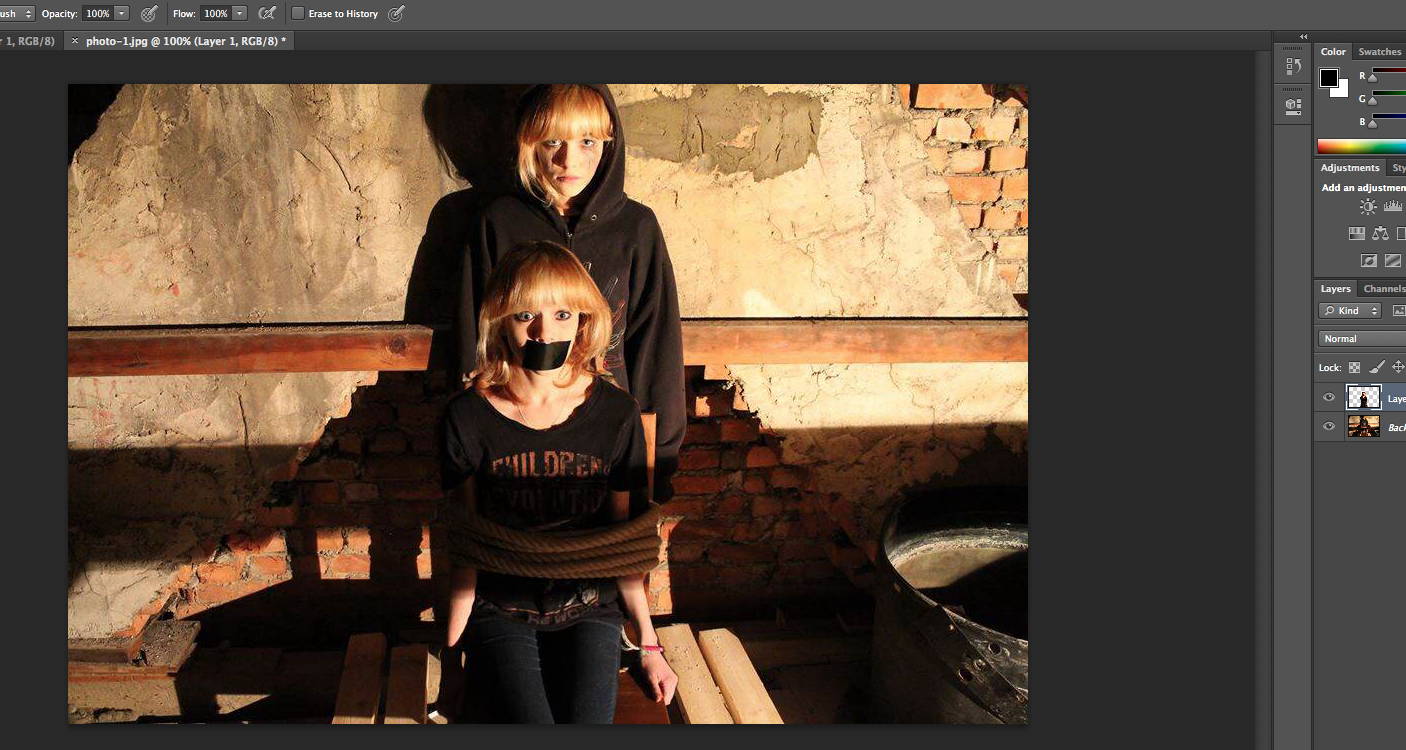
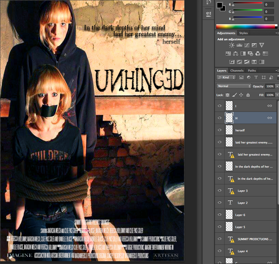
- Our poster also includes the imaginary friend, this required the use of photoshop to lift one aspect of an image and move it to the other side. We used the 'lasso' tool to cut out our protagonist sitting on the chair and move her over to the second image in the loft. After rubbing out the individual pixels around her and adding some shadows so that it didn't seem like it had been stuck on we had our completed image.
- However, our initial image was landscape which did not suit our genre and so we had to alter it to portrait. After cutting both sides of the image and stretching it slightly to make it a4 the poster looked fine.
- Our final product was professionally layered and reinforced the narrative with the inclusion of the imaginary friend. The gaffer tape over our protagonist's mouth clearly tells the audience that she is being controlled by her mental illness and that she is not the villain but the victim.
Website
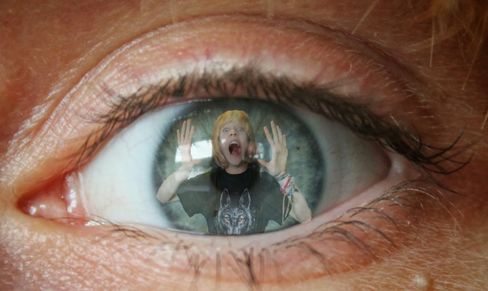
- We also had the inclusion of the imaginary friend in the website image.
- When first taking the image we had to use a tripod so the image would be stable and merging the two images wouldn't be difficult.
- We had a focused image of our protagonist in the foreground so the audience was able to recognise who our main character was.
- We then included the imaginary friend in the background, we did this by retaking the photo with our actor further away from the camera. We then ensured that she was out of focus, therefore showing that although our protagonist's mental illness isn't obvious its always in the background of her mind.
- Finally, to add the psychological effect we added visual effects on the image and therefore our genre was clear. This was a gif which blacked the imaginary friend's face out occasionally, therefore adding in a surreal edge.

Typography
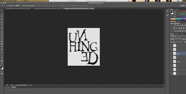
Initial Typography- Typography was one of the main areas which underwent many changes. To begin with a font was chosen called 'Dark Ages' which we all quite liked. We then experimented with manipulating the typography in photoshop by blurring the ends of the letters so they looked like they were turning into vapour.

Development
- However we noticed quite quickly that although this did look creepy it did not really match our psychological genre at all and so we had to change it.
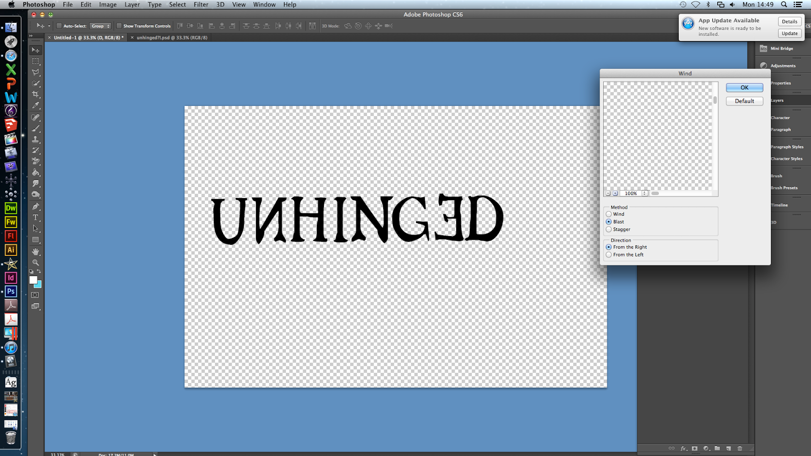
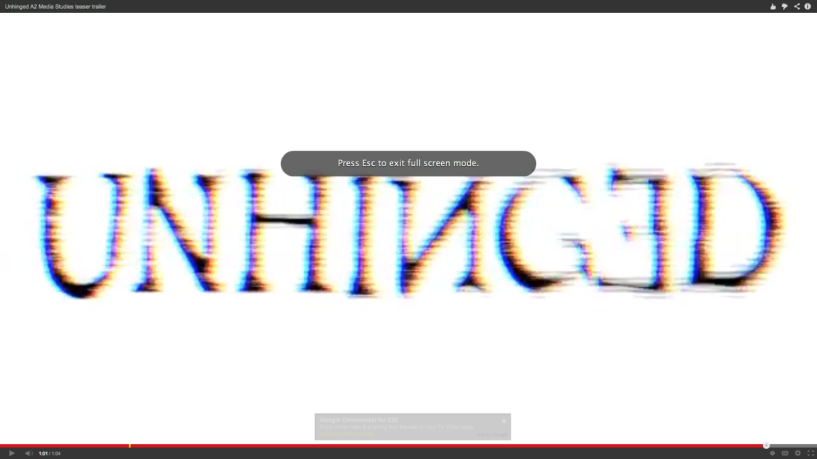
- We decided to go for a typography called 'Old Style' which was manipulated to seem eroded with the effect 'wind' at a 'blast' level. This meant that the typography now suited our genre. Additionally we also used the transform tool to flip certain letters upside down and to make them inverted. This reinforces our genre further as its connotes that something isn't quite right, which is what our title states as well.
- In order to ensure all our media texts were matching we had the same typography and effect on the website, poster and trailer.
Further Changes
- We then noticed we had different layouts of the title on the different texts, with the website having the title in white and in a single line, the poster having the title split up on three lines in black and the website having a mix of white and black on one line. This was bad for continuity and so we decided to change the title on the website on three lines and changed the colour to black. This meant that our products were seen as a package rather than separate pieces.
 Colour Scheme
Initial Ideas
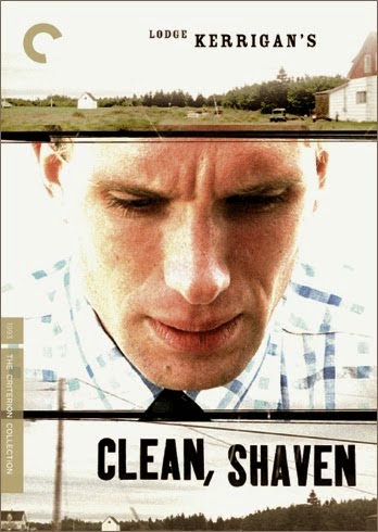
- Initially we started out researching different colour schemes for psychological genre, and decided that the two examples given were our favourite colour schemes which would accurately suit our genre. We felt the neon colouring would clearly state that our trailer was psychological, however we also felt that the bright white of clean, shaven linked in with hospitals and would demonstrate that our protagonist suffers from a mental illness.
Development
- However when creating our website and poster images we strayed off from this as we felt that the content of the image was more important than the actual colours, and that our texts definitely came together as a package due to the presence of our protagonist and her imaginary friend in both images.
- Despite this we did have a theme of high contrast, saturation and darkness which made our images come together and match. Both images were altered to seem more grimy and psychological, with dark shadows being highlighted and certain areas becoming harder to see (e.g. the imaginary friend in the background.)
- We felt this was better than a 'colour scheme' as it was more professional. They did both follow a theme and have a similar texture to them, however the colouring is different.
- Despite this we did maintain the same colour scheme of black and white for the title and tagline, so that there was one main area that was exactly the same, therefore completely tying all our products together.
- This theme of black on white is also in the trailer with the titles and the final title at the end.


