For our trailer, poster and website we need to find a consistent typography to use which will fit with the genre of our work, and have effective connotations, linking to our plot if possible. I have decided to look at other film posters to analyse their typography and see what ideas we can gain from it.
 When looking at the typography used in 'The Ring' film poster, we can see that there are two different style being used. The tagline is in a modern looking font, it is very plain and the capital letters make it stand out. The contrast in colours also make it stand out against the back ground. It is important to look at the size of the font too, it is quite small in comparison to the actual name of the film, ensuring the viewer doesn't get confused between the two. The positioning of the tagline is very clever, it is placed at the top making people naturally read it first, it also means that the finish the sentence when they read the title of the film, linking the two together effectively. The typography used for the title of the film is made to look handwritten and appears to be very childish hand writing, perhaps hinting at parts of the story line before the viewer has even seen the trailer. This works well because it is quite large allowing people to see it from a distance, but also the contrast again ensures it is seen and stands out.
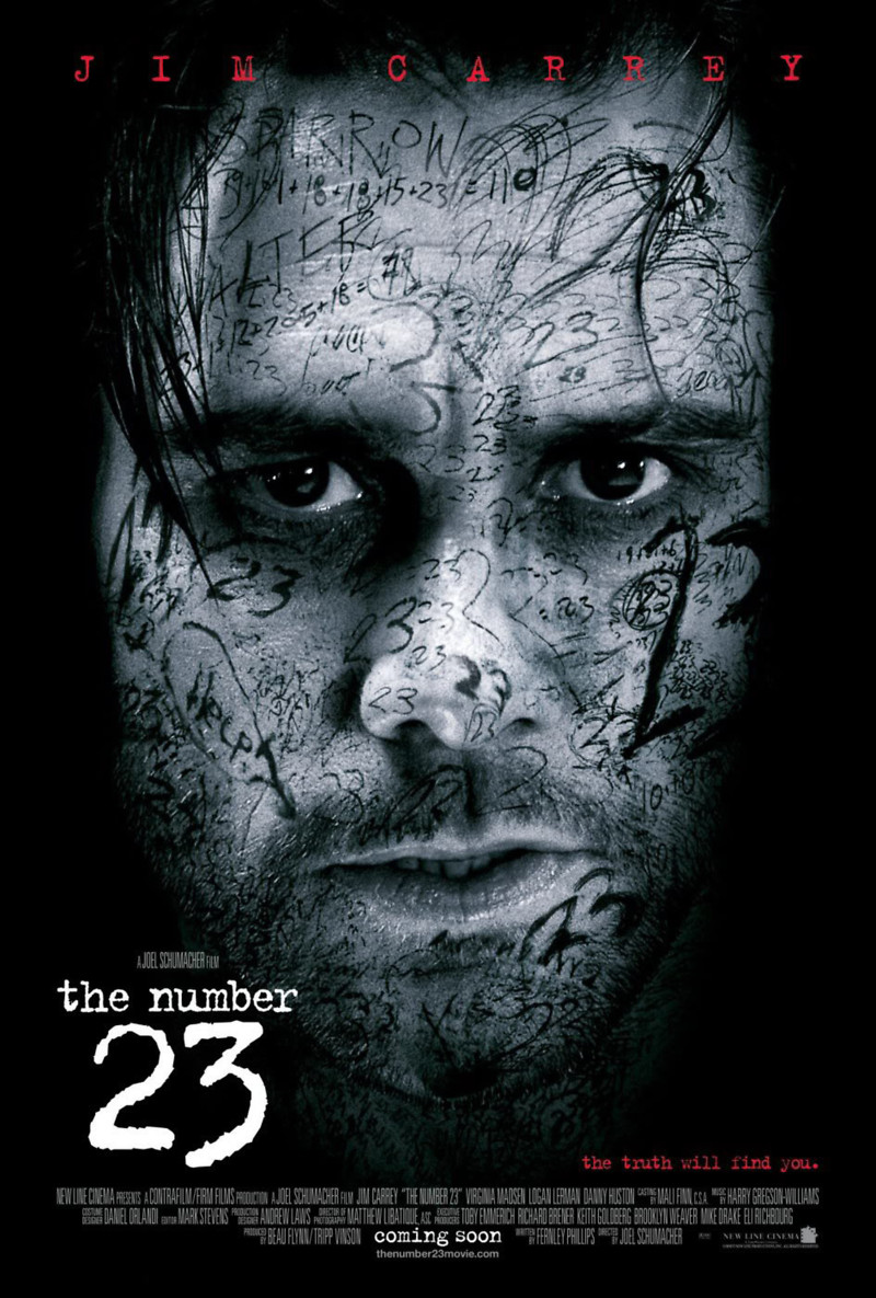 In this poster the typography is varied. Jim Carrey's name is displayed in red and is very big at the top of the poster showing that the creators of the poster want to draw the audience's attention to their protagonist. This is combined with the close up shot of him as the main image in the poster. The idea of this and the tagline being in red suggest that there is danger in the film and to the actor that Jim Carrey will be playing. The title is not in capitals which is a contrast to the typography used at the top of the poster, is suggests that the attention should be on the number '23' instead of any words, which is why it is scrawled all over the face in the poster. The use of white font has been used to contrast angainst the dark, almost black background, this works really well as it draws in the eye of the viewer and makes sure it is clear from a distance.
In this film poster the same typography has been used for the tagline, title and actor's name. The difference between them is that the tagline is in black and is very small. This is obviously not what the creators want to draw the most attention to. The main actor's name is in a medium sized font and is in white, again creating a contrast so it stand out and is just above the title. We can therefore tell from this that the film makers want to reach out to fans of the actor and get them to watch the film. The actual title of the film is still in white and is much bigger. 'Mind' has been made ever so slightly bigger but is connected to the rest of the title showing how the typography has been manipulated.
For our film poster it is likely that we will have a dark area due to the nature of our genre and plot, so I believe that by using a white font will be the most effective as it will be clear and draw the reader in. A convention of film posters is that the tagline is red, so we could use this too elsewhere on our poster.
No comments:
Post a Comment